

The <ScrollBar> element of XAML represents a scroll bar control in UI. The ScrollBar control is used to add horizontal and vertical scroll bars to content controls. This tutorial and code examples show how to use a ScrollBar control in a WPF app using XAML.
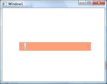
The following code example creates a ScrollBar. The Orientation property of ScrollBar element sets the direction of scrolling that can either be horizontal or vertical. The Backtround property sets the background color of a scroll bar.
- <ScrollBar Name="McScroller" Orientation="Horizontal"
- Width ="250" Height="30"
- Margin="10,10,0,0"
- Background="LightSalmon" />
The Value property of ScrollBar sets up the current value of a ScrollBar control. The Minimum and Maximum properties represent the minimum and maximum range of a ScrollBar. In the following code, I set the Value property to 50 and now the ScrollBar.
- <ScrollBar Name="McScroller" Orientation="Horizontal"
- Margin="10,10,0,0"
- Width ="250" Height="30"
- Background="LightSalmon"
- Minimum="1" Maximum="240"
- Value="50" />
Here is a complete tutorial - WPF ToolBar Control using XAML and C#
Vithal WadjePosted Jan 2, 2015, 5:50 AM
nice