

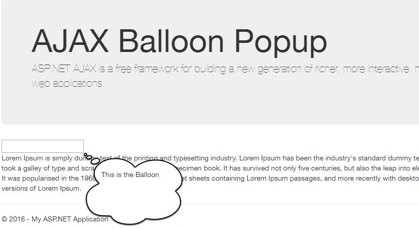
Balloon Popup Extender Control is an extender control and it is required to control the work. The basic purpose of the Balloon Popup Control is to show some information or direction while filling out a form, or it can be used with some text and show information on the click of that text.
It has three different styles: Balloon, Rectangle and Custom type. In addition to the three different types, it also supports three sizes which are small, medium, and large for the best user experience.
If you have used custom Balloon Popup then the custom style can be overridden using the custom css URL.
It can be set to five positions, which are TopLeft, TopRight, BottomLeft, BottomRight, and Auto. If you have set auto, then it can align itself according to the available space.
The Balloon Extender Control works on MouseOver, Click, and Focus events. If the Balloon is shown on any of the events, you don’t have to worry about hiding the popup, the Extender Control automatically takes care of it.
Let’s have a look at the initial setup, as follows:
- <asp:Panel ID="Panel2" runat="server"></asp:Panel>
- <asp:TextBox ID="myTextBox" runat="server"></asp:TextBox>
- <div class="row">
- <div id="ajaxcontroltoolkitplaceholder">
- <ajaxToolkit:BalloonPopupExtender ID="PopupControlExtender2" runat="server" TargetControlID="myTextBox" BalloonPopupControlID="Panel2" Position="BottomRight" BalloonStyle="Cloud" BalloonSize="Small" CustomCssUrl="CustomStyle/BalloonPopupOvalStyle.css" CustomClassName="oval" UseShadow="true" ScrollBars="Auto" DisplayOnMouseOver="true" DisplayOnFocus="false" DisplayOnClick="true" />
- </div>
- </div>
- TargetControlID
The target control Id is used to attach the Extender.
- TargetControlID="myTextBox"
- <asp:TextBox ID="myTextBox" runat="server">This is the Balloon</asp:TextBox>
- BalloonPopupControlID
The ID of the control to display. The panel is used with the text inside to show on the events and is set on the text box.
- BalloonPopupControlID="Panel2"
- <asp:Panel ID="Panel2" runat="server"></asp:Panel>
- Position
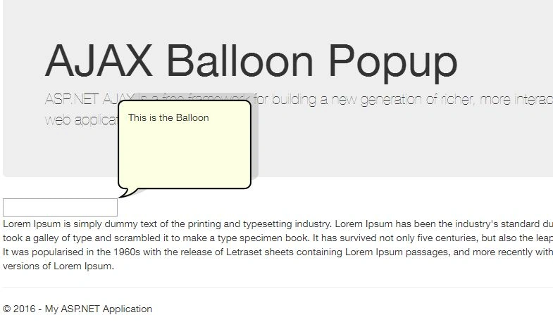
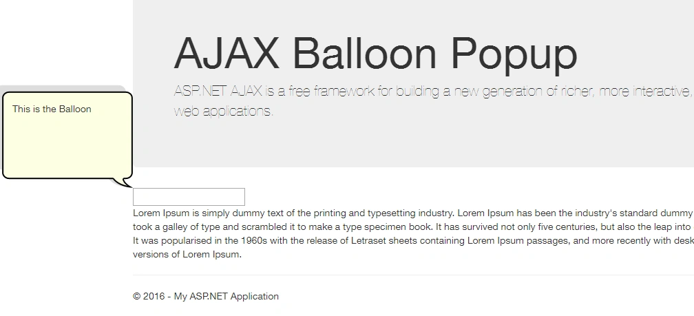
Optional setting specifies where the popup should be positioned relative to the target control. (TopRight, TopLeft, BottomRight, BottomLeft, Auto). The default value is auto.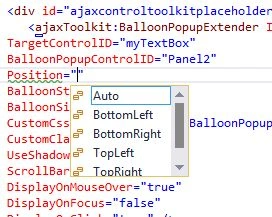
- Top Right
- TopLeft
- BottomRight
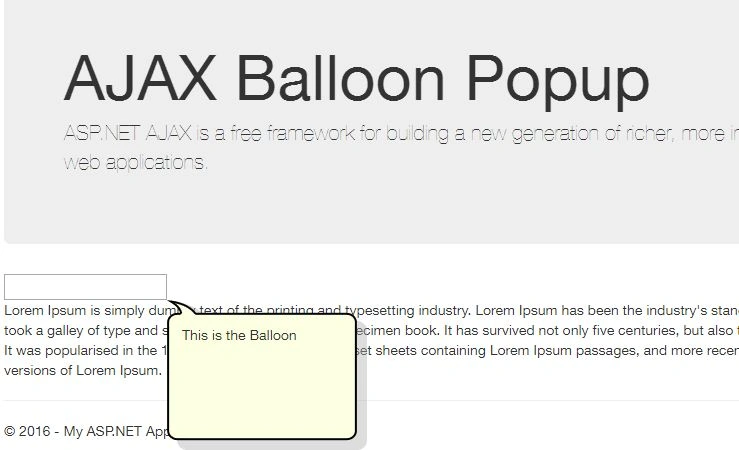
- BottomLeft
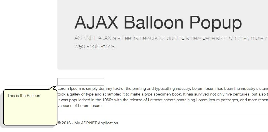
- Top Right
- OffsetX/OffsetY
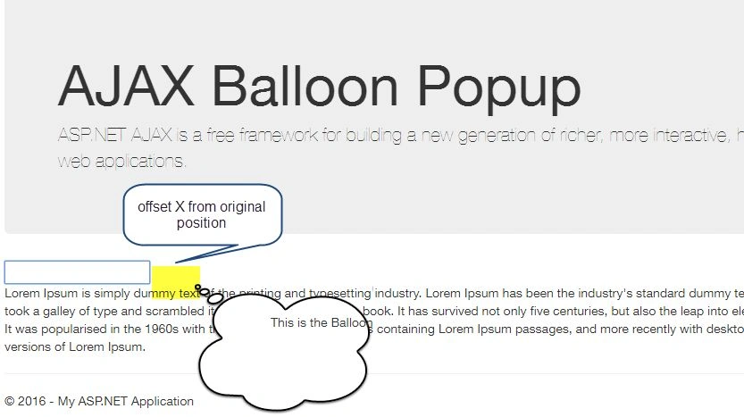
It is the number of the pixels to offset the balloon from the original position; either horizontally or vertically. The default value is 0.
Offset X (Horizontal)
OffsetX="50"
Offset Y (Vertical)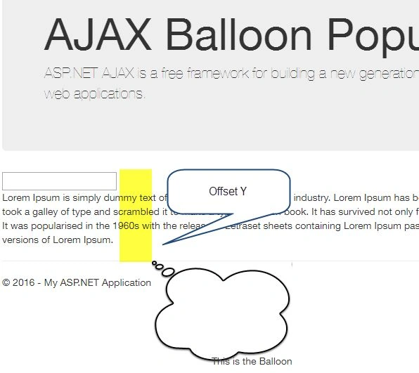
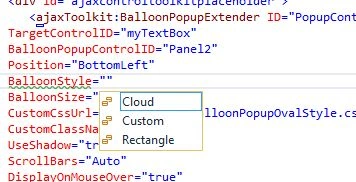
- BalloonStyle
Optional setting that specifies the theme of BalloonPopup. (Cloud, Rectangle, Custom). The default value is Rectangle.
Cloud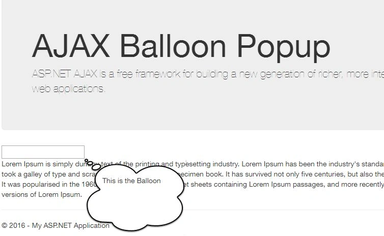
Rectangle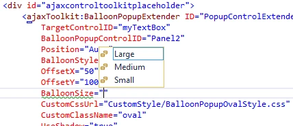
- BalloonSize
Optional setting, that specifies the size of Balloon Popup. (Small, Medium, and Large). The default value is small.
Small
BalloonSize="Small"
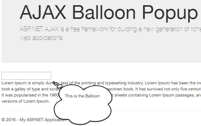
Medium
BalloonSize="Medium"
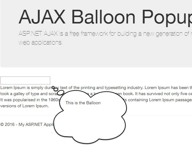
Large
BalloonSize="Large"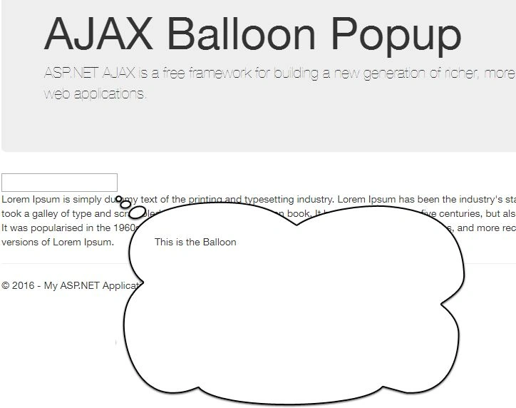
- CustomCssUrl
This is required if a user chooses BalloonStyle as custom. This specifies the URL of custom css, which will display the custom theme.- CustomCssUrl="CustomStyle/BalloonPopupOvalStyle.css"
- CustomClassName
This is required, if a user chooses BalloonStyle as custom. This specifies the name of the css class for the custom theme.- CustomClassName="oval"
- UseShadow
Optional setting, which specifies whether to display the shadow of Balloon Popup or not.
UseShadow="false"
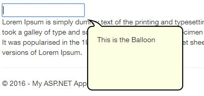
UseShadow="true"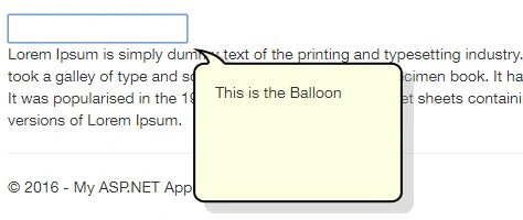
- ScrollBars
Optional setting, that specifies whether to display the scrollbar or not if the contents are overflowing. This property contains five options - None, Horizontal, Vertical, Both and Auto. The default value is Auto.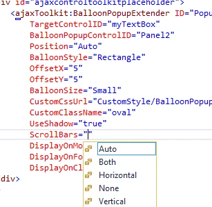
- DisplayOnMouseOveries
Optional setting, that specifies whether to display Balloon Popup on the client on MouseOver event. The default value is false.
DisplayOnMouseOver="false"
- DisplayOnFocus
Optional setting, that specifies whether to display Balloon Popup on the client on Focus event. The default value is false.
DisplayOnFocus="false"
- DisplayOnClick
Optional setting, that specifies whether to display Balloon Popup on the client on Click event. The default value is true.
DisplayOnClick="true"
Iqrar AliPosted Dec 9, 2016, 9:44 AM
Very knowledgeable piece of data.
Santhakumar MunuswamyPosted Jun 25, 2016, 12:47 AM
Thank you for nice article. Keep it up
Prasanna MuraliPosted Jun 23, 2016, 10:18 AM
Nice one...
GokulPosted Jun 23, 2016, 3:12 AM
Thanks for sharing
RajaPosted Jun 22, 2016, 5:24 AM
Good one..
Vignesh ManiPosted Jun 21, 2016, 4:58 PM
Nice
Kuppurasu NagarajPosted Jun 21, 2016, 12:38 PM
Nice Sharing..