

Introduction
Please check on the list of Kendo UI component for Angular 2
Content
- Setup Kendo UI for an Angular 2.
- Configuring Kendo Combo box control for an Angular 2.
Quick setup of Kendo UI for Angular 2
Before going to the initial setup of the project, just make sure that the latest versions of Node.js and NPM are installed in your system
Step 1
Install Angular-CLI package, open the command prompt and write the command given below to install Angular CLI package
npm install -g @angular-cli
Step 2
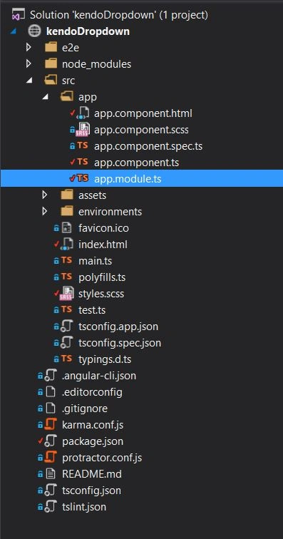
Go to the respective directory, where you need to save your project and give the command given below in the command prompt to create a project.
ng new kendodropdown --style=scss
Kendodropdown is our project name.
Step 3
To associate the progress of NPM registry with the @progress scope, run the command given below.
npm login --registry=https://registry.npm.telerik.com/ --scope=@progress
NPM will ask you for telerik account credential and an email. If you are not an existing user, try to create a new telerik account.
Configuring Kendo auto complete control for an Angular 2
Step 4
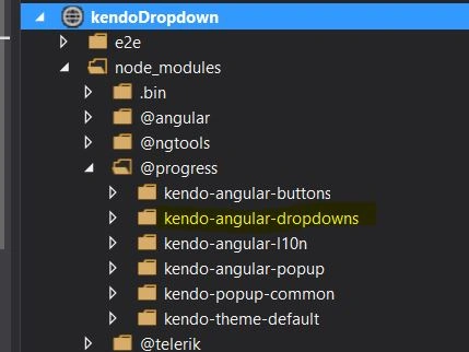
Let’s create a new component. In this article, we are going to see Kendo combo box for an Angular 2. To use the control, first we need to install Kendo dropdowns module, give the command given below to install Kendo dropdowns.
npm install --save @progress/kendo-angular-dropdowns @progress/kendo-angular-l10n @angular/animations
Step 5
Learn to solve the Rubix Cube with the easiest method, memorizing only six algorithms.
import { BrowserModule } from '@angular/platform-browser';- import { NgModule } from '@angular/core';
- import { FormsModule } from '@angular/forms';
- import { HttpModule } from '@angular/http';
- import { BrowserAnimationsModule } from '@angular/platform-browser/animations';
- import { DropDownsModule } from '@progress/kendo-angular-dropdowns';
- import { AppComponent } from './app.component';
- @NgModule({
- declarations: [
- AppComponent
- ],
- imports: [
- BrowserModule,
- FormsModule,
- HttpModule,
- BrowserAnimationsModule,
- DropDownsModule
- ],
- providers: [],
- bootstrap: [AppComponent]
- })
- export class AppModule { }
Open app.component.html and write the code given below in it.
- <h1>{{title}}</h1>
- <div class="example-wrapper">
- <p>Favorite Fruits:</p>
- <kendo-combobox [data]="listItems" [allowCustom]="allowCustom">
- </kendo-combobox>
- </div>
Step 7
Open app.compoenent.ts and write the code given below in it.
- import { Component } from '@angular/core';
- @Component({
- selector: 'app-combobox',
- templateUrl: './app.component.html',
- styleUrls: ['./app.component.scss']
- })
- export class AppComponent {
- title = 'Kendo Combo Box';
- public allowCustom: boolean = true;
- public listItems: Array<string> = ["Apple", "Orange", "Grapes"];
- }
The listItem array is created, which is used to populate the combo box control and the selector (app-combobox) is defined.
Step 8
Open an Index file and write the code given below.
<!doctype html>- <html lang="en">
- <head>
- <meta charset="utf-8">
- <title>KendoDropdown</title>
- <base href="/">
- <meta name="viewport" content="width=device-width, initial-scale=1">
- <link rel="icon" type="image/x-icon" href="favicon.ico">
- </head>
- <body>
- <app-combobox>Loading...</app-combobox>
- </body>
- </html>
Index is the main page, which is used to display the control based on the selector(app-combobox).
Step 9
Open the style.scss and write the code given below in it.
The code given above is used to integrate Kendo's default theme into our Application.
Step 10
Use the command giiven below to build and run the Application.
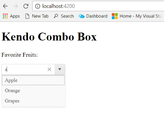
Result
References
- http://www.telerik.com/kendo-angular-ui/getting-started
- http://www.telerik.com/kendo-angular-ui/components/dropdowns/combobox/data-binding/
Laxmidhar SahooPosted Dec 19, 2017, 5:05 AM
A good naration that is given