The Grouper
The Grouper is a special groupbox control that is rounded and fully customizable. The control can paint borders, drop shadows, gradient and solid backgrounds, custom text and custom icons. The purpose of this control was to design a better looking groupbox winform control. I used the (Keep it Simple Stupid) philosophy to design a tight knitted re-useable control that i hope you all enjoy. This control is still in beta version, but it seems to be stable.
Using the code
Before you add the control, you must add a reference (CodeVendor.Controls) to your project.
using
CodeVendor.Controls;
The grouper control can be added to your project with the following code. Add this code to your class.
private CodeVendor.Controls.Grouper Grouper1;
this.Grouper1 = new CodeVendor.Controls.Grouper();
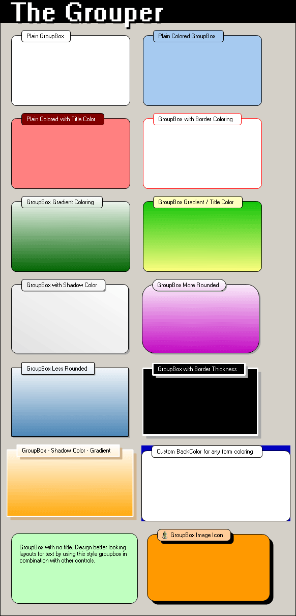
Custom Control Properties
Below is a list of grouper control properties that change the physical appearance of the control.
| Property Name |
Type |
Description |
| Control Properties |
| BackColor |
Color |
This feature will paint the background color of the control. |
| BackgroundColor |
Color |
This feature will change the group control color. This color can also be used in combination with BackgroundGradientColor for a gradient paint. |
| BackgroundGradientColor |
Color |
This feature can be used in combination with BackgroundColor to create a gradient background. |
| BackgroundGradientMode |
GroupBoxGradientMode |
This feature turns on background gradient painting. |
| BorderColor |
Color |
This feature will allow you to change the color of the control's border. |
| BorderThickness |
Float |
This feature will allow you to set the control's border size. |
| CustomGroupBoxColor |
Color |
This feature will paint the group title background to the specified color if PaintGroupBox is set to true. |
| GroupImage |
Image |
This feature can add a 16 x 16 image to the group title bar. |
| GroupTitle |
string |
This feature will add a group title to the control. |
| PaintGroupBox |
bool |
This feature will paint the group title background to the CustomGroupBoxColor. |
| RoundCorners |
int |
This feature will round the corners of the control. |
| ShadowColor |
Color |
This feature will change the control's shadow color. |
| ShadowControl |
bool |
This feature will allow you to turn on control shadowing. |
| ShadowThickness |
int |
This feature will change the size of the shadow border. |
Grouper Source Code
I started off writing this control because I was tired of the plain old windows groupbox. My winform application groupbox needed an updated XP look with round edges and gradient backgrounds. Like most developers writing controls, I thought to myself, should I custom draw the original groupbox control or reinvent the wheel and start from the ground up. I choose to reinvent the wheel. :) hehe
ReInventing the wheel gave me the power to draw the control without flicker and customize it to my preferences. Taking the time to make a control from the ground up seems long and futile, but having the satisfaction of knowing that i wrote the code and if anything breaks its because of something i wrote and not someone else's is fully worth it.
To start off designing the control, I had to figure out how the original groupbox acts as a container for other controls during design mode. Below is the code for turning any control into a design-time container control.
[Designer("System.Windows.Forms.Design.ParentControlDesigner, System.Design", typeof(IDesigner))]
This code must be added on top of your class as an attribute to your control like so.
[Designer("System.Windows.Forms.Design.ParentControlDesigner, System.Design",
typeof(IDesigner))]
public class Grouper : System.Windows.Forms.UserControl{}
Once the attribute is added your control, the control will now automatically turn into a Design-Time Control Container. WOW! Very easy and self contained, microsoft sure does think of everything. The url i found for this resource is:
http://support.microsoft.com/default.aspx?scid=kb;en-us;813450
Since that took hardly anytime at all to add such power to my control, I decided to invest more time into where the original groupbox left off, which was the design.
Painting a Control Without Flicker
If you are painting your own custom control, you should think about "What is the best way to paint without Flicker?". To paint without flicker you need a way to double buffer your drawing or graphics. Microsoft has given us this way through using Control Styles. The code below shows how to add double buffering to your control.
//Set the control styles----------------------------------
this.SetStyle(ControlStyles.DoubleBuffer, true);
this.SetStyle(ControlStyles.AllPaintingInWmPaint, true);
this.SetStyle(ControlStyles.UserPaint, true);
this.SetStyle(ControlStyles.SupportsTransparentBackColor, true);
//--------------------------------------------------------
This code should be added to your constructor method of your class. All of the styles are needed to create a non flicker control. If you want to make a custom double buffer you can create the same effect by drawing all graphics to a off screen bitmap, then drawing the bitmap to the screen all at once. This will virtually create the same effect as the code above. Also notice this style:
this
.SetStyle(ControlStyles.SupportsTransparentBackColor, true);
This style allows any control to support transparent colors. By default usercontrols cannot support transparent colors. So you must enable this to add transparency to your backcolor property.
Lets continue on with the painting of our custom painted control. To paint a user control you need to override one of two methods depending on desired effect. The two methods are OnPaint() and OnPaintBackground(). Below is the code to override these methods.
protected override void OnPaint(PaintEventArgs e)
{
base.OnPaint (e);
}
protected override void OnPaintBackground(PaintEventArgs pevent)
{
base.OnPaintBackground (pevent);
}
For the grouper we will be using the OnPaint() method. The code is below:
/// <SUMMARY>Overrides the OnPaint method to paint control.</SUMMARY>
protected override void OnPaint(PaintEventArgs e)
{
PaintBack(e.Graphics);
PaintGroupText(e.Graphics);
}
I receive the control's graphic object from the Paint Event Arguments and pass it to my two custom methods, PaintBack() and PaintGroupText().
Creating a Rounded Control
So, you want to create a rounded custom usercontrol? It is pretty simple to create a rounded control with help from gdi+ library. Lets dive into the code to find out how it works.
/// <SUMMARY>This method will paint the control.</SUMMARY>
private void PaintBack(System.Drawing.Graphics g)
{
//Set Graphics smoothing mode to Anit-Alias--
g.SmoothingMode = SmoothingMode.AntiAlias;
//-------------------------------------------
//Declare Variables------------------
int ArcWidth = this.RoundCorners * 2;
int ArcHeight = this.RoundCorners * 2;
int ArcX1 = 0;
int ArcX2 = (this.ShadowControl) ? (this.Width - (ArcWidth + 1))-this.ShadowThickness : this.Width - (ArcWidth + 1);
int ArcY1 = 10;
int ArcY2 = (this.ShadowControl) ? (this.Height - (ArcHeight + 1))-this.ShadowThickness : this.Height - (ArcHeight + 1);
System.Drawing.Drawing2D.GraphicsPath path = new System.Drawing.Drawing2D.GraphicsPath();
System.Drawing.Brush BorderBrush = new SolidBrush(this.BorderColor);
System.Drawing.Pen BorderPen = new Pen(BorderBrush, this.BorderThickness);
System.Drawing.Drawing2D.LinearGradientBrush BackgroundGradientBrush = null;
System.Drawing.Brush BackgroundBrush = new SolidBrush(this.BackgroundColor);
System.Drawing.SolidBrush ShadowBrush = null;
System.Drawing.Drawing2D.GraphicsPath ShadowPath = null;
//-----------------------------------
//Check if shadow is needed----------
if(this.ShadowControl)
{
ShadowBrush = new SolidBrush(this.ShadowColor);
ShadowPath = new System.Drawing.Drawing2D.GraphicsPath();
ShadowPath.AddArc(ArcX1+this.ShadowThickness, ArcY1+this.ShadowThickness, ArcWidth, ArcHeight, 180, GroupBoxConstants.SweepAngle); // Top Left
ShadowPath.AddArc(ArcX2+this.ShadowThickness, ArcY1+this.ShadowThickness, ArcWidth, ArcHeight, 270, GroupBoxConstants.SweepAngle); //Top Right
ShadowPath.AddArc(ArcX2+this.ShadowThickness, ArcY2+this.ShadowThickness, ArcWidth, ArcHeight, 360, GroupBoxConstants.SweepAngle); //Bottom Right
ShadowPath.AddArc(ArcX1+this.ShadowThickness, ArcY2+this.ShadowThickness, ArcWidth, ArcHeight, 90, GroupBoxConstants.SweepAngle); //Bottom Left
ShadowPath.CloseAllFigures();
//Paint Rounded Rectangle------------
g.FillPath(ShadowBrush, ShadowPath);
//-----------------------------------
}
//-----------------------------------
//Create Rounded Rectangle Path------
path.AddArc(ArcX1, ArcY1, ArcWidth, ArcHeight, 180, GroupBoxConstants.SweepAngle); // Top Left
path.AddArc(ArcX2, ArcY1, ArcWidth, ArcHeight, 270, GroupBoxConstants.SweepAngle); //Top Right
path.AddArc(ArcX2, ArcY2, ArcWidth, ArcHeight, 360, GroupBoxConstants.SweepAngle); //Bottom Right
path.AddArc(ArcX1, ArcY2, ArcWidth, ArcHeight, 90, GroupBoxConstants.SweepAngle); //Bottom Left
path.CloseAllFigures();
//-----------------------------------
//Check if Gradient Mode is enabled--
if(this.BackgroundGradientMode==GroupBoxGradientMode.None)
{
//Paint Rounded Rectangle------------
g.FillPath(BackgroundBrush, path);
//-----------------------------------
}
else
{
BackgroundGradientBrush = new LinearGradientBrush(new Rectangle(0,0,this.Width,this.Height),
this.BackgroundColor, this.BackgroundGradientColor, (LinearGradientMode)this.BackgroundGradientMode);
//Paint Rounded Rectangle------------
g.FillPath(BackgroundGradientBrush, path);
//-----------------------------------
}
//-----------------------------------
//Paint Borded-----------------------
g.DrawPath(BorderPen, path);
//-----------------------------------
//Destroy Graphic Objects------------
if(path!=null){path.Dispose();}
if(BorderBrush!=null){BorderBrush.Dispose();}
if(BorderPen!=null){BorderPen.Dispose();}
if(BackgroundGradientBrush!=null){BackgroundGradientBrush.Dispose();}
if(BackgroundBrush!=null){BackgroundBrush.Dispose();}
if(ShadowBrush!=null){ShadowBrush.Dispose();}
if(ShadowPath!=null){ShadowPath.Dispose();}
//-----------------------------------
}
The PaintBack() method above uses the GraphicsPath() method from the System.Drawing.Drawing2D class to create 4 arcs starting in the order of Top Left, Top Right, Bottom Right and Bottom Left. The arcs need to be set to TopLeft: 180, TopRight: 270, BottomRight: 360 and BottomLeft: 90 with a sweep angle of 90. The CloseAllFigures() method of the GraphicsPath, closes all of these arcs together for you, creating a rounded rectangle path. All that is left to do is to fill your path, using the FillPath() method. You can also choose from a solid brush or linear gradient brush for the background of the groupbox. To draw a border around the control, I use the DrawPath() method of the graphics library. By passing the same path to this method with a graphics pen, you can create a line border that follows the same path.
Disposing of Graphic Objects!
So many coders including myself forget to dispose() of there graphics brushes, pens, paths, colors, etc. Leaving unmanaged resources open can cause memory leaks and will eventually slow your machine down to a dead stop. Make sure you follow these common rules whenever your using the graphics library:
- Dispose of all graphic objects by calling their dispose() methods.
- Make sure to check that your graphic objects are not null before disposing of them.
- If you have common graphic objects among multiple methods, think about declaring them as class variables or constants.
- Don't rely on the garbage collector to auto collect your used graphic resources.
Control Improvements Needed
- The group title bar does not size properly to an increased font size.
- Control needs to be able to shrink to minimum height and width, without drawing over itself.
- Group title bar needs to be able to accept icons bigger than 16 x 16, and expand to the appropriate size.
- Some fonts have an issue reporting exact sizes when measured with the measurestring() method.
- Option to minimize groupbox, and a user button to minimize.
Please let me know about any improvements or features you would like to see with the 1.0 version of this control.
History
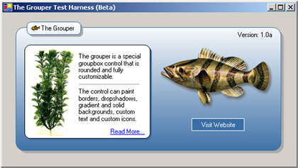
Version 1.0a Beta - December 17, 2005
ScreenShots