Introduction
This article demonstrates the Expander control in Silverlight and binding data with to control.
We have the Expander control in Silverlight to which we can add other controls like Datagrid, Chart, images etc.
as Expander Content. We can give a Header to the Expander with the help of <Expander. Header>.
Step 1: How to use Expander control in Silverlight.
<xmlns:toolkit=http://schemas.microsoft.com/winfx/2006/xaml/presentation/toolkit>
In this assembly reference we have an Expander control.
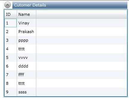
Add a Datagrid to the Expander control as its content, bind data to datagrid from service method, as below.
<Border x:Name="BorderExpender2" BorderThickness="0.5" BorderBrush="LightGray" Grid.Row="1" DataContext="">
<toolkit:Expander x:Name="Expander2" VerticalAlignment="Top" IsExpanded="True" ExpandDirection="Down" >
<toolkit:Expander.Header>
<Border BorderThickness="0" Height="20" VerticalAlignment="Top" HorizontalAlignment="Stretch" >
<Border.Background>
<LinearGradientBrush EndPoint="0.5,1" StartPoint="0.5,0">
<GradientStop Color="#FFCFDDED"/>
<GradientStop Color="#FF59789B" Offset="0.691"/>
</LinearGradientBrush>
</Border.Background>
<TextBlock x:Name="txtcus" Margin="5,0,0,0" VerticalAlignment="Center" Text="Cutomer Graph" Foreground="AliceBlue" HorizontalAlignment="Left"></TextBlock>
</Border>
</toolkit:Expander.Header>
<toolkit:Expander.Content>
<Border BorderThickness="1" BorderBrush="#0e71a3" Height="245" >
<toolkit:Chart HorizontalAlignment="Center" Name="mychart" Title="Chart Title" VerticalAlignment="Center" Width="281" Height="216">
<toolkit:BarSeries ItemsSource="{Binding}" IndependentValuePath="Name" DependentValuePath="ID"></toolkit:BarSeries>
</toolkit:Chart>
</Border>
</toolkit:Expander.Content>
</toolkit:Expander>
</Border>
It look like as following:
Step 2: Apply Style to expander control.
<Style x:Key="ExpanderStyle1" TargetType="controls:Expander">
<Setter Property="BorderThickness" Value="1"/>
<Setter Property="HorizontalContentAlignment" Value="Stretch"/>
<Setter Property="VerticalContentAlignment" Value="Stretch"/>
<Setter Property="Template">
<Setter.Value>
<ControlTemplate TargetType="controls:Expander">
<Grid Background="Transparent">
<Grid.Resources>
<LinearGradientBrush x:Key="ExpanderArrowFill" EndPoint="0,1" StartPoint="0,0">
<GradientStop Color="White" Offset="0"/>
<GradientStop Color="#FFBFBFBF" Offset="0.5"/>
<GradientStop Color="#FF878787" Offset="1"/>
</LinearGradientBrush>
<LinearGradientBrush x:Key="ExpanderArrowHoverFill" EndPoint="0,1" StartPoint="0,0">
<GradientStop Color="#FFF0F8FE" Offset="0"/>
<GradientStop Color="#FFE0F3FE" Offset="0.3"/>
<GradientStop Color="#FF6FA7C5" Offset="1"/>
</LinearGradientBrush>
<LinearGradientBrush x:Key="ExpanderArrowPressedFill" EndPoint="0,1" StartPoint="0,0">
<GradientStop Color="#FFDCF0FA" Offset="0"/>
<GradientStop Color="#FFC5E6F7" Offset="0.2"/>
<GradientStop Color="#FF5690D0" Offset="1"/>
</LinearGradientBrush>
<ControlTemplate x:Key="ExpanderDownHeaderTemplate" TargetType="ToggleButton">
<Grid>
<Grid.Background>
After applying the style to the Expander control, it looks like as follows:
Step 3: Chart and Image controls in expander control as their content.
1. Image:
<toolkit:Expander.Content>
<Border BorderThickness="1" BorderBrush="#0e71a3" Height="222" >
<Grid x:Name="FirstGrid" Width="318">
<Ellipse Fill="LightBlue" Height="211" Width="310"
VerticalAlignment="Top"
HorizontalAlignment="Left"/>
<Viewbox Width="314" HorizontalAlignment="Left" VerticalAlignment="Top" Margin="4,4,0,0" >
<Viewbox.Clip>
<EllipseGeometry RadiusX="150" RadiusY="100" Center="150,100"/>
</Viewbox.Clip>
<Image Stretch="Fill" Source="/Images/emp1image.jpg"
/>
</Viewbox>
</Grid>
</Border>
</toolkit:Expander.Content>
Output:

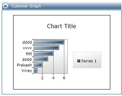
2. Chart:
<toolkit:Expander.Content>
<Border BorderThickness="1" BorderBrush="#0e71a3" Height="245" >
<toolkit:Chart HorizontalAlignment="Center" Name="mychart" Title="Chart Title" VerticalAlignment="Center" Width="281" Height="216">
<toolkit:BarSeries ItemsSource="{Binding}" IndependentValuePath="Name" DependentValuePath="CID"></toolkit:BarSeries>
</toolkit:Chart>
</Border>
</toolkit:Expander.Content>
Output:
Summary
We can add many other controls to the Expander control as their content in Silverlight.
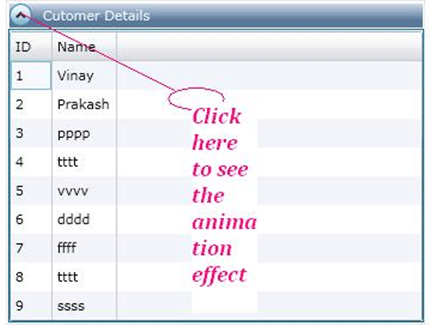
We can also give the animation effect to the Expander control.