Introduction
This is a Custom Control that I have created, this is my first control. What this control will do? I guess this is very simple; it will just change the Month name on button up or down.
In our Sample Application we will just demonstrate how to use it.
Create a Silverlight Project
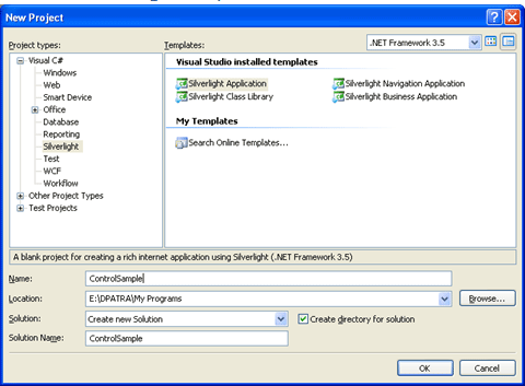
Figure 1.1 Creating Silverlight Project
Designing the Application
Here is an idea; we will have two buttons up and down, and one text box which will carry the text. I have used Blend 3 to design this. First I have created a path (using the Pen Tool) a triangle and made a copy of it so that I can use it for its reverse side.
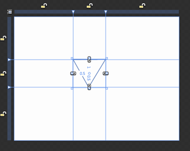
Figure 1.2 Creating Triangle using Pen Tool
Then I Converted the Path into Buttons, and made two Buttons out of it; Up Button and Down Button. They will look similar to the following.
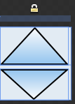
Figure 1.3 Up and Down Button
Adding a TextBox Control
Adding a text box is not that tough but I have made some changes to look familiar with the control. The following xaml code for the whole design will help you.
<UserControl
xmlns="http://schemas.microsoft.com/winfx/2006/xaml/presentation"
xmlns:x="http://schemas.microsoft.com/winfx/2006/xaml"
xmlns:inputToolkit="clr-namespace:System.Windows.Controls;assembly=System.Windows.Controls.Input.Toolkit"
xmlns:vsm="clr-namespace:System.Windows;assembly=System.Windows" x:Class="ControlSample.MainPage"
Width="180" Height="52" Background="#FFE6EFF7">
<UserControl.Resources>
<Style x:Key="UpButton" TargetType="Button">
<Setter Property="Template">
<Setter.Value>
<ControlTemplate TargetType="Button">
<Grid>
<vsm:VisualStateManager.VisualStateGroups>
<vsm:VisualStateGroup x:Name="CommonStates">
<vsm:VisualState x:Name="MouseOver"/>
<vsm:VisualState x:Name="Normal"/>
<vsm:VisualState x:Name="Pressed"/>
<vsm:VisualState x:Name="Disabled"/>
</vsm:VisualStateGroup>
<vsm:VisualStateGroup x:Name="FocusStates">
<vsm:VisualState x:Name="Unfocused"/>
<vsm:VisualState x:Name="Focused"/>
</vsm:VisualStateGroup>
</vsm:VisualStateManager.VisualStateGroups>
<Path Stretch="Fill" Stroke="#FF000000" RenderTransformOrigin="0.5,0.5" UseLayoutRounding="False" Data="M140,106 L201,106 L170,167 z">
<Path.RenderTransform>
<TransformGroup>
<ScaleTransform/>
<SkewTransform/>
<RotateTransform Angle="180"/>
<TranslateTransform/>
</TransformGroup>
</Path.RenderTransform>
<Path.Fill>
<LinearGradientBrush EndPoint="0.5,1" StartPoint="0.5,0">
<GradientStop Color="#FF96C7F1"/>
<GradientStop Color="#FFFFFFFF" Offset="1"/>
</LinearGradientBrush>
</Path.Fill>
</Path>
</Grid>
</ControlTemplate>
</Setter.Value>
</Setter>
</Style>
<Style x:Key="DownButton" TargetType="Button">
<Setter Property="Template">
<Setter.Value>
<ControlTemplate TargetType="Button">
<Grid>
<vsm:VisualStateManager.VisualStateGroups>
<vsm:VisualStateGroup x:Name="CommonStates">
<vsm:VisualState x:Name="MouseOver"/>
<vsm:VisualState x:Name="Normal"/>
<vsm:VisualState x:Name="Pressed"/>
<vsm:VisualState x:Name="Disabled"/>
</vsm:VisualStateGroup>
<vsm:VisualStateGroup x:Name="FocusStates">
<vsm:VisualState x:Name="Unfocused"/>
<vsm:VisualState x:Name="Focused"/>
</vsm:VisualStateGroup>
</vsm:VisualStateManager.VisualStateGroups>
<Path Stretch="Fill" Stroke="#FF000000" UseLayoutRounding="False" Data="M140,106 L201,106 L170,167 z">
<Path.Fill>
<LinearGradientBrush EndPoint="0.5,1" StartPoint="0.5,0">
<GradientStop Color="#FF96C7F1"/>
<GradientStop Color="#FFFFFFFF" Offset="1"/>
</LinearGradientBrush>
</Path.Fill>
</Path>
</Grid>
</ControlTemplate>
</Setter.Value>
</Setter>
</Style>
</UserControl.Resources>
<Grid x:Name="LayoutRoot" Background="#FFE4EDF5" VerticalAlignment="Top" Height="52" Width="180" HorizontalAlignment="Left">
<Grid.RowDefinitions>
<RowDefinition Height="27"/>
<RowDefinition Height="25"/>
</Grid.RowDefinitions>
<Grid.ColumnDefinitions>
<ColumnDefinition Width="128"/>
<ColumnDefinition Width="52"/>
</Grid.ColumnDefinitions>
<Button x:Name="btnDown" Height="22" HorizontalAlignment="Center" Style="{StaticResource DownButton}" VerticalAlignment="Bottom" Width="48" Content="Button" Click="btnDown_Click" Grid.Column="1" Grid.Row="1"/>
<Button x:Name="btnUp" HorizontalAlignment="Center" Style="{StaticResource UpButton}" Width="48" Content="Button" Click="btnUp_Click" Grid.Column="1" VerticalAlignment="Top"/>
<TextBox x:Name="txtMonth" Height="48" TextWrapping="NoWrap" HorizontalAlignment="Right" VerticalAlignment="Center" Width="Auto" FontSize="20" Text="January" Grid.RowSpan="2" IsReadOnly="True" TextAlignment="Center" BorderBrush="{x:Null}" Background="#FFD9E9F7"/>
</Grid>
</UserControl>
Logic to Display Month On Button Click
I have used the following logic:
private void btnDown_Click(object sender, RoutedEventArgs e)
{
switch (txtMonth.Text)
{
case "January":
txtMonth.Text = "December";
break;
case "February":
txtMonth.Text = "January";
break;
case "March":
txtMonth.Text = "February";
break;
case "April":
txtMonth.Text = "March";
break;
case "May":
txtMonth.Text = "April";
break;
case "Jun":
txtMonth.Text = "May";
break;
case "July":
txtMonth.Text = "Jun";
break;
case "August":
txtMonth.Text = "July";
break;
case "September":
txtMonth.Text = "August";
break;
case "October":
txtMonth.Text = "September";
break;
case "November":
txtMonth.Text = "October";
break;
case "December":
txtMonth.Text = "November";
break;
default:
break;
}
}
private void btnUp_Click(object sender, RoutedEventArgs e)
{
switch (txtMonth.Text)
{
case "January":
txtMonth.Text = "February";
break;
case "February":
txtMonth.Text = "March";
case "March":
txtMonth.Text = "April";
break;
case "April":
txtMonth.Text = "May";
break;
case "May":
txtMonth.Text = "Jun";
break;
case "Jun":
txtMonth.Text = "July";
break;
case "July":
txtMonth.Text = "August";
break;
case "August":
txtMonth.Text = "September";
break;
case "September":
txtMonth.Text = "October";
break;
case "October":
txtMonth.Text = "November";
break;
case "November":
txtMonth.Text = "December";
break;
case "December":
txtMonth.Text = "January";
break;
default:
break;
}
}
Running the Application
When you click different images you will be notified by the PopUp Control.
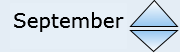
Figure 1.4 Month UpDown Control is displayed
That's it, we have successfully created a Month UpDown Control. Enjoy Coding.