

The Clip property takes a Geometry type that can be a line, rectangle, ellipse, or group geometry.
The following XAML code snippet uses an Image object to display an image.
<Image Source="Waterfall.jpg"
Width="300" Height="300">
The output looks like Figure 1.

Figure 1
The XAML code in Listing 1 sets the Image.Clip property to an EllipseGeometry and sets the RadiusX, RadiusY, and Center properties of the geometry.
<Image Source="Waterfall.jpg"
Width="300" Height="300">
<Image.Clip>
<EllipseGeometry
RadiusX="100"
RadiusY="100"
Center="200,150"/>
</Image.Clip>
</Image>
Listing 1.
The new output looks like Figure 2.

Figure 2. A clipped image
Since the Clip property is defined in the UIElement, it can be applied to any element. For example, the following code generates a rectangle looks like Figure 3.
<Rectangle Width="300" Height="200"
Stroke="Black" StrokeThickness="4"
Fill="Yellow">
<Rectangle.Clip>
<EllipseGeometry
RadiusX="150"
RadiusY="100"
Center="150,100"/>
</Rectangle.Clip>
</Rectangle>
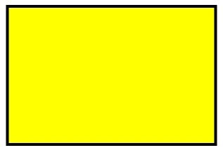
Figure 3. A rectangle
Now we can apply clipping on the rectangle and the new output looks like Figure 4 with the following code.
<Rectangle Width="300" Height="200"
Stroke="Black" StrokeThickness="4"
Fill="Yellow">
<Rectangle.Clip>
<EllipseGeometry
RadiusX="150"
RadiusY="100"
Center="150,100"/>
</Rectangle.Clip>
</Rectangle>
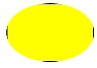
Figure 4. A clipped rectangle
HarshitPosted Nov 10, 2010, 3:30 AM
what if i want to rotate my tool and then crop the image?? what is the possiblity in .net [email protected]