Label Control in Silverlight
This article demonstrates how to create and use a Label control in Silverlight using XAML and C#.
Note: The Label control is not a part of Silverlight 2 rather it is a part of Silverlight Toolkit. This article is written by using the Silverlight Toolkit November 2008 that you can download from here: Silverlight Toolkit - Release: Silverlight Toolkit November 2008. This control may be a part of Silverlight in near future versions.
Adding Silverlight Toolkit Reference
Before you can use a Label control, you must download the Silverlight Toolkit. After that you need to add a reference to an assembly.
To add a reference, right click the References folder of your project in Solution Explorer and select Add Reference. This action will open the Add Reference dialog as you can in the following Figure 1. On this dialog, select Browse option and browse the Microsoft.Windows.Controls.dll assembly from the folder where you installed the Silverlight Toolkit. This assembly resides in the Binaries folder.

Figure 1
Once you add the reference, you will see the Microsoft.Windows.Controls added to your References dialog as you see in Figure 2.

Figure 2
Now, the next step is to import the Microsoft.Windows.Controls namespace to the page. Once you type xmlns= in your page, you will see Microsoft.Windows.Controls listing in Intellisense. Select it as shown in Figure 3.
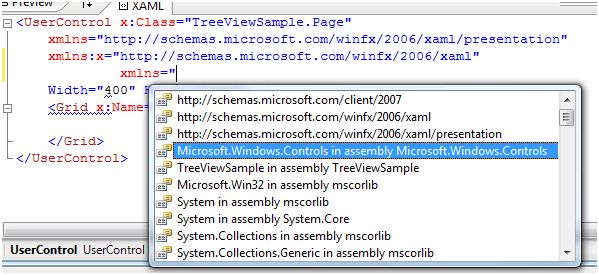
Figure 3
The final reference added to the page looks like following. As you can see here, I added name of this reference to ToolkitRef.
xmlns:ToolkitRef="clr-namespace:Microsoft.Windows.Controls;assembly=Microsoft.Windows.Controls"
Now you will see ToolkitRef in your page and once you select it, you will notice Label added to the Intellisense. To add the Label control to your page, just select it as you can see in Figure 4.
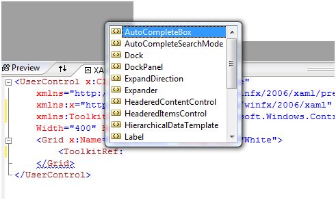
Figure 4
Creating a Label
The Label element represents a Silverlight Label control in XAML.
< ToolkitRef:Label />
The Width and Height attributes of the Label element represent the width and the height of a Label. The Content property of the Label element sets the text of a Label. The x:Name attribute represents the name of the control, which is a unique identifier of a control.
The code snippet in Listing 1 creates a Label control and sets the name, height, width, and content of a Label control. The code also sets the font format for the text.
<ToolkitRef:Label x:Name="Label1"
Content="Hello! I am Label Control"
Width="200" Height="40"
Canvas.Left="10" Canvas.Top="10"
FontSize="14" FontFamily="Georgia"
FontWeight="Bold"/>
Listing 1
The output looks like Figure 5.
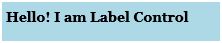
Figure 5
The Background and Foreground properties set the background and foreground colors of the Label control. The code snippet in Listing 2 sets the background, foreground, and alignment of a Label control.
<ToolkitRef:Label x:Name="Label1"
Content="Hello! I am Label Control"
Width="200" Height="30"
Canvas.Left="10" Canvas.Top="10"
FontSize="14" FontFamily="Georgia"
FontWeight="Bold"
Background="Black"
Foreground="Orange"
VerticalAlignment="Center"
HorizontalAlignment="Center"
/>
Listing 2
The new output looks like Figure 6.

Figure 6
Adding Contents to a Label Control
The Content property of the Label control allows you to set any other controls as the content of a Label control. The code snippet in Listing 3 adds some ellipse controls to a Label control.
<ToolkitRef:Label Canvas.Left="10" Canvas.Top="50">
<StackPanel Orientation="Horizontal">
<Ellipse Width="100" Height="100" Fill="Red" />
<Ellipse Width="80" Height="80" Fill="Orange" />
<Ellipse Width="60" Height="60" Fill="Yellow" />
<Ellipse Width="40" Height="40" Fill="Green" />
<Ellipse Width="20" Height="20" Fill="Blue" />
<Ellipse Width="15" Height="15" Fill="Indigo" />
<Ellipse Width="10" Height="10" Fill="Violet" />
</StackPanel>
</ToolkitRef:Label>
Listing 3
Listing 3 generates an output that looks like Figure 7.
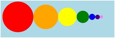
Figure 7
Formatting a Label
The BorderBrush property of the Label sets a brush to draw the border of a Label. You may use any brush to fill the border. The following code snippet uses a linear gradient brush to draw the border with a combination of red and blue color.
<ToolkitRef:Label.BorderBrush>
<LinearGradientBrush StartPoint="0,0" EndPoint="1,1" >
<GradientStop Color="Blue" Offset="0" />
<GradientStop Color="Red" Offset="1.0" />
</LinearGradientBrush>
</ToolkitRef:Label.BorderBrush>
The Background and Foreground properties of the Label set the background and foreground colors of a Label. You may use any brush to fill the border. The following code snippet uses linear gradient brushes to draw the background and foreground of a Label.
<ToolkitRef:Label.Background>
<LinearGradientBrush StartPoint="0,0" EndPoint="1,1" >
<GradientStop Color="Blue" Offset="0.1" />
<GradientStop Color="Orange" Offset="0.25" />
<GradientStop Color="Green" Offset="0.75" />
<GradientStop Color="Black" Offset="1.0" />
</LinearGradientBrush>
</ToolkitRef:Label.Background>
<ToolkitRef:Label.Foreground>
<LinearGradientBrush StartPoint="0,0" EndPoint="1,1" >
<GradientStop Color="Orange" Offset="0.25" />
<GradientStop Color="Green" Offset="1.0" />
</LinearGradientBrush>
</ToolkitRef:Label.Foreground>
The new Label looks like Figure 8.

Figure 8
Setting Image as Background of a Label
To set an image as background of a Label, we can set an image as the Background of the Label. The following code snippet sets the background of a Label to an image.
<ToolkitRef:Label.Background>
<ImageBrush ImageSource="Garden.jpg" />
</ToolkitRef:Label.Background>
The new output looks like Figure 9.
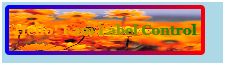
Figure 9
Summary
In this article, I discussed how we can create a Label control in Silverlight and C#. We also saw how we can format a Label by setting its border, background, and foreground properties. After that, we saw you to set an image as the background of a Label.