The items in a ResourceDictionary are not immediately processed when application code is loaded by a XAML loader. Instead, the ResourceDictionary persists as an object, and the individual values are processed only when they are specifically requested.
The ResourceDictionary class is not derived from DictionaryBase. Instead, the ResourceDictionary class implements IDictionary but relies on a Hashtable internally.
In Extensible Application Markup Language (XAML), the ResourceDictionary class is typically an implicit collection element that is the object element value of several Resources properties, when given in property element syntax. For details on implicit collections in XAML, see XAML Syntax Terminology. An exception is when you want to specify a merged dictionary; for details, see Merged Resource Dictionaries.
Another possible XAML usage is to declare a resource dictionary as a discrete XAML file, and either load it at run time with Load or include it in a (full-trust) project as a resource or loose file. In this case, ResourceDictionary can be declared as an object element, serving as the root element of the XAML. You must map the appropriate XML namespace values (default for the WPF namespace and typically x: for the XAML namespace) onto the Resource Dictionary element if you plan to use it as the root element. Then you can add child elements that define the resources, each with an x:Key value.
Getting Started:
First of all make a new WPF Application and add a new ResourceDictionary file. I am putting my ResourceDictionary File in the Themes directory. Like figure1.
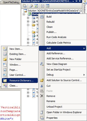
Figure1.
Here is my ResourceDictionary file XML code:
<ResourceDictionary xmlns="http://schemas.microsoft.com/winfx/2006/xaml/presentation"
xmlns:col="clr-namespace:System.Collections;assembly=mscorlib"
xmlns:x="http://schemas.microsoft.com/winfx/2006/xaml">
<!--This is for gradient button style-->
<ControlTemplate x:Key="buttonTemplate" TargetType="{x:Type Button}">
<Grid>
<Ellipse x:Name="outerCircle">
<Ellipse.Fill>
<LinearGradientBrush StartPoint="0,0" EndPoint="0,1">
<GradientStop Offset="0" Color="Blue" />
<GradientStop Offset="1" Color="Red" />
</LinearGradientBrush>
</Ellipse.Fill>
</Ellipse>
<Ellipse x:Name="innerCircle" RenderTransformOrigin=".5,.5">
<Ellipse.RenderTransform>
<ScaleTransform ScaleX=".8" ScaleY=".8" />
</Ellipse.RenderTransform>
<Ellipse.Fill>
<LinearGradientBrush StartPoint="0,0" EndPoint="0,1">
<GradientStop Offset="0" Color="Red" />
<GradientStop Offset="1" Color="Blue" />
</LinearGradientBrush>
</Ellipse.Fill>
</Ellipse>
<Viewbox>
<ContentPresenter Margin="{TemplateBinding Padding}" />
</Viewbox>
</Grid>
<ControlTemplate.Triggers>
<Trigger Property="IsMouseOver" Value="True">
<Setter TargetName="outerCircle" Property="Fill" Value="Orange" />
</Trigger>
<Trigger Property="IsPressed" Value="True">
<Setter Property="RenderTransform" >
<Setter.Value>
<ScaleTransform ScaleX=".9" ScaleY=".9" />
</Setter.Value>
</Setter>
<Setter Property="RenderTransformOrigin" Value=".5,.5"/>
</Trigger>
</ControlTemplate.Triggers>
</ControlTemplate>
<!--This style used for normal button style-->
<Style x:Key="buttonStyle" TargetType="{x:Type Button}">
<Setter Property="Foreground" Value="White" />
<Setter Property="Background" Value="Green" />
<Setter Property="FontSize" Value="14" />
</Style>
<!--This style used for combo box collection style and list items-->
<CollectionViewSource x:Key="myCol">
<CollectionViewSource.Source>
<col:ArrayList>
<ListBoxItem>Raj Beniwal</ListBoxItem>
<ListBoxItem>Vikash Nanda</ListBoxItem>
<ListBoxItem>Amit Mishra</ListBoxItem>
<ListBoxItem>Ketan Puri</ListBoxItem>
</col:ArrayList>
</CollectionViewSource.Source>
</CollectionViewSource>
<!--This style used for tab item styles-->
<Style x:Key="tabItemStyle" TargetType="{x:Type TabItem}">
<Setter Property="BorderBrush" Value="Blue" />
<Setter Property="Background" Value="LightPink" />
<Setter Property="FontSize" Value="14" />
<Setter Property="Foreground" Value="IndianRed" />
</Style>
</ResourceDictionary>
You can initialise the path of Resource Dictionary in App.xaml file.
<Application x:Class="DataGridWithADONETEntityDataModel.App"
xmlns="http://schemas.microsoft.com/winfx/2006/xaml/presentation"
xmlns:x="http://schemas.microsoft.com/winfx/2006/xaml"
StartupUri="ResourceDictionary.xaml">
<Application.Resources>
<ResourceDictionary>
<ResourceDictionary.MergedDictionaries>
<ResourceDictionary Source="Themes/Dictionary1.xaml" />
</ResourceDictionary.MergedDictionaries>
</ResourceDictionary>
</Application.Resources>
</Application>
Here is my .xaml code.
<Window x:Class="DataGridWithADONETEntityDataModel.ResourceDictionary"
xmlns="http://schemas.microsoft.com/winfx/2006/xaml/presentation"
xmlns:x="http://schemas.microsoft.com/winfx/2006/xaml"
xmlns:res="clr-namespace:DataGridWithADONETEntityDataModel"
xmlns:col="clr-namespace:System.Collections;assembly=mscorlib"
Title="ResourceDictionary" Height="500" Width="500">
<Grid>
<ComboBox ItemsSource="{Binding Source={StaticResource myCol}}" Height="20" Margin="12,12,66,0" VerticalAlignment="Top"></ComboBox>
<Button Margin="12,51,0,0" Height="40" Width="200" Name="button1" Template="{StaticResource buttonTemplate}" HorizontalAlignment="Left" VerticalAlignment="Top">Click Me!</Button>
<Button Margin="227,51,51,0" Name="button2" Style="{StaticResource buttonStyle}" Height="23" VerticalAlignment="Top">Click Me!</Button>
<TabControl Height="295" Margin="12,145,30,22" Name="tabControl1" Width="436" Background="NavajoWhite">
<TabItem Header="About Me" Name="tabItem1" Style="{StaticResource tabItemStyle}">
<Grid>
<TextBlock TextWrapping="Wrap">Rajkumar is working as a senior software engineer has over 6 years experience working on ASP.NET, VB.NET, C#, AJAX and other latest technologies. He holds Master's degree in Computer Science. currently enjoying working on WPF, WCF, Silverlight, MVC, XAML.</TextBlock>
</Grid>
</TabItem>
<TabItem Header="Contact Me" Name="tabItem2" Style="{StaticResource tabItemStyle}">
<Grid>
<TextBlock TextWrapping="Wrap">I can be reached on at raj2511984 at yahoo.com OR [email protected]</TextBlock>
</Grid>
</TabItem>
<TabItem Header="Fav Pictures" Name="tabItem3" Style="{StaticResource tabItemStyle}">
<Grid>
<Image Source="Neha-Dhupia-20091231-001.jpg" Margin="0,0,200,0"></Image>
<Image Source="Neha-Dhupia-20091231-003.jpg" Margin="180,0,0,0"></Image>
</Grid>
</TabItem>
<TabItem Header="My Hobbies" Name="tabItem4" Style="{StaticResource tabItemStyle}">
<Grid>
<TextBlock TextWrapping="Wrap">MY PASSION'S MUSIC TRANSCENDS BETWEEN HEIGHTS OF HEAVEN AND DEPTHS OF HELL! ONE MINUTE YOU'RE AT THE GREATEST PARTY ON EARTH AND YOUR WORLD IS FILLED WITH JOY, THE NEXT YOURE PLUNGED INTO A DARK DIRTY SCENE FROM A TIM BURTON FILM AND A NIGHTMARE THAT YOU DON'T WANT TO END! IT'S TIME TO START LIVING.</TextBlock>
</Grid>
</TabItem>
</TabControl>
</Grid>
</Window>
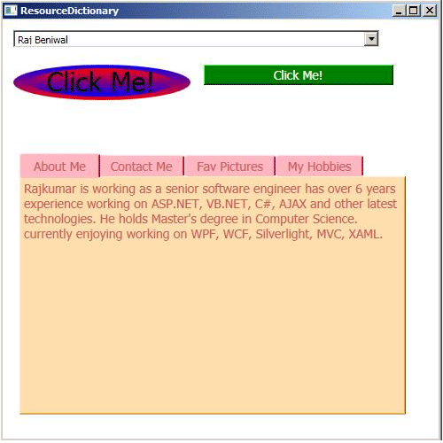
Now execute the application.