

Introduction
I have started an article series on Bootstrap. Read the first part here,
Bootstrap For Beginners - Part One
In this article, we will learn about Containers and then we will understand Bootstrap Container classes by creating examples. So by using this, we can easily create interactive, responsive website layouts.
Containers. In Bootstrap we can contain elements to wrap site contents.
There are two Bootstrap Container classes.
- The .container class is used to provide a responsive fixed-width container.
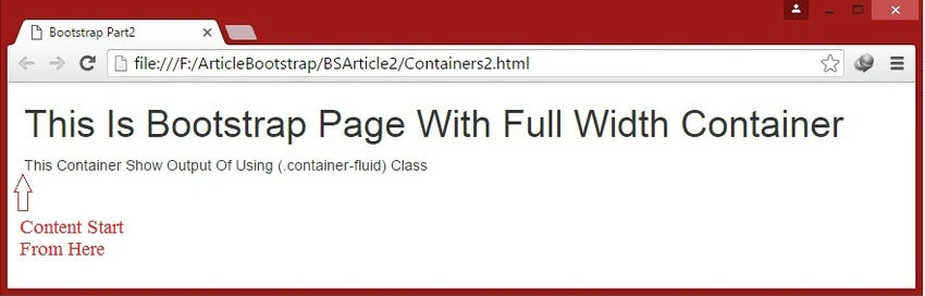
- The .container-fluid class is used to provide a full-width container.
We have to note that we cannot put a container inside another container since it is not nestable.
Example 1. Using .container class(responsive fixed width container).
In this example, we will create a simple Bootstrap page. Using the ".container" class we will create a fixed-width container that is responsive for different devices. In this, we will write some text. We will have some space on the left and right side of the page by writing the following code.
<!DOCTYPE html>

<html lang="en">
<head>
    <meta charset="utf-8">
    <title>Bootstrap Part2</title>
    <meta name="viewport" content="width=device-width, initial-scale=1">
    <link rel="stylesheet" type="text/css" href="css/bootstrap.min.css">
</head>
<body>
    <div class="container">
        <h1>This Is Bootstrap Page With Responsive Fixed Width Container</h1>
        <p>This Container Show Output Of Using (.container) Class</p>
    </div>
    <script src="js/jquery-2.1.4.min.js"></script>
    <script src="js/bootstrap.min.js"></script>
</body>
</html>
Output
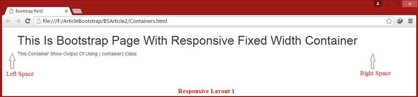
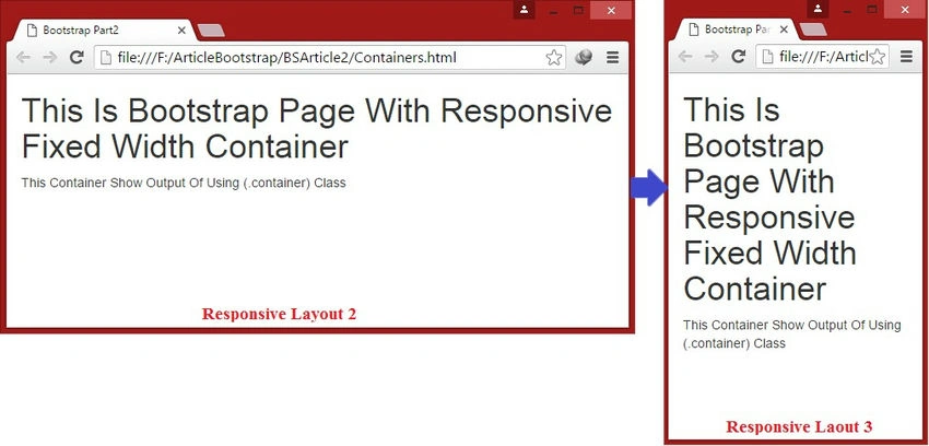
container and container-fluid class.

Example 2. Using .container-fluid class (full-width container).
In this example, we will create the same simple Bootstrap page as Example 1. Using the ".container-fluid" class we will create a full-width container. In this, we will write some text. Now we will create a page by writing the following code.
<!DOCTYPE html>
<html lang="en">
<head>
    <meta charset="utf-8">
    <title>Bootstrap Part2</title>
    <meta name="viewport" content="width=device-width, initial-scale=1">
    <link rel="stylesheet" type="text/css" href="css/bootstrap.min.css">
</head>
<body>
    <div class="container-fluid">
        <h1>This Is Bootstrap Page With Full Width Container</h1>
        <p>This Container Show Output Of Using (.container-fluid) Class</p>
    </div>
    <script src="js/jquery-2.1.4.min.js"></script>
    <script src="js/bootstrap.min.js"></script>
</body>
</html>
Output
In this article, we focused on Bootstrap Containers. In upcoming articles, we will understand all the components of Bootstrap step by step.
Read more articles on Bootstrap.
Prasanna MuraliPosted May 20, 2016, 11:18 AM
Nice one....
Sonu ChaudharyPosted May 2, 2016, 5:59 AM
Thanks for sharing
Vivek KumarPosted Apr 28, 2016, 3:01 PM
Good one
newto netPosted Apr 18, 2016, 10:34 AM
Your first part tutorial is missing.
Humayun Kabir MamunPosted Apr 11, 2016, 12:33 AM
Nice...
Amit Kumar SinghPosted Apr 9, 2016, 3:42 PM
Nice one
Kuppurasu NagarajPosted Apr 9, 2016, 10:25 AM
Nice article..
Gowtham RajamanickamPosted Apr 8, 2016, 8:53 AM
nice share
Gowtham KPosted Apr 6, 2016, 1:18 PM
Nice Share
Vignesh ManiPosted Apr 6, 2016, 12:35 PM
Good one
Mohammed IbrahimPosted Apr 6, 2016, 12:13 PM
nice
Debasis SahaPosted Apr 6, 2016, 10:07 AM
Good One..
Rahul Kumar SaxenaPosted Apr 6, 2016, 9:58 AM
Good One Shaili Dashora