Introduction
In part II of this article series we have seen to put Next and Previous Buttons and animations related to it. In this article we will see about the Window Transperency and FullScreen View.
To make a Window fullscreen we need a basic property and that is WindowState, we need to set it to Maximized.

Now to make the Window Transparent we need the Property AllowTransperency. We need to set it to True.

If we don't have any Background Color then the whole screen will be Transparent and you wouldn't know whether your application is running or not. It's preferred that we should have a Backgrond with required Opacity. Then AllowTransperency property would give you a better effect.
Such as I have used:

Now we would have a close button to come out of the page, otherwise there is no way we can get back to our main application.
In AllowTransperency as True mode the Titlebar as well as the Control Box is hidden and the window is treated as TopMost window.
So let's put a Button on the right top, where usual close Button resides.
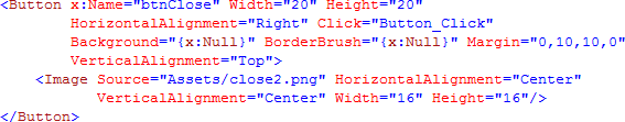
The Button will look like as follows:

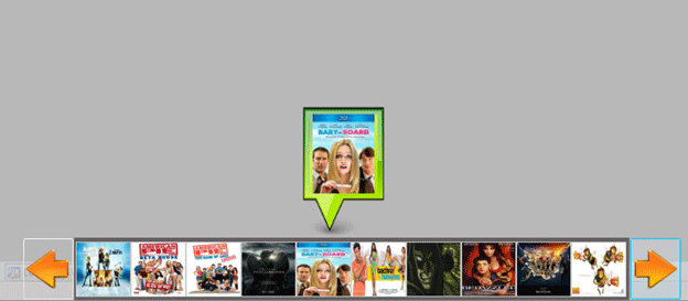
Now we will have the preview for the Image that we mouse hover in the ListBox.
Initailly I was using another Image to display it, but I thought if we have a Tooltip Property then why am I using another Image for Preview.
So I customized the ToolTip.
A Tooltip comes with the following basic properties enabled by default.
- BorderBrush
- Background
- Effect
The effect is always DropShadow.
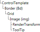
Now designing a Custom Tooltip. It's normal design as other control but here's the trick. Design the panel in any other pages such as it's Width and Height Property could be easily be designed.
The following outline is for the Hierarchical structure of the Tooltip.
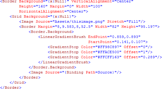
Now in XAML it looks like the following:
Now we will put it inside the Image as Tooltip.
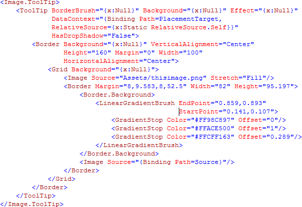
As discussed previously I have used the following properties as Null to make the Tooltip.

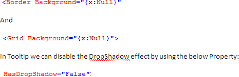
And
In Tooltip we can disable the DropShadow effect by using the below Property:
We need to have our Tooltip Placed on top of the Image we mouse hover, so that it would look like we are previewing it.
We have use the following property of ToolTip in Image itself.

Remember that we have to use it in Image Control which is having the Tooltip.
In next part we will see how we can loop through the Image Collection.