Introduction
In this article we will do some customization on Slider Control available in Silverlight 3. In my previous article Creating Button Control Template, we have done similar stuff but here we will see some more.
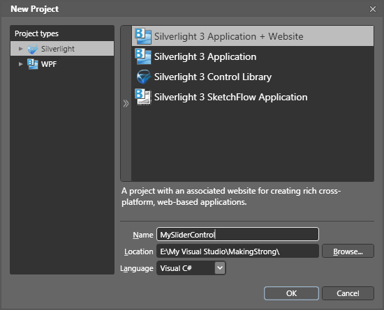
Creating Silverlight 3 Application
Open up Blend 3 and create a Silverlight 3 Application.
1) Drag and drop a Slider Control into the designer surface.
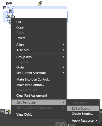
2) Right click on your Slider and select "Edit Template" and then select "Edit a Copy".
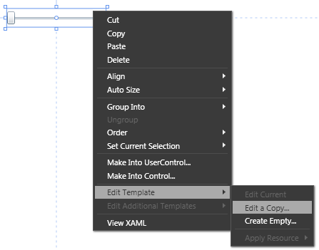
3) When a dialog box pops up asking to give a name to this style, give MySliderStyle.
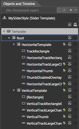
If you look at the ControlTemplate for slider, you will see there are two main Grids within the template: "HorizontalTemplate" and "VerticalTemplate". These grids encapsulate the default look for the slider when it is on the respective Orientation. Now we will focus on customizing the Horizontal Template only.
HorizontalTemplate has
- Two RepeatButton controls,
- A Rectangle (as the track) and
- A Thumb.
If you are in design view, you can see them in the Objects and Timeline view like this:
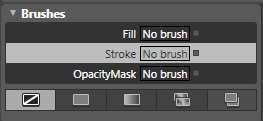
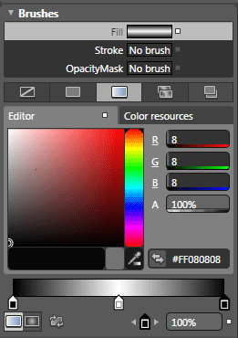
4) Modify the [TrackRectangle] element so that its Stroke and Fill are transparent, you do it in Blend by right clicking on the brush editor and selecting "Reset".
5) Now, disable the RepeatButtons so that they do not interfere with our overlapping sliders.
6) Select both Repeat Buttons (HorizontalTrackLargeChangeDecreaseRepeatButton and HorizontalTrackLargeChangeIncreaseRepeatButton) and uncheck the IsHitTestVisible checkbox from the common properties.
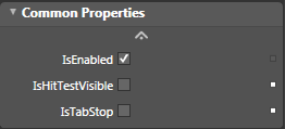
You are turning IsHitTestVisible to false as opposed to say setting the Visibility to collapsed because Visibility affects layout and Slider is stretching/shrinking the button to alter the position the of the Thumb.
Now we will customize the template for the Thumb in the slider.
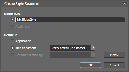
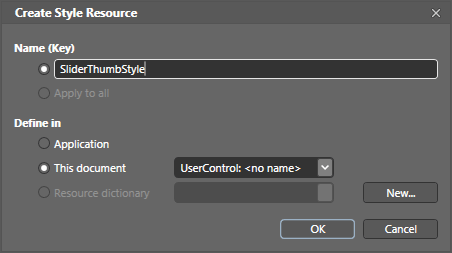
7) Select the HorizontalThumb in the HorizontalTemplate and "Edit the Template" and "Edit a copy".
8) When prompted for name and location, enter "SliderThumbStyle" as the name and the scope for definition is within this document.

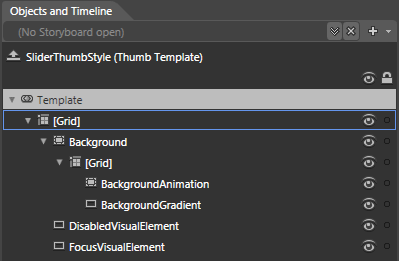
Notice how the Template for thumb has a lot of elements: ThumbOurterBorderFill, ThumbOuterRoundBorder, etc. In our case we want a completely different/new look & feel so we can delete all these.
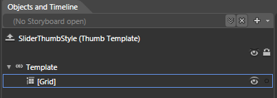
9) Grab the Pen tool in Blend and draw the shape for your thumb. Make sure you have the [Grid] element selected when you grab the Pen, as you will be drawing in the grid. Get creative (feel free to do a triangle, a star, whatever you want).
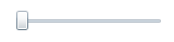
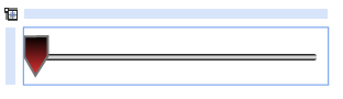
The default thumb looks like this:

Those are all the changes need to customize the Slider & Thumb. Let's now see if it works.
Though you wrote no code, you have redefined the look of thumb and drastically altered the look and behavior of the slider.
10) Now we will change the TrackRectangle. Select TrackRectangle from the Object and Timeline Pane and change the fill property so that it will look like the following.
Now press F5 and see your control in the browser. Looks like you have successfully created your own Slider Control Template.
We will design some other control next time. Enjoy Animating.
Here is the XAML code for your reference.
<UserControl
xmlns="http://schemas.microsoft.com/winfx/2006/xaml/presentation"
xmlns:x="http://schemas.microsoft.com/winfx/2006/xaml"
x:Class="MySliderControl.MainPage"
Width="640" Height="480">
<UserControl.Resources>
<Style x:Key="SliderThumbStyle" TargetType="Thumb">
<Setter Property="Background" Value="#FF1F3B53"/>
<Setter Property="BorderThickness" Value="1"/>
<Setter Property="IsTabStop" Value="False"/>
<Setter Property="BorderBrush">
<Setter.Value>
<LinearGradientBrush EndPoint="0.5,1" StartPoint="0.5,0">
<GradientStop Color="#FFA3AEB9" Offset="0"/>
<GradientStop Color="#FF8399A9" Offset="0.375"/>
<GradientStop Color="#FF718597" Offset="0.375"/>
<GradientStop Color="#FF617584" Offset="1"/>
</LinearGradientBrush>
</Setter.Value>
</Setter>
<Setter Property="Template">
<Setter.Value>
<ControlTemplate TargetType="Thumb">
<Grid>
<VisualStateManager.VisualStateGroups>
<VisualStateGroup x:Name="CommonStates">
<VisualState x:Name="Normal"/>
<VisualState x:Name="MouseOver"/>
<VisualState x:Name="Pressed"/>
<VisualState x:Name="Disabled"/>
</VisualStateGroup>
<VisualStateGroup x:Name="FocusStates">
<VisualState x:Name="Focused"/>
<VisualState x:Name="Unfocused"/>
</VisualStateGroup>
</VisualStateManager.VisualStateGroups>
<Path Stretch="Fill" Stroke="#FF737373" StrokeThickness="1" Margin="-0.375,-0.5,-0.25,-0.375" UseLayoutRounding="False" Data="M0.125,0.125 L0.125,9.25 L5.125,17.875 L10.75,9 L10.75,0 z">
<Path.Fill>
<LinearGradientBrush EndPoint="0.5,1" StartPoint="0.5,0">
<GradientStop Color="Black" Offset="0"/>
<GradientStop Color="#FFE93333" Offset="1"/>
</LinearGradientBrush>
</Path.Fill>
</Path>
</Grid>
</ControlTemplate>
</Setter.Value>
</Setter>
</Style>
<Style x:Key="MySliderStyle" TargetType="Slider">
<Setter Property="BorderThickness" Value="1"/>
<Setter Property="Maximum" Value="10"/>
<Setter Property="Minimum" Value="0"/>
<Setter Property="Value" Value="0"/>
<Setter Property="BorderBrush">
<Setter.Value>
<LinearGradientBrush EndPoint="0.5,1" StartPoint="0.5,0">
<GradientStop Color="#FFA3AEB9" Offset="0"/>
<GradientStop Color="#FF8399A9" Offset="0.375"/>
<GradientStop Color="#FF718597" Offset="0.375"/>
<GradientStop Color="#FF617584" Offset="1"/>
</LinearGradientBrush>
</Setter.Value>
</Setter>
<Setter Property="IsTabStop" Value="False"/>
<Setter Property="Template">
<Setter.Value>
<ControlTemplate TargetType="Slider">
<Grid x:Name="Root">
<Grid.Resources>
<ControlTemplate x:Key="RepeatButtonTemplate">
<Grid x:Name="Root" Opacity="0" Background="Transparent"/>
</ControlTemplate>
</Grid.Resources>
<VisualStateManager.VisualStateGroups>
<VisualStateGroup x:Name="CommonStates">
<VisualState x:Name="Normal"/>
<VisualState x:Name="MouseOver"/>
<VisualState x:Name="Disabled">
<Storyboard>
<ObjectAnimationUsingKeyFrames Duration="0" Storyboard.TargetName="HorizontalTrackRectangleDisabledOverlay"
Storyboard.TargetProperty="Visibility">
<DiscreteObjectKeyFrame KeyTime="0">
<DiscreteObjectKeyFrame.Value>
<Visibility>Visible</Visibility>
</DiscreteObjectKeyFrame.Value>
</DiscreteObjectKeyFrame>
</ObjectAnimationUsingKeyFrames>
<ObjectAnimationUsingKeyFrames Duration="0" Storyboard.TargetName="ThumbDisabledOverlay"
Storyboard.TargetProperty="Visibility">
<DiscreteObjectKeyFrame KeyTime="0">
<DiscreteObjectKeyFrame.Value>
<Visibility>Visible</Visibility>
</DiscreteObjectKeyFrame.Value>
</DiscreteObjectKeyFrame>
</ObjectAnimationUsingKeyFrames>
<ObjectAnimationUsingKeyFrames Duration="0" Storyboard.TargetName="VerticalTrackRectangleDisabledOverlay"
Storyboard.TargetProperty="Visibility">
<DiscreteObjectKeyFrame KeyTime="0">
<DiscreteObjectKeyFrame.Value>
<Visibility>Visible</Visibility>
</DiscreteObjectKeyFrame.Value>
</DiscreteObjectKeyFrame>
</ObjectAnimationUsingKeyFrames>
</Storyboard>
</VisualState>
</VisualStateGroup>
</VisualStateManager.VisualStateGroups>
<Grid x:Name="HorizontalTemplate" Background="{TemplateBinding Background}">
<Grid.ColumnDefinitions>
<ColumnDefinition Width="Auto"/>
<ColumnDefinition Width="Auto"/>
<ColumnDefinition Width="*"/>
</Grid.ColumnDefinitions>
<Rectangle x:Name="TrackRectangle" StrokeThickness="{TemplateBinding BorderThickness}" RadiusX="1" RadiusY="1" Height="3"
Margin="5,0,5,0" Grid.Column="0" Grid.ColumnSpan="3">
<Rectangle.Fill>
<LinearGradientBrush EndPoint="0.5,1" StartPoint="0.5,0">
<GradientStop Color="Black" Offset="0"/>
<GradientStop Color="White" Offset="0.5"/>
<GradientStop Color="#FF080808" Offset="1"/>
</LinearGradientBrush>
</Rectangle.Fill>
</Rectangle>
<Rectangle x:Name="HorizontalTrackRectangleDisabledOverlay" Fill="White" RadiusX="1" RadiusY="1" Height="3" Margin="5,0,5,0"
Opacity=".55" Visibility="Collapsed" Grid.Column="0" Grid.ColumnSpan="3"/>
<RepeatButton x:Name="HorizontalTrackLargeChangeDecreaseRepeatButton" Height="18" IsHitTestVisible="False"
IsTabStop="False" Template="{StaticResource RepeatButtonTemplate}" Grid.Column="0"/>
<Thumb x:Name="HorizontalThumb" Height="18" Style="{StaticResource SliderThumbStyle}" Width="11" IsTabStop="True"
Grid.Column="1"/>
<Rectangle x:Name="ThumbDisabledOverlay" Fill="White" RadiusX="2" RadiusY="2" Width="11" Opacity=".55" Visibility="Collapsed"
Grid.Column="1"/>
<RepeatButton x:Name="HorizontalTrackLargeChangeIncreaseRepeatButton" Height="18" IsHitTestVisible="False" IsTabStop="False"
Template="{StaticResource RepeatButtonTemplate}" Grid.Column="2"/>
</Grid>
<Grid x:Name="VerticalTemplate" Visibility="Collapsed" Background="{TemplateBinding Background}">
<Grid.RowDefinitions>
<RowDefinition Height="*"/>
<RowDefinition Height="Auto"/>
<RowDefinition Height="Auto"/>
</Grid.RowDefinitions>
<Rectangle Fill="#FFE6EFF7" Stroke="#FFA3AEB9" StrokeThickness="{TemplateBinding BorderThickness}" RadiusX="1" RadiusY="1"
Margin="0,5,0,5" Width="3" Grid.Row="0" Grid.RowSpan="3"/>
<Rectangle x:Name="VerticalTrackRectangleDisabledOverlay" Fill="White" RadiusX="1" RadiusY="1" Margin="0,5,0,5" Width="3"
Opacity=".55" Visibility="Collapsed" Grid.Row="0" Grid.RowSpan="3"/>
<RepeatButton x:Name="VerticalTrackLargeChangeDecreaseRepeatButton" Width="18" IsTabStop="False" Template="
{StaticResource RepeatButtonTemplate}" Grid.Row="2"/>
<Thumb x:Name="VerticalThumb" Height="11" Width="18" IsTabStop="True" Grid.Row="1"/>
<RepeatButton x:Name="VerticalTrackLargeChangeIncreaseRepeatButton" Width="18" IsTabStop="False" Template="
{StaticResource RepeatButtonTemplate}" Grid.Row="0"/>
</Grid>
</Grid>
</ControlTemplate>
</Setter.Value>
</Setter>
</Style>
</UserControl.Resources>
<Grid x:Name="LayoutRoot" Background="White">
<Slider Height="26" HorizontalAlignment="Left" Margin="71,121,0,0" VerticalAlignment="Top" Width="138" Style="{StaticResource MySliderStyle}"/>
</Grid>
</UserControl>