Slider Control
The Slider element in XAML represents a Silverlight Slider control.
<Slider></Slider>
Slider Control Properties
The Width and Height property represent the width and the height of the control. The x:Name property represents name of the control, which is a unique identifier of the control. The Background property is used to set the background color of the control. The Minimum and Maximum properties represent the minimum and maximum values of the slider range.
The code snippet in Listing 1 creates a Slider control and sets its name, height, width, background, maximum, and minimum properties. .
<Slider x:Name="mcSlider" Width="300" Height="20"
Background="Gray" Maximum="100" Minimum="0">
</Slider>
Listing 1
The code snippet in Listing 1 generates output looks like Figure 1.
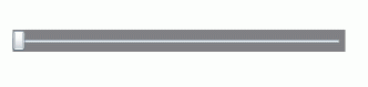
Figure 1
The IsFocused property indicates whether the slider control has focus and IsDirectionReversed property represents the direction of increasing value. By default, the slider control sits on UI in horizontal direction. By using the Orientation property, a slider control can be placed vertically.
The code snippet in Listing 2 sets the orientation of a slider control vertical.
<Slider x:Name="mcSlider" Width="300" Height="20"
Background="Gray" Maximum="100" Minimum="0">
</Slider>
Listing 1
The code snippet in Listing 2 generates output looks like Figure 2.
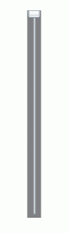
Figure 2
The Application
Now we are going to create a real world application that will use Slider controls values to create a color from three values Red, Green, and Blue respectively. From these three values, we will create a color and fill an ellipse with that color.
First we create a UI page with one circle and three slider controls that looks like Figure 3.
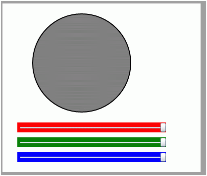
Figure 3
The code that generates Figure 3 is listed in Listing 2.
<Canvas x:Name="LayoutRoot" Background="LightGray" >
<!-- Create an Ellipse -->
<Ellipse x:Name="mcCircle" Width="200" Height="200"
Canvas.Left="60" Canvas.Top="20"
Fill="Gray" Stroke="Black" StrokeThickness="2">
</Ellipse>
<!-- Create Slider controls -->
<Slider x:Name="RedSlider" Width="300" Height="20"
Background="Red" Maximum="255" Minimum="0"
Canvas.Left="30" Canvas.Top="240"
ValueChanged="RedSlider_ValueChanged"/>
<Slider x:Name="GreenSlider" Width="300" Height="20"
Background="Green" Maximum="255" Minimum="0"
Canvas.Left="30" Canvas.Top="270"
ValueChanged="GreenSlider_ValueChanged"/>
<Slider x:Name="BlueSlider" Width="300" Height="20"
Background="Blue" Maximum="255" Minimum="0"
Canvas.Left="30" Canvas.Top="300"
ValueChanged="BlueSlider_ValueChanged"/>
</Canvas>
Listing 2
Now, on the ValueChanged event of slider controls, we write the code listed in Listing 3. In this code, we simply create a Color from the values of the slider controls and create a brush with this color and fill the circle.
private void RedSlider_ValueChanged(object sender, RoutedPropertyChangedEventArgs<double> e)
{
UpdateCircleWithColors();
}
private void GreenSlider_ValueChanged(object sender, RoutedPropertyChangedEventArgs<double> e)
{
UpdateCircleWithColors();
}
private void BlueSlider_ValueChanged(object sender, RoutedPropertyChangedEventArgs<double> e)
{
UpdateCircleWithColors();
}
private void UpdateCircleWithColors()
{
Color clr = Color.FromArgb(255, Convert.ToByte(RedSlider.Value),
Convert.ToByte(GreenSlider.Value), Convert.ToByte(BlueSlider.Value));
mcCircle.Fill = new SolidColorBrush(clr);
}
Listing 3
Now if you run the application and change slider values, you will see the fill color of circle changes accordingly. See Figure 4.
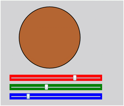
Figure 4
Summary
In this article, I discussed how to create and use a Slider control available in Silverlight 2.0. We also saw, how to create a real world application using slider controls.