Introduction
In Silverlight, it is very important to be familair with rows and columns because they are very necessary primary building blocks of Silverlight based applications. Horizontal (parallel to or in the plane of the horizon or a base line) and Vertical (right angles to the plane) can be called rows and columns. You can find a complete Silverlight article in one place here.
Ok...that's the very basics; now let's come to Silverlight Rows and Columns.
Steps to Create Rows and Columns
Follow the steps to create rows and columns:
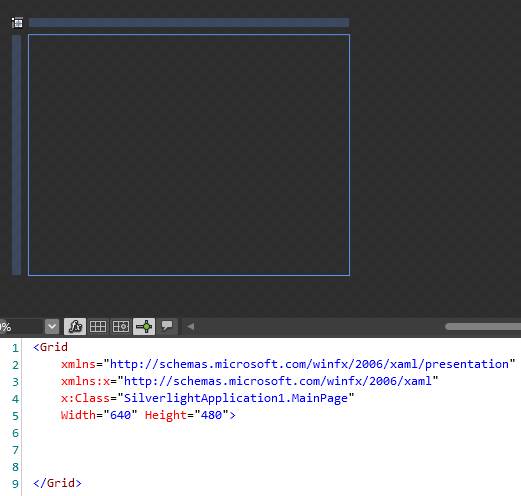
(i) Create a brand new project in Expression Blend or if you have any other project then clean its markup first (to understand it well). Here is my very first markup screenshot:
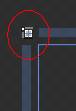
(ii) Before any further action be sure that your layout is in Grid mode (not in Canvas mode).
(iii) Now move your mouse pointer around; you should see an orange horizontal/vertical line appearing on the Grid. Clicking it creates a new row/columns in the Grid. On the same slider here, we can drag the line to resize it.
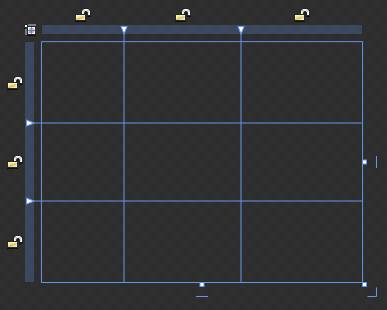
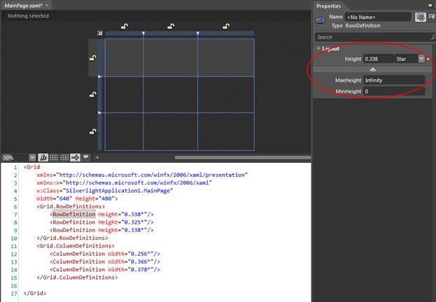
In the above screen, I have created three rows and three columns.
(iv) Now let's look at size properties available here. If you click on the  icon you will get a different mode as in here:
: Star Sized - Star means the rest size. '1' Star for a column's width means take the whole rest of the width once all the other columns have been laid out. 0.5 Star means take half of the rest of the width…, and so on. This is default type lock and it generates following markup [...Height="0.338*"/>] in xaml.
 : Pixel Sized -Pixel sized menas the size in pixel form. For example, if we write 245 then size is fixed to 245. It generates following markup [...Width="242"/>] in xaml.
 : Auto Sized - Auto sized menas not limited, in other words it's size will depend on controls inside this area. It generates the following markup [...Width="Auto" MinWidth="242"/>] in xaml.
(v) Ok, now move on to putting some controls inside them. For this, select the column or any row by using the selection tool; place the mouse next to the small lock at the Grid's first row, and click (don't click on the lock, but next to it, as shown in image below); this selects the whole row.
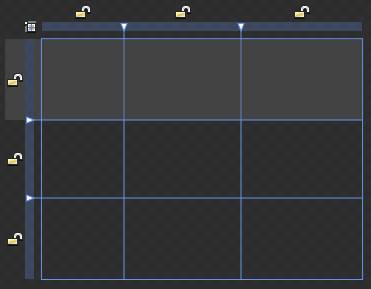
In the above screen, I've selected a row.
(vi) When we select the row/column, we can either set the height/width and other properties from xaml code or by properties window.
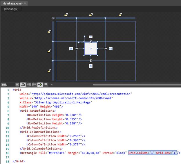
(vii) Now to draw any art in separate cell, we can draw this by selecting the rectangle/ellipse and drawing it in cell. After drawing we can move this art to any other cell as well. When we move art, generates some xaml code as [....Grid.Column="1" Grid.Row="1"/>].
So, that's all about how to work with columns and rows in silverlight.
Be tuned for the next article.
HAVE A HAPPY CODING!!