Now everyone is playing with Silverlight technology. If anybody still looking for a start, go here http://www.c-sharpcorner.com/UploadFile/jaishmathews/678/Default.aspx . This article specifically mentioned about differences among 3 root level containers using for building Silverlight controls. You can call these containers as Layout controls. You will see the differences lively by running the sample code attached along with this article.
Following are the Layout controls we are taking about
Canvas - This container supports pinpoint support for controls positioning. Whatever controls dropping inside it can be mentioned with its position. For positioning we are using properties Canvas.Left and Canvas.Top. We need to mention inside specific control that relative to the Canvas, what's the Left and Top position of that control. One important feature is that controls in same position can overlay each other. I.e. last control added will overlay 1st control, of both controls positioned in same location. These all we can utilize many ways. If you have creativity in graphics, it's all depends on you. Just look below the code inside my .XAML file, which used a Canvas as its Layout control.
<UserControl x:Class="MySilverlightApp.CanvasPage"
xmlns="http://schemas.microsoft.com/winfx/2006/xaml/presentation"
xmlns:x="http://schemas.microsoft.com/winfx/2006/xaml"
xmlns:d="http://schemas.microsoft.com/expression/blend/2008" xmlns:mc="http://schemas.openxmlformats.org/markup-compatibility/2006"
mc:Ignorable="d">
<Canvas>
<Rectangle Canvas.Left="30" Canvas.Top="30" Height="200" Width="530" Fill="Black"></Rectangle>
<TextBlock Canvas.Left="40" Canvas.Top="40" Foreground="Red" FontWeight="bold" Height="100" FontSize="50" Text="JAISH MATHEWS"></TextBlock>
<TextBlock Canvas.Left="60" Canvas.Top="60" Foreground="AliceBlue" FontWeight="bold" Height="100" FontSize="50" Text="JAISH MATHEWS"></TextBlock>
<TextBlock Canvas.Left="80" Canvas.Top="80" Foreground="Green" Height="100" FontWeight="bold" FontSize="50" Text="JAISH MATHEWS"></TextBlock>
<Button Click="Button_Click" Content="Show StackPanel" FontWeight="bold" Canvas.Left="80" Canvas.Top="150" Height="50" Width="160">
</Button>
</Canvas>
</UserControl>
You can see the properties Canvas.Left and Canvas.Top applied to a rectangle and 3 Text Blocks and a Button. I made the positioning in a manner that you people can see the overlay behavior lively. More over for the next container also I used exactly same code and you won't see any overlay behavior there. Lastly I added one event handler for Button to navigate to second Silverlight control where we used another Layout control. The code inside event handler is as below.
this.Content = new StackPage();
This code also important. If you need to navigate to a different Silverlight control from an existing one, this is a way. Here StackPage is the type class name for my 2nd Silverlight control where I used different Layout control named StackPanel. Now let run application. You will get output like below where you can see that controls are overlayed.

StackPanel - As you already seen Canvas can position the contents inside it. But this is not the scenario always. We need items to be ordered row wise or column wise automatically based on their stack order i.e. which once control is 1st written, that will be on top and remaining will be below in order. Otherwise 1st written control will be on left remaining will be added to its right side based on the order. There is a property in StackPanel named Orientation, which can set either Horizontal or Vertical. This will decide that controls want to display top to bottom or left to right. Below is the .XAML for my StackPanel Silverlight control.
<UserControl x:Class="MySilverlightApp.StackPage"
xmlns="http://schemas.microsoft.com/winfx/2006/xaml/presentation"
xmlns:x="http://schemas.microsoft.com/winfx/2006/xaml">
<StackPanel>
<Rectangle Canvas.Left="30" Canvas.Top="30" Height="150" Width="530" Fill="Black"></Rectangle>
<TextBlock Canvas.Left="40" Canvas.Top="40" Foreground="Red" FontWeight="bold" Height="100" FontSize="50" Text="JAISH MATHEWS"></TextBlock>
<TextBlock Canvas.Left="60" Canvas.Top="60" Foreground="AliceBlue" FontWeight="bold" Height="100" FontSize="50" Text="JAISH MATHEWS"></TextBlock>
<TextBlock Canvas.Left="80" Canvas.Top="80" Foreground="Green" Height="100" FontWeight="bold" FontSize="50" Text="JAISH MATHEWS"></TextBlock>
<Button Click="Button_Click" Content="Show GridPanel" FontWeight="bold" Canvas.Left="80" Canvas.Top="150" Height="50" Width="160">
</Button>
</StackPanel>
</UserControl>
You can see that I used the same controls and kept the exact positioning property of the Canvas too. Only changed the Layout control as StackPanel. Now run the application again. You will get the 1st screen with Canvas mentioned above. Click the button on the screen to navigate to StackPanel control. Below is the screen shot what you will notice.
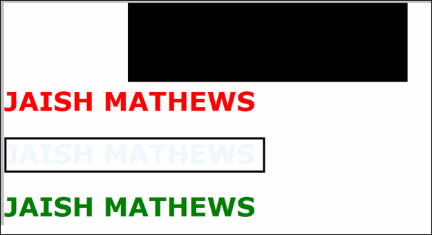
Of course, 1st noticed thing is that there is no overlay here. Even though we mentioned position properties, controls displaying top to bottom. But another interesting thing is that the second text saying "JAISH MATHEWS" [I marked with black box] looks in a different color and also difficult to read compared to our Canvas Layout [Compare with 1st screen shot]. Both places we used color as "AliceBlue". The answer is simple as in Canvas the second text is overlaid on top of black Rectangle. So that text is displaying there with a black background and looks like white. But for StackPanel, we lost this black background as no overlay is supporting. So the whole look also differed. Here you want to understand the possibilities; a graphic minded person can expose using all these.
Grid - Tabular display of information always has its own place. You can think this Layout control for displaying controls like they are inside an HTML table. Below are the steps to create a Grid Layout display
Below is my Grid Layout Silverlight control XAML code
<UserControl x:Class="MySilverlightApp.GridPage"
xmlns="http://schemas.microsoft.com/winfx/2006/xaml/presentation"
xmlns:x="http://schemas.microsoft.com/winfx/2006/xaml">
<Grid ShowGridLines="True" Width="1000" Height="200" Background="Lavender">
<Grid.RowDefinitions>
<RowDefinition Height="100"></RowDefinition>
<RowDefinition Height="100" ></RowDefinition>
</Grid.RowDefinitions>
<Grid.ColumnDefinitions>
<ColumnDefinition Width="500"></ColumnDefinition>
<ColumnDefinition Width="500"></ColumnDefinition>
</Grid.ColumnDefinitions>
<TextBlock Text="This is my 1st column in side 1st row" Foreground="Red" FontWeight="bold" FontSize="20" Grid.Column="0" Grid.Row="0">
<TextBlock.Effect>
<DropShadowEffect ShadowDepth="15" Color="Blue"></DropShadowEffect>
</TextBlock.Effect>
</TextBlock>
<TextBlock Text="This is my 2nd column in side 1st row" Foreground="Red" FontWeight="bold" FontSize="20" Grid.Column="1" Grid.Row="0">
<TextBlock.Effect>
<DropShadowEffect ShadowDepth="15" Color="Blue"></DropShadowEffect>
</TextBlock.Effect>
</TextBlock>
<TextBlock Text="This is my 1st and 2nd spanned columns in side 2nd row" TextAlignment="Center" Grid.ColumnSpan="2" FontSize="20" Foreground="Red" FontWeight="bold" Grid.Row="1">
<TextBlock.Effect>
<DropShadowEffect ShadowDepth="15" Color="Blue" ></DropShadowEffect>
</TextBlock.Effect>
</TextBlock>
</Grid>
</UserControl>
As you can see we defined rows and columns using Grid.RowDefinitions and Grid.ColumnDefinitions. Then inside each control we mentioned it's container row and column using Grid.Row and Grid.Column. You also need to notice 2 other things like Grid.ColumnSpan="2", where we can mention the colspan or rowspan like in our HTML table. I also exposed some graphical possibilities through <TextBlock.Effect>. Now run the application and through button click from StackPanel, you will get Grid Layout control like below.
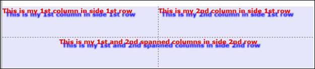
Above screen telling about all about our defined layout. A Grid Layout control can contain another Grid Layout control in its row. I am asking everybody to go through all such elaborated design scenarios. Don't forget to download the code attached this as all above mentioned matters has a Ref. to that only.