There are many different layout controls, and they are all used at different times to accomplish different goals because they each display their content differently. Basically, layout controls are the controls that handle the size and positioning of elements inside of them in an application; that is, they are the containers that house your objects.
Main Layout Controls:
Grid
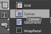
Canvas
StackPanel
WrapPanel
DockPanel
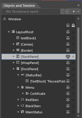
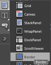
Border Detail Description with examples:
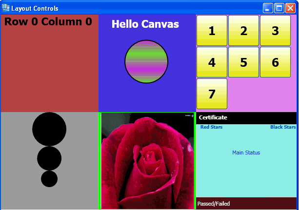
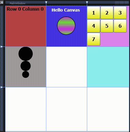
GRID: The most popular and most used WPF layout element is the Grid. When we open a new document in Expression Blend the default layout control shown is the "Grid" named Layout root which you can see in the object and timeline panel. That is because the Grid is by far the most common layout control. A Grid is very much like an HTML table in which we can define rows and columns and then place content inside of those rows and columns.
<Window
xmlns="http://schemas.microsoft.com/winfx/2006/xaml/presentation"
xmlns:x="http://schemas.microsoft.com/winfx/2006/xaml"
x:Class="LayoutControls.MainWindow"
x:Name="Window"
Title="Layout Controls"
Width="614" Height="654">
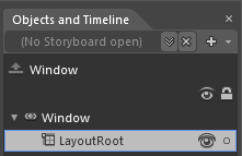
<Grid x:Name="LayoutRoot" Height="616">
</Grid>
</Window>
Rows and Columns in a Grid:
<Grid.RowDefinitions>
<RowDefinition Height="200"/>
<RowDefinition Height="200"/>
<RowDefinition Height="200"/>
</Grid.RowDefinitions>
<Grid.ColumnDefinitions>
<ColumnDefinition Width="200"/>
<ColumnDefinition Width="200"/>
<ColumnDefinition Width="200"/>
</Grid.ColumnDefinitions>
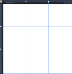
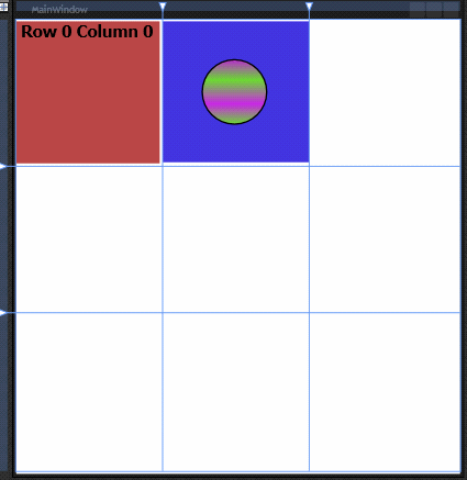
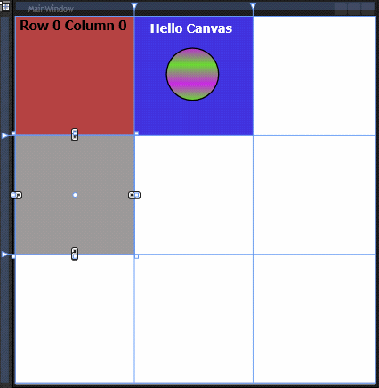
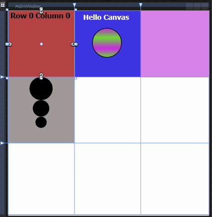
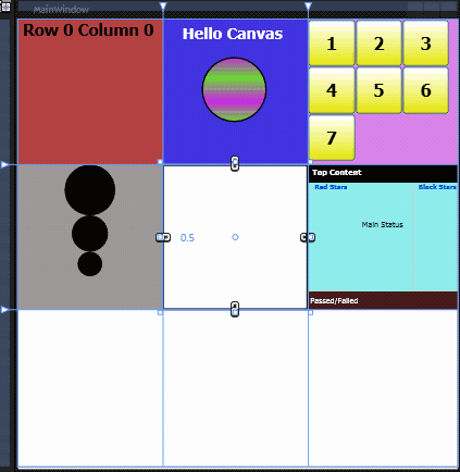
Note: Blue lines are showing the Rows and columns.
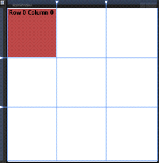
You can add controls into the Grid and then specify in the XAML what row and column they should be in.eg –
"Adding Textblock control"
<TextBlock Grid.Row="0" Grid.Column="0" TextWrapping="Wrap"
Margin="0,2,4,4" x:Name="textBlock1" Background="#FFB64545"
Text =" Row 0 Column 0" FontSize="22" FontWeight="Bold"
</TextBlock>
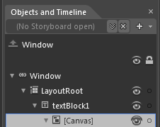
CANVAS : The next layout element is the "The Canvas will never change the position of child elements in it, and I find this very useful. The canvas is the only layout that allows you to have an absolute co-ordinate for each object. They don't get affected by resizing the window at all. To see how the Canvas works, you have to make some changes to the project:
Select a canvas control and draw it holding Alt key to place it wherever you want in the layoutroot as I have placed it in Row 0 Column 1, fill it with blue color to show the difference :
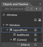
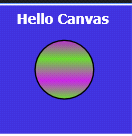
Select the Ellipse tool from the toolbar. Hold down Shift and draw an Ellipse using Gradient Brush inside the Canvas :
<Canvas Background="#FF4033DC" Grid.Column="1" Margin="0,2,0,5.447">
<Ellipse Height="90" Canvas.Left="53" Canvas.Top="52" Width="90">
<Ellipse.Fill>
<LinearGradientBrush EndPoint="0.5,1" StartPoint="0.5,0">
<GradientStop Color="#FFB52ACC"/>
<GradientStop Color="#FF67D630" Offset="1"/>
<GradientStop Color="#FFC526E0" Offset="0.687"/>
<GradientStop Color="#FF67D630" Offset="0.317"/>
</LinearGradientBrush>
</Ellipse.Fill>
</Ellipse>
</Canvas>
Draw out a TextBlock in your Canvas and change the text as "Hello Canvas".
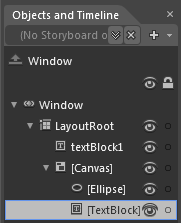
The interesting thing to see here is that the Canvas itself has a Margin property, and thus its positioning can be controlled by its parent Grid. However, the Ellipse and TextBlock do not have any Margin properties—rather, they have Canvas.top and Canvas.Left properties.
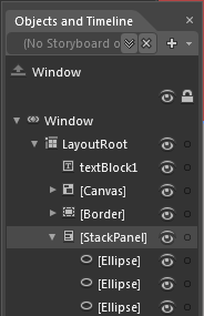
STACKPANEL: Another very useful layout element is the StackPanel it will position content inside of it for you in a stacking manner (horizontally or vertically). This is different from the Grid or Canvas, which rely on the developer to set the relative or absolute positioning of child objects. Lets see the use of Stack panel:
Select the StackPanel tool from the toolbar,and draw it in Row 1 Column 0 of the layout root and fill it with "grey" color.
Now, draw three Ellipses of different size in the newly created StackPanel and filll them using "Black" color.
<StackPanel Grid.Row="1" Orientation="Vertical" Background="#FF9B9898" Margin="-1.5,0,0.5,0" Height="200" >
<Ellipse Fill="Black" Height="70" Margin="65.5,0"/>
<Ellipse Fill="Black" Height="50" Margin="75.5,0"/>
<Ellipse Fill="Black" Height="35" Margin="83.5,0"/>
</StackPanel>
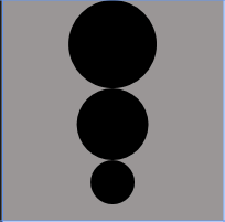
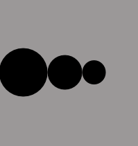
Note: You can change the orientation property to Horizontal or vertical.
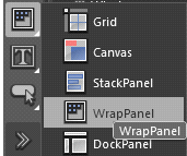
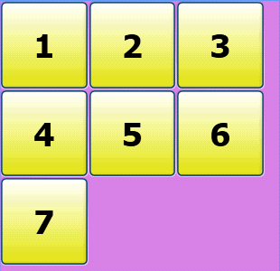
WRAPPANEL : Wrapping allows you to have many different things on a page, and as you resize, they're wrapped to the next line if they don't fit on the current one. This is perfect for things such as album art, etc. Also, since they display so nicely, they can be animated to display one by one, and fade in an out – perfect for a fluid interface for showing photographs, or icons. A WrapPanel layout control is similar to a StackPanel layout control, but it allows elements to be placed on multiple lines. When an object overflows off the edge of the panel, it will not be clipped, but instead will be wrapped to the next line.
Select WrapPanel tool from the toolbar and draw in Row 0 Column 2 and fill it with "#FFD87FE7" color.
Draw a Buttons in the wrap panel using Gradient brush and copy paste more buttons to the wrappanel,you can easily see that all the buttons are placed one by one in multiple lines like this:
<WrapPanel Background="#FFD87FE7" Grid.Column="2" Margin="0,0,-6,0">
<Button x:Name="Button1" Content="1" Height="65" Width="65" FontSize="24" FontWeight="Bold"/>
<Button x:Name="Button2" Content="2" Height="65" Width="65" FontSize="24" FontWeight="Bold"/>
<Button x:Name="Button3" Content="3" Height="65" Width="65" FontSize="24" FontWeight="Bold"/>
<Button x:Name="Button4" Content="4" Height="65" Width="65" FontSize="24" FontWeight="Bold"/>
<Button x:Name="Button5" Content="5" Height="65" Width="65" FontSize="24" FontWeight="Bold"/>
<Button x:Name="Button6" Content="6" Height="65" Width="65" FontSize="24" FontWeight="Bold"/>
<Button x:Name="Button7" Content="7" Height="65" Width="65" FontSize="24" FontWeight="Bold"/>
</WrapPanel>
DOCKPANEL: DockPanel is useful for describing the overall layout of a simple user interface. A DockPanel arranges each child element so that it fills a particular edge of the panel. If multiple children are docked to the same edge, they simply stack up against that edge in order.It provides an easy docking of elements to the left, right, top, bottom or center of the panel. The dock side of an element is defined by the attached property DockPanel.Dock. To dock an element to the center of the panel, it must be the last child of the panel and the LastChildFill property must be set to true. DockPanel is useful for describing the overall layout of a simple user interface. A DockPanel arranges each child element so that it fills a particular edge of the panel. If multiple children are docked to the same edge, they simply stack up against that edge in order.
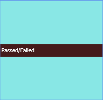
Select a DockPanel from the toolbar and draw it in Row 1, Column 2 and set its background = "#FF8AE9E7":
Draw a statusbar in the DockPanel and Textblock in the statusbar docked on bottom to fill the entire Horizontal Space like this :
<DockPanel Background="#FF8AE9E7" Grid.Column="2" Grid.Row="1" Width="Auto" Height="Auto" Margin="0,0,-6,0">
<StatusBar Width="Auto" Height="25" Background="#FF451B1B" DockPanel.Dock="Bottom">
<TextBlock Width="Auto" Height="Auto" Foreground="#FFFEFEFE" Text="Passed/Failed"/>
</StatusBar>
</DockPanel>
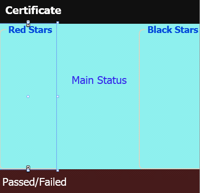
Now Draw two GroupBoxes Docked to Left and Right:
<GroupBox DockPanel.Dock="Left" Width="58.666" Height="Auto" Header="Red Stars" FontSize="9.333" FontWeight="Bold"/>
<GroupBox DockPanel.Dock="Right" Width="62.666" Height="Auto" Header="Black Stars" FontSize="9.333" FontWeight="Bold" />
Draw one menu and one menu item inside the menu docked on top to fill the entire horizontal Space:
<Menu Width="Auto" Height="25" DockPanel.Dock="Top" Background="#FF161511" Foreground="#FFCE2525">
<MenuItem Header="Top Content" Foreground="White" FontWeight="Bold"/>
</Menu>
Lastly Draw an canvas and a TextBlock inside the canvas as a final element to fill the remaining Space:
<Canvas Width="Auto" Height="Auto">
<TextBlock Width="Auto" Height="Auto" Text="Main Status" TextWrapping="Wrap"
Canvas.Left="15.632" Canvas.Top="51"/>
</Canvas>
Your dockpanel will be like this :
BORDER: The Border is a very simple layout element that allows you to draw a stroke around another element and then give it a background or an actual border. The Border layout element can only have one child element, and that content can be either left, right, top, bottom, or center aligned. These properties can be set manually in the XAML, or in Blend 3 in the Layout section of the Properties panel. Try making a Border element now:
Select the Border tool from the toolbar and in Row 1 Column 1, draw a border
Copy-Paste an Image in to the Border and adjust the size of the border according to Image.
<Border BorderThickness="5,2" Height="200" Width="200" Canvas.Left="0.5" Canvas.Top="199.5" HorizontalAlignment="Left">
<Image Margin="2,-0.5,2,-1.5" Source="pic5.jpg" Stretch="Fill" Width="190" Height="194" />
</Border>

Change the HorizontalAlignment and VerticalAlignment property in the Layout section of the Properties panel to see how the child object is affected.
Change the Background of the border to a gradient in the Brushes section of the Properties panel.
Select the BorderBrush property in the Brushes section of the Properties panel and select a solid color; I chose green.
In the Appearance section of the Properties panel, give the Border a BorderThickness of 5 for the left and right and 2 for the top and bottom.

Note: The Border content control allows you to draw a stroke and background around an element.