

Introduction
I already discussed the implementation of the Kendo ToolTip using jQuery in my last blog. In this blog, I’m going to discuss how to customize the Kendo ToolTip based on the requirement.
Kendo ToolTip
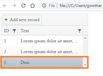
Consider a scenario where you need to customize the Kendo ToolTip visibility based on the length of the content, which means when the length of the text exceeds a certain limit, we need to enable the tooltip; otherwise we need to hide the tooltip.
- <!DOCTYPE html>
- <html>
- <head>
- <meta charset="utf-8"/>
- <title>Kendo UI Snippet</title>
- <link rel="stylesheet" href="https://kendo.cdn.telerik.com/2017.3.1026/styles/kendo.common.min.css"/>
- <link rel="stylesheet" href="https://kendo.cdn.telerik.com/2017.3.1026/styles/kendo.silver.min.css"/>
- <link rel="stylesheet" href="https://kendo.cdn.telerik.com/2017.3.1026/styles/kendo.mobile.all.min.css"/>
- <script src="https://code.jquery.com/jquery-1.12.4.min.js"></script>
- <script src="https://kendo.cdn.telerik.com/2017.3.1026/js/kendo.all.min.js"></script>
- </head>
- <body>
- <div id="grid"></div>
- <style>
- #grid{
- width:300px;
- }
- .k-tooltip.k-popup{
- visibility: hidden;
- }
- </style>
- <script>
- var grid = null;
- $(document).ready(function () {
- var dataSource = new kendo.data.DataSource({
- data: [
- {ID:1 ,Text: "Lorem ipsum dolor sit amet, consectetur adipiscing elit"},
- {ID:2 ,Text: "Lorem ipsum dolor sit amet, consectetur adipiscing elit. "},
- {ID:3 ,Text: " Duis "}
- ],
- schema: {
- model: {
- fields: {
- ID: { type: "number" },
- Text: { type: "string" }
- }}
- },
- });
- grid = $("#grid").kendoGrid({
- dataSource: dataSource,
- scrollable: true,
- filterable: true,
- toolbar: ["create"],
- columns: [
- { field: "ID", width: "50px" },
- { field: "Text", width: "200px", attributes: {
- style: 'white-space: nowrap '
- } }],
- editable: "incell"
- }).data("kendoGrid");
- $("#grid").kendoTooltip({
- show: function(e){
- if(this.content.text().length > 30){
- this.content.parent().css("visibility", "visible");
- }
- },
- hide:function(e){
- this.content.parent().css("visibility", "hidden");
- },
- filter: "td:nth-child(2)", //this filter selects the second column's cells
- position: "right",
- content: function(e){
- var dataItem = $("#grid").data("kendoGrid").dataItem(e.target.closest("tr"));
- var content = dataItem.Text;
- return content;
- }
- }).data("kendoTooltip");
- });
- </script>
- </body>
- </html>
KendoToolTip object is used to initialize the kendo tooltip for the control where it is used. In that object, you can notice that the show function is defined with the condition like - if the text content exceeds more than 30 characters, the tooltip pop up should be visible. Otherwise, it should be hidden.
By default, the tooltip pop up is disabled using the style.
- .k-tooltip.k-popup{
- visibility: hidden;
- }

Join the conversation! Your thoughts help the community grow.