

Introduction
I have already posted this kind of article here and it is a very nice example of making a custom loader. However we need to provide some kind of progress/loaders until the user data is loaded. It is good practices for the user to be informed of his data as it is loaded from the web. In a previous article I introduce the loader without related text. But now I thought It's better to show related text with the loader, so the user can get an idea of the data he is waiting on.
Requirements
- This sample is targeted to the Windows Phone 7.1 OS
- Additionally I am using a MessagePrompt to display a custom loader. So we need to add the Coding4fun Toolkit to use the "MessagePrompt".
Step 1
First I made a usercontrol named "UcCustomLoaderWithText". In this control I rotate the image using "Storyboard" like this:
XAML Code
- <Grid HorizontalAlignment="Left" Background="Transparent">
- <Grid.RowDefinitions>
- <RowDefinition Height="Auto"/>
- </Grid.RowDefinitions>
- <Canvas Grid.Row="0" RenderTransformOrigin="0.5,0.5" Margin="0,0,0,0" Width="50" Height="50" HorizontalAlignment="Left" VerticalAlignment="Center" d:LayoutOverrides="Margin">
- <Canvas.RenderTransform>
- <RotateTransform x:Name="SpinnerRotate" Angle="0" />
- </Canvas.RenderTransform>
- <Canvas.Triggers>
- <EventTrigger RoutedEvent="Canvas.Loaded">
- <BeginStoryboard>
- <Storyboard>
- <DoubleAnimation Storyboard.TargetName="SpinnerRotate"
- Storyboard.TargetProperty="(RotateTransform.Angle)"
- From="0" To="360" Duration="0:0:01"
- RepeatBehavior="Forever" />
- </Storyboard>
- </BeginStoryboard>
- </EventTrigger>
- </Canvas.Triggers>
- <Image x:Name="ImageLoader" HorizontalAlignment="Center" Width="50" Height="50" VerticalAlignment="Center" RenderTransformOrigin="0.5,0.5" Source="/Images/imgCustomLoader2.png">
- <Image.RenderTransform>
- <CompositeTransform/>
- </Image.RenderTransform>
- </Image>
- </Canvas>
- <TextBlock Name="TBlckLoaderText" HorizontalAlignment="Left" VerticalAlignment="Center" Margin="55,0,0,0" Grid.Row="0" Text="Loading ..." Foreground="Black" TextWrapping="Wrap"/>
- </Grid>
Here I have placed the image inside the canvas and rotated it with the "RotateTransform.Angle" property. So it is rotated continuously in a clockwise direction.
Step 2
In this sample I am using a "MessagePrompt" to display the Customloader on a button click. So we need to add the Coding4Fun.Phone.Controls.dll from Coding4fun.
C# Code
- private void BtnLoaderWithText_Click(object sender, RoutedEventArgs e)
- {
- MessagePrompt ObjMsgPrompt = new MessagePrompt();
- ObjMsgPrompt = new MessagePrompt();
- ObjMsgPrompt.Body = GetCustomLoaderText("Fetching Data...");//Set custom text on loader
- ObjMsgPrompt.Width = 480;
- ObjMsgPrompt.Height = 470;
- ObjMsgPrompt.Background = new SolidColorBrush(Colors.LightGray);
- VerticalAlignment = VerticalAlignment.Top;
- ObjMsgPrompt.Margin = new Thickness(0, 300, 0, 0);
- ObjMsgPrompt.ActionPopUpButtons.Clear();//clearing default 'tick' symbol from MessagePrompt
- ObjMsgPrompt.Show();
- }
- public UcCustomLoaderWithText GetCustomLoaderText(string MsgBodyText)
- {
- UcCustomLoaderWithText ObjUcCustomLoaderWithText = new UcCustomLoaderWithText();
- ObjUcCustomLoaderWithText = new UcCustomLoaderWithText();
- ObjUcCustomLoaderWithText.VerticalAlignment = VerticalAlignment.Center;
- ObjUcCustomLoaderWithText.TBlckLoaderText.Text = MsgBodyText;
- return ObjUcCustomLoaderWithText;
- }
Step 3
Creating the XAML in the "MainPage" to make the button click event to display the custom loader like this.
XAML Code
- <Grid x:Name="LayoutRoot" Height="800" Background="#FF9CE8EC">
- <!--ContentPanel - place additional content here-->
- <Grid x:Name="ContentPanel" Grid.Row="1" Margin="12,0,12,0">
- <Grid.RowDefinitions>
- <RowDefinition Height="Auto"/>
- </Grid.RowDefinitions>
- <StackPanel Orientation="Vertical">
- <TextBlock Text="Custom Loader:" FontSize="30" Foreground="#FF9D2ADE"/>
- <Button Name="BtnLoaderWithText" Margin="0,35,0,0" Content="CustomLoader With Text" Click="BtnLoaderWithText_Click" />
- </StackPanel>
- </Grid>
- </Grid>
Output
After: 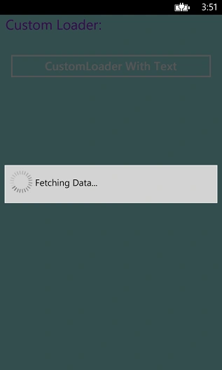
The source code is available at CustomLoaderSample.
Suresh MPosted Nov 25, 2014, 2:04 AM
with out using back button how to stop the loader in same screen?
Subramanyam RajuPosted Nov 25, 2014, 1:48 AM
When user press back button,it will be close.
Suresh MPosted Nov 25, 2014, 1:26 AM
hi how to stop this custom loader.?
Vithal WadjePosted Nov 24, 2014, 6:57 AM
thanks SubramanyamRaju B sir,hope in future i will see your more articles
Subramanyam RajuPosted Nov 24, 2014, 3:40 AM
Thanks Dinesh :)
Dinesh BeniwalPosted Nov 24, 2014, 3:15 AM
Good start Subramanyam, Welcome to C# Corner.
Vithal WadjePosted Nov 23, 2014, 11:30 PM
yes,welcome and thanks
Subramanyam RajuPosted Nov 23, 2014, 11:17 PM
Ok Thanks,In next time i will do it and it is first time for me to write article in c-sharpcorner
Vithal WadjePosted Nov 21, 2014, 3:42 PM
you can upload source code along with this article as wel no need to give your blog link,because some times it gives the problem when we are downloading the code from office PC from blogspot because in office blogger sites are blocked means don't have an access of this