

Introduction
WPF is a presentation system for building Windows based applications having an attractive User Interface (UI). This is not only in Windows-based or standalone applications, this also works in browser-based applications. WPF is an engine that is a vector-based rendering engine that uses modern graphic hardware. WPF has many features and those features make WPF popular. Some of the feature are the following:
- Direct 3D
- Data Binding
- Media Service
- Templates
- Animations
- Imaging
- Documents
- Text
In this article we will learn about animated buttons using WPF. We will use style and a template to create a customized button. This customized button design part is written in the Extensible Application Markup Language (XAML). We will be learning step-by-step.
Create a Basic Button in WPF
step 1 : Open the Visual Studio
Step 2 : Select a new WPF project. Click the file menu and select New then click on the project. Find the Windows Desktop WPF Application template. 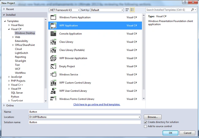
Step 3: Change the default Grid element into StackPanel and use the default buttons inside the StackPanel, as in the following code:
- <Window x:Class="WpfApplication1.MainWindow"
- xmlns="http://schemas.microsoft.com/winfx/2006/xaml/presentation"
- xmlns:x="http://schemas.microsoft.com/winfx/2006/xaml"
- Title="MainWindow" Height="300" Width="300" Background="Black">
- <StackPanel HorizontalAlignment="Left">
- <Button>Button 1</Button>
- <Button>Button 2</Button>
- <Button>Button 3</Button>
- <Button>Button 3</Button>
- </StackPanel>
- </Window>
Output: 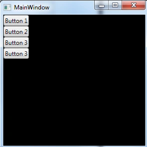
Set Basic Properties
We will set the basic properties for the Button. We will use an Application resource to set the property. It is similar to Cascading Style Sheets (CSS) in any web pages. However application resources are much more powerful than CSS. Let's try to implement that.
- Define an Application.Resources block
Open the app.xaml file and add the definition of the Application.Resources if it is not present in the app.xaml file.
- <Application x:Class="Button.App"
- xmlns="http://schemas.microsoft.com/winfx/2006/xaml/presentation"
- xmlns:x="http://schemas.microsoft.com/winfx/2006/xaml"
- StartupUri="MainWindow.xaml">
- <Application.Resources>
- </Application.Resources>
- </Application>
Application.Resources enables the resources to be used any where in the application.
- Define basic property value
As we can see the basic property for the target control. This time our target control is Button and we will set the width and margin for that, as we can see in the following code.- <Application.Resources>
- <Style TargetType="Button">
- <Setter Property="Width" Value="90"/>
- <Setter Property="Margin" Value="10"/>
- </Style>
- </Application.Resources>
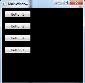
- Set a style property value to a resource
As in the code above we have set some color (gradient color) inside the button.
- <Application.Resources>
- <LinearGradientBrush x:Key="GrayBlueGardientBrush"
- StartPoint="0,0" EndPoint="1,1">
- <GradientStop Color="DarkCyan" Offset="0"/>
- <GradientStop Color="#CCCCFF" Offset="0.5"/>
- <GradientStop Color="DarkCyan" Offset="1"/>
- </LinearGradientBrush>
- <Style TargetType="{x:Type Button}">
- <Setter Property="Background" Value="{StaticResource GrayBlueGardientBrush}"/>
- <Setter Property="Width" Value="80"/>
- <Setter Property="Margin" Value="10"/>
- </Style>
- </Application.Resources>
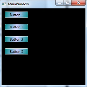
Using Template Defines the Look of the Button
We will be using a template for the button. Templates generally give us a different look. There are various templates to make our button a unique look. Always remember we need to use a template inside the style tag.
- Set up the template
A button has a template property, we will define the template property value just like the other property values and set the style in the setter tag.
- <Application.Resources>
- <LinearGradientBrush x:Key="GrayBlueGardientBrush"
- StartPoint="0,0" EndPoint="1,1">
- <GradientStop Color="DarkCyan" Offset="0"/>
- <GradientStop Color="#CCCCFF" Offset="0.5"/>
- <GradientStop Color="DarkCyan" Offset="1"/>
- </LinearGradientBrush>
- <Style TargetType="{x:Type Button}">
- <Setter Property="Background" Value="{StaticResource GrayBlueGardientBrush}"/>
- <Setter Property="Width" Value="80"/>
- <Setter Property="Margin" Value="10"/>
- <Setter Property="Template">
- <Setter.Value>
- </Setter.Value>
- </Setter>
- </Style>
- </Application.Resources>
- Alter button presentation
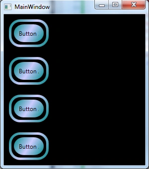
A DockPanel is used to host the ContentPresenter of the button and ContentPresenter will help to display the content of the button. We will make rounded edges for the button.- <Setter.Value>
- <ControlTemplate TargetType="Button">
- <Grid Width="{TemplateBinding Width}" Height="{TemplateBinding Height}" ClipToBounds="True">
- <Rectangle x:Name="outerRectangle"
- HorizontalAlignment="Stretch"
- VerticalAlignment="Stretch"
- Stroke="{TemplateBinding Background}"
- RadiusX="20" RadiusY="20" StrokeThickness="5"
- Fill="Transparent" />
- <Rectangle x:Name="innerRectangle"
- HorizontalAlignment="Stretch"
- VerticalAlignment="Stretch" Stroke="Transparent"
- StrokeThickness="20"
- Fill="{TemplateBinding Background}"
- RadiusX="20" RadiusY="20" />
- <DockPanel Name="myContentPresenterDockPanel">
- <ContentPresenter x:Name="myContentPresenter" Margin="20"
- Content="{TemplateBinding Content}"
- TextBlock.Foreground="Black" />
- </DockPanel>
- </Grid>
- </ControlTemplate>
- </Setter.Value>
- Add a glasseffect to the template
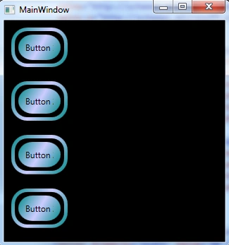
The glasseffect control is used to fill a rectangle that we insert into the grid of the template button. For that we need to create a resource. That resource will create the glass gradient effect.
- <Application.Resources>
- <GradientStopCollection x:Key="MyGlassGradientStopsResource">
- <GradientStop Color="WhiteSmoke" Offset="0.2" />
- <GradientStop Color="Transparent" Offset="0.4" />
- <GradientStop Color="WhiteSmoke" Offset="0.5" />
- <GradientStop Color="Transparent" Offset="0.75" />
- <GradientStop Color="WhiteSmoke" Offset="0.9" />
- <GradientStop Color="Transparent" Offset="1" />
- </GradientStopCollection>
- <LinearGradientBrush x:Key="GrayBlueGardientBrush"
- StartPoint="0,0" EndPoint="1,1">
- <GradientStop Color="DarkCyan" Offset="0"/>
- <GradientStop Color="#CCCCFF" Offset="0.5"/>
- <GradientStop Color="DarkCyan" Offset="1"/>
- </LinearGradientBrush>
- <Style TargetType="{x:Type Button}">
- <Setter Property="Background" Value="{StaticResource GrayBlueGardientBrush}"/>
- <Setter Property="Width" Value="80"/>
- <Setter Property="Margin" Value="10"/>
- <Setter Property="Template">
- <Setter.Value>
- <ControlTemplate TargetType="{x:Type Button}">
- <Grid Width="{TemplateBinding Width}" Height="{TemplateBinding Height}"
- ClipToBounds="True">
- <Rectangle x:Name="outerRectangle" HorizontalAlignment="Stretch"
- VerticalAlignment="Stretch" Stroke="{TemplateBinding Background}"
- RadiusX="20" RadiusY="20" StrokeThickness="5" Fill="Transparent" />
- <Rectangle x:Name="innerRectangle" HorizontalAlignment="Stretch"
- VerticalAlignment="Stretch" Stroke="Transparent" StrokeThickness="20"
- Fill="{TemplateBinding Background}" RadiusX="20" RadiusY="20" />
- <Rectangle x:Name="glassCube" HorizontalAlignment="Stretch"
- VerticalAlignment="Stretch"
- StrokeThickness="2" RadiusX="10" RadiusY="10" Opacity="0"
- Fill="{StaticResource GrayBlueGardientBrush}"
- RenderTransformOrigin="0.5,0.5">
- <Rectangle.Stroke>
- <LinearGradientBrush StartPoint="0.5,0" EndPoint="0.5,1">
- <LinearGradientBrush.GradientStops>
- <GradientStop Offset="0.0" Color="LightBlue" />
- <GradientStop Offset="1.0" Color="Gray" />
- </LinearGradientBrush.GradientStops>
- </LinearGradientBrush>
- </Rectangle.Stroke>
- <Rectangle.RenderTransform>
- <TransformGroup>
- <ScaleTransform />
- <RotateTransform />
- </TransformGroup>
- </Rectangle.RenderTransform>
- <Rectangle.BitmapEffect>
- <BevelBitmapEffect />
- </Rectangle.BitmapEffect>
- </Rectangle>
- <DockPanel Name="myContentPresenterDockPanel">
- <ContentPresenter x:Name="myContentPresenter" Margin="20"
- Content="{TemplateBinding Content}" TextBlock.Foreground="Black" />
- </DockPanel>
- </Grid>
- </ControlTemplate>
- </Setter.Value>
- </Setter>
- </Style>
- </Application.Resources>
Create Button Interactivity
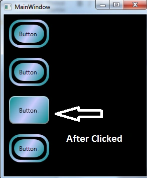
Interactivity means mouse-over, mouse-leave, click and so on. For setting the button interactivity we need to use a property trigger and an event trigger. To define the trigger within our template or style, we need to set the property "condition", such as the IsMouseOver equal to true. The procedure to create the button interactivity is as the following.
- Add template triggers : Add the highlighted markup to our template.
- <Setter.Value>
- <ControlTemplate TargetType="{x:Type Button}">
- <Grid Width="{TemplateBinding Width}"
- Height="{TemplateBinding Height}" ClipToBounds="True">
- <Rectangle x:Name="outerRectangle" HorizontalAlignment="Stretch"
- VerticalAlignment="Stretch" Stroke="{TemplateBinding Background}"
- RadiusX="20" RadiusY="20" StrokeThickness="5" Fill="Transparent" />
- <Rectangle x:Name="innerRectangle" HorizontalAlignment="Stretch"
- VerticalAlignment="Stretch" Stroke="Transparent"
- StrokeThickness="20"
- Fill="{TemplateBinding Background}" RadiusX="20" RadiusY="20"
- />
- <Rectangle x:Name="glassCube" HorizontalAlignment="Stretch"
- VerticalAlignment="Stretch"
- StrokeThickness="2" RadiusX="10" RadiusY="10" Opacity="0"
- Fill="{StaticResource GrayBlueGardientBrush}"
- RenderTransformOrigin="0.5,0.5">
- <Rectangle.Stroke>
- <LinearGradientBrush StartPoint="0.5,0" EndPoint="0.5,1">
- <LinearGradientBrush.GradientStops>
- <GradientStop Offset="0.0" Color="LightBlue" />
- <GradientStop Offset="1.0" Color="Gray" />
- </LinearGradientBrush.GradientStops>
- </LinearGradientBrush>
- </Rectangle.Stroke>
- <Rectangle.RenderTransform>
- <TransformGroup>
- <ScaleTransform />
- <RotateTransform />
- </TransformGroup>
- </Rectangle.RenderTransform>
- <Rectangle.BitmapEffect>
- <BevelBitmapEffect />
- </Rectangle.BitmapEffect>
- </Rectangle>
- <DockPanel Name="myContentPresenterDockPanel">
- <ContentPresenter x:Name="myContentPresenter" Margin="20"
- Content="{TemplateBinding Content}" TextBlock.Foreground="Black" />
- </DockPanel>
- </Grid>
- <ControlTemplate.Triggers>
- </ControlTemplate.Triggers>
- </ControlTemplate>
- </Setter.Value>
- Add property triggers : Add the code to the ControlTemplate.Triggers block.
- <ControlTemplate.Triggers>
- <Trigger Property="IsMouseOver" Value="True">
- <Setter Property ="Rectangle.Stroke" TargetName="outerRectangle"
- Value="{DynamicResource {x:Static SystemColors.HighlightBrushKey}}" />
- <Setter Property="Rectangle.Opacity" Value="1" TargetName="glassCube" />
- <Setter Property="ContentPresenter.BitmapEffect"
- TargetName="myContentPresenter">
- <Setter.Value>
- <BlurBitmapEffect Radius="1" />
- </Setter.Value>
- </Setter>
- </Trigger>
- </ControlTemplate.Triggers>
- Add a focus trigger : Adding some setter for the focus on button click
- <ControlTemplate.Triggers>
- <Trigger Property="IsMouseOver" Value="True">
- <Setter Property ="Rectangle.Stroke" TargetName="outerRectangle"
- Value="{DynamicResource {x:Static SystemColors.HighlightBrushKey}}" />
- <Setter Property="Rectangle.Opacity" Value="1" TargetName="glassCube" />
- <Setter Property="ContentPresenter.BitmapEffect" TargetName="myContentPresenter">
- <Setter.Value>
- <BlurBitmapEffect Radius="1" />
- </Setter.Value>
- </Setter>
- </Trigger>
- <Trigger Property="IsFocused" Value="true">
- <Setter Property="Rectangle.Opacity" Value="1" TargetName="glassCube" />
- <Setter Property="Rectangle.Stroke" TargetName="outerRectangle"
- Value="{DynamicResource {x:Static SystemColors.HighlightBrushKey}}" />
- <Setter Property="Rectangle.Opacity" Value="1" TargetName="glassCube" />
- </Trigger>
- </ControlTemplate.Triggers>
- Add animations for MouseEnter and MouseLeave
- <EventTrigger RoutedEvent="Mouse.MouseEnter">
- <EventTrigger.Actions>
- <BeginStoryboard Name="mouseEnterBeginStoryboard">
- <Storyboard>
- <DoubleAnimation Storyboard.TargetName="glassCube"
- Storyboard.TargetProperty=
- "(Rectangle.RenderTransform).(TransformGroup.Children)[0]. (ScaleTransform.ScaleX)"
- By="-0.1" Duration="0:0:0.5" />
- <DoubleAnimation Storyboard.TargetName="glassCube" Storyboard.TargetProperty=
- "(Rectangle.RenderTransform).(TransformGroup.Children)[0]. (ScaleTransform.ScaleY)"
- By="-0.1" Duration="0:0:0.5" />
- </Storyboard>
- </BeginStoryboard>
- </EventTrigger.Actions>
- </EventTrigger>
- <EventTrigger RoutedEvent="Mouse.MouseLeave">
- <EventTrigger.Actions>
- <StopStoryboard BeginStoryboardName="mouseEnterBeginStoryboard" />
- </EventTrigger.Actions>
- </EventTrigger>
- Add an animation for when the button is clicked
- <EventTrigger RoutedEvent="Mouse.MouseLeave">
- <EventTrigger.Actions>
- <StopStoryboard BeginStoryboardName="mouseEnterBeginStoryboard" />
- </EventTrigger.Actions>
- </EventTrigger>
- <EventTrigger RoutedEvent="Button.Click">
- <EventTrigger.Actions>
- <BeginStoryboard>
- <Storyboard>
- <DoubleAnimation Storyboard.TargetName="glassCube"
- Storyboard.TargetProperty=
- "(Rectangle.RenderTransform).(TransformGroup.Children)[1].(RotateTransform.Angle)"
- By="360" Duration="0:0:0.5" />
- </Storyboard>
- </BeginStoryboard>
- </EventTrigger.Actions>
- </EventTrigger>
Summary
In this article we learned various styles for a button, set the basic properties for the button that the entire application will use. We have also learned how to create resources like gardiants to be used for property values of the style setters and we have customized the behavior of a button in response to user actions, like mouseEnter, MouseLeave and click that all have animated effects.
Join the conversation! Your thoughts help the community grow.