

Introduction
- <canvas id="canvas" width="1000" height="800"></canvas>
- function dofirst()
- {
- var x = document.getElementById("canvas");
- canvas = x.getContext("2d");
- }
Step 3 Associate the Event addEventListener on mousemove and set the
function name with it.
- window.addEventListener("mousemove", bucky, false);
Step 4 Define the function with canvas position and fill that in shape of a rectangle. which creates an animation effect.
- function bucky(e)
- {
- // canvas.clearRect(0, 0, 600, 400);
- var xpos = e.clientX;
- var ypos = e.clientY;
- canvas.fillRect(xpos-50, ypos-50, 100, 100);
- }
Step 5 Call the function on window load.
Here is the Full Source Code
- window.addEventListener("load", dofirst, false);
- <html
- xmlns="http://www.w3.org/1999/xhtml">
- <head>
- <title></title>
- <script type="text/javascript" language="javascript">
- function dofirst()
- {
- var x = document.getElementById("canvas");
- canvas = x.getContext("2d");
- window.addEventListener("mousemove", bucky, false);
- }
- function bucky(e) {
- // canvas.clearRect(0, 0, 600, 400);
- var xpos = e.clientX;
- var ypos = e.clientY;
- canvas.fillRect(xpos-50, ypos-50, 100, 100);
- }
- window.addEventListener("load", dofirst, false);
- </script>
- </head>
- <body>
- <canvas id="canvas" width="1000" height="800"></canvas>
- </body>
- </html>
Output
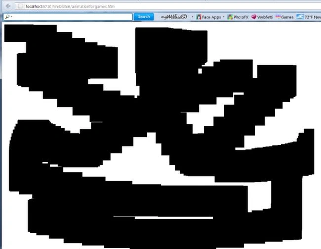
Example 2: In this example, we use some CSS transformation and transition to animate. We define a div rotate the div on mouse hover event using CSS transformations and transitions.
Here is code
Example 2: In this example, we use some CSS transformation and transition to animate. We define a div rotate the div on mouse hover event using CSS transformations and transitions.
- <html
- xmlns="http://www.w3.org/1999/xhtml">
- <head runat="server">
- <title></title>
- <style>
- #box
- {
- display:block;
- width:500px;
- margin:50px auto;
- text-align:center;
- border:7px solid blue;
- background:yellow;
- outline:7px solid red;
- -moz-transform: rotateZ(5deg);
- -moz-transition: -webkit-transform 2s ease-in-out;
- }
- #box:hover{
- -moz-transform:rotateZ(180deg);
- }
- </style>
- </head>
- <body>
- <form id="form1" runat="server">
- <div id="box"></div>
- </form>
- </body>
- </html>
Output
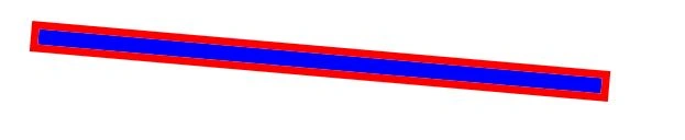
After mouse-hover on the div

Join the conversation! Your thoughts help the community grow.