

Introduction
In this article, we will discuss the SVG Gradients in HTML5. Gradients are a way of filling shapes with color, in an uneven fashion and they consist of continuously smooth color transitions along a vector from one color to another and we can apply several color transitions to the element.
There are basically two types of SVG Gradients in HTML5:
- Linear Gradients.
- Radial Gradients.
We will talk about both of these gradients in the following sections.
SVG Linear Gradient
The <linearGradient> element is used to define a linear gradient. Linear gradients change evenly from one color to another, in a linear fashion. The <linearGradient> element must be nested within a <defs> tag. The color can change either vertically, horizontally, or along a vector you define.
Example - 1
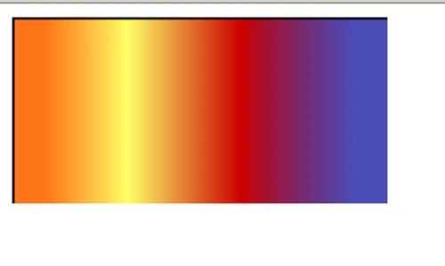
Fill a rectangle with a Horizontally Linear Gradient:
- <html>
- <head>
- </head>
- <body>
- <svg width="8cm" height="4cm" viewBox="0 0 800 400" version="1.1"
- xmlns="http://www.w3.org/2000/svg">
- <defs>
- <linearGradient id="LinerGradient">
- <stop offset="10%" stop-color="#F60" stop-opacity="0.9" />
- <stop offset="35%" stop-color="#FF6" />
- <stop offset="70%" stop-color="#cc0000" stop-opacity="1"/>
- <stop offset="90%" stop-color="#000099" stop-opacity="0.7"/>
- </linearGradient>
- </defs>
- <rect stroke="black" stroke-width="5" x="10" y="10" width="800" height="500" fill="url(#LinearGradient)" />
- </svg>
- </body>
- </html>
Output:
 Example - 2
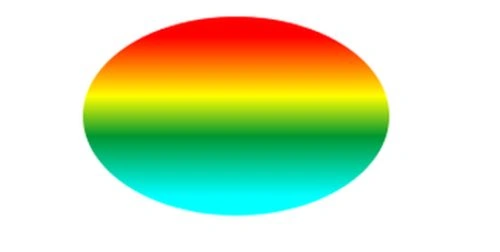
Filling an ellipse with a Vertically Linear Gradient:
Example - 2
Filling an ellipse with a Vertically Linear Gradient:
- <html>
- <head>
- </head>
- <body>
- <svg xmlns="http://www.w3.org/2000/svg" version="1.1">
- <defs>
- <linearGradient id="grad2" x1="0%" y1="0%" x2="0%" y2="100%">
- <stop offset="10%" style="stop-color:#ff0000;stop-opacity:1" />
- <stop offset="40%" style="stop-color:#ffff00;stop-opacity:1" />
- <stop offset="60%" style="stop-color:#009632;stop-opacity:1" />
- <stop offset="90%" style="stop-color:#00ffff;stop-opacity:1" />
- </linearGradient>
- </defs>
- <ellipse cx="200" cy="70" rx="100" ry="65" fill="url(#grad2)" />
- </svg>
- </body>
- </html>
SVG Radial Gradient
Radial gradients are gradients in which the colors change circularly rather than linearly. The <radialGradient> element is used to define a radial gradient. The <radialGradient> element must be nested within a <defs> tag.
Example - 1
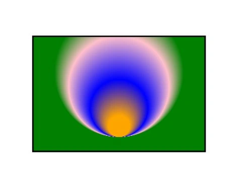
Rectangle With Radial Gradient:
- <html>
- <head>
- </head>
- </body>
- <svg width="10cm" height="10cm" viewBox="0 0 800 400" version="1.1"
- xmlns="http://www.w3.org/2000/svg">
- <defs>
- <radialGradient id="MG" gradientUnits="userSpaceOnUse" cx="400" cy="200" r="250" fx="400" fy="500">
- <stop offset="15%" stop-color="orange" />
- <stop offset="40%" stop-color="blue" />
- <stop offset="70%" stop-color="pink" />
- <stop offset="90%" stop-color="green" />
- </radialGradient>
- </defs>
- <rect fill="url(#MG)" stroke="black" stroke-width="5" x="100" y="100" width="600" height="400"/>
- </svg>
- </body>
- </html>
Output:
 Example - 2
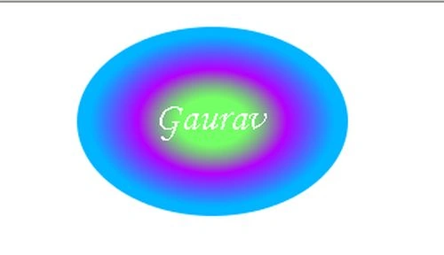
Ellipse with a radial gradient:
Example - 2
Ellipse with a radial gradient:
- <html>
- <head>
- </head>
- <body>
- <svg xmlns="http://www.w3.org/2000/svg" version="1.1">
- <defs>
- <radialGradient id="RadialGradient" cx="50%" cy="50%" r="50%" fx="50%" fy="50%">
- <stop offset="25%" style="stop-color:#19ff00;stop-opacity:0.6" />
- <stop offset="55%" style="stop-color:#b400ff;stop-opacity:1.9" />
- <stop offset="90%" style="stop-color:#00b4ff;stop-opacity:1" />
- </radialGradient>
- </defs>
- <ellipse cx="200" cy="80" rx="100" ry="70" fill="url(#RadialGradient)" />
- <text fill="#ffffff" font-size="30" font-family="Monotype Corsiva" x="157" y="86">
- Gaurav</text>
- </svg>
- </body>
- </html>
Join the conversation! Your thoughts help the community grow.