

Step 1: Open Expression Blend 4 -> Select Silverlight Application + Web -> Change Name and Location accordingly -> hit OK. A Blank Window appears on Artboard.
Step 2: Draw Previous Button (which is used in Websites) using Block Arrow Left Shape as shown below:
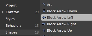
- Select Assets -> Shapes -> Select Block Arrow Left Shape located to the Left of Workspace as shown below:
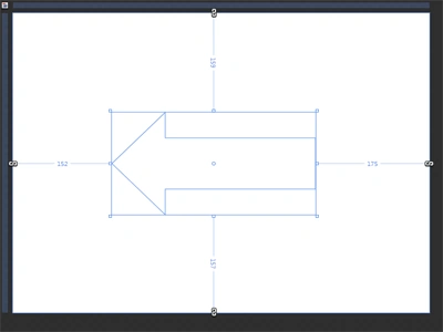
- Draw an Arrow as shown below:
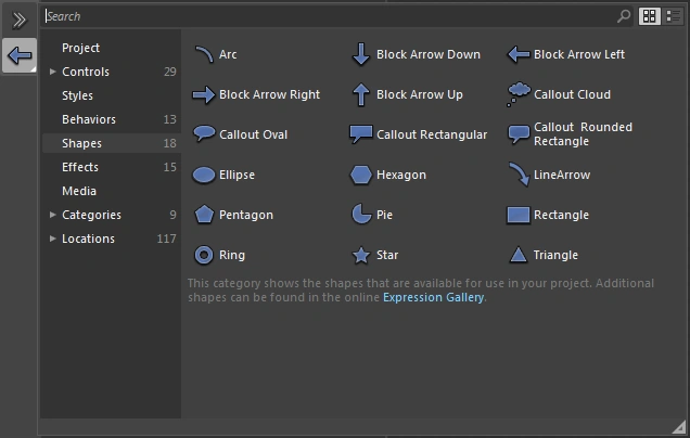
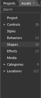
Note: There are 18 shapes in Assets in Expression Blend 4. We can select Shapes from Assets located to the left side of the Workspace as well as at the top of the Workspace in the Tool Box as shown below:
- Select Layout Property from the Property Panel located to the right of the Workspace.
Note: In the above image you can see the arrow between the Margin and Min Width properties. This arrow is used to expand or collapse the Sub Properties of the Layout Property as shown below:
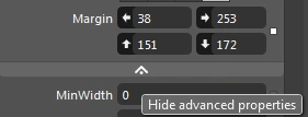
Note: When we click on the White Arrow the Layout Property is Expand or Collapsed as shown below:


- The Layout Property contains 17 properties as shown below:
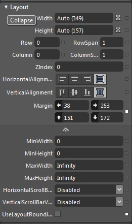
- Select the Width-Height Property of the Layout Property; increase or decrease the range and see the effect as shown below:
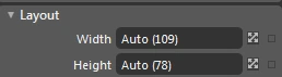
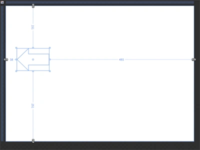
Note: When we select any property there is a description that flashes about the use of the tool below the property as shown below:
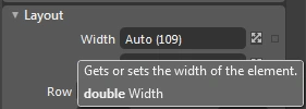
- Row, Column, RowSpan, ColumnSpan Properties of the Layout Property are used for Table-Based work.
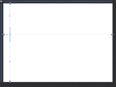
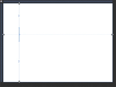
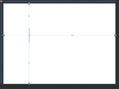
- HorizontalAlignment Property contains 4 types of alignments ie; Left, Center, Right, Stretch. Select HorizontalAlignment Property and see the effect as shown below:
Left:

Center:

Right:

Stretch:

Note: When we use the Stretch Property the image changes to its Default Shape.
- VerticalAlignment Property contains 4 types of alignments ie; Top, Center, Bottom and Stretch. Select the VerticalAlignmnet Property and see the effect as shown below:

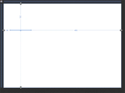
Center:

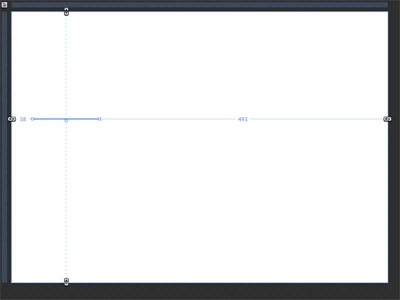
Bottom:

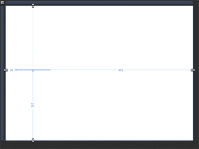
Stretch:

Note: When we use the Stretch Property the image changes to its Default Shape.
- Margin Property contains 4 types of properties; they are Left, Right, Top and Bottom. Select the margin property and see the effect as shown below:

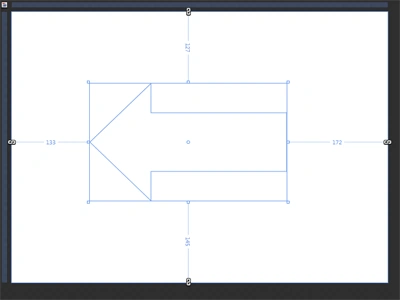
Right:

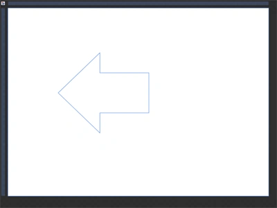
Top:

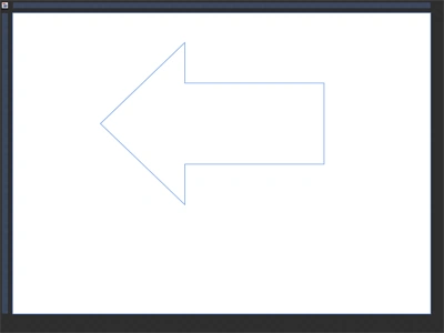
Bottom:

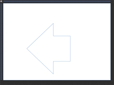
- Select the MinWidth Property; increase or decrease the range and see the effect as shown below:

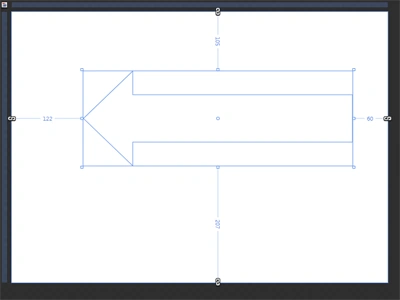
- Select the MinHeight Property, increase or decrease the range and see the effect as shown below:

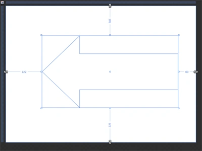
Step 3: Select Arrow, select Fill -> Gradient Brush -> Grey Color -> Stroke -> Green Color and see the effect as shown below:
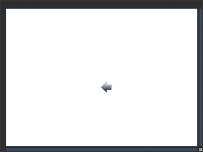
Here's the Previous Button.
Step 4: Draw Next Button (which is used in Websites) using the Block Arrow Right Shape as shown below:
- Select Assets -> Shapes -> Select Block Arrow Right Shape located to the left of the Workspace as shown below:
- Draw an Arrow as shown below:
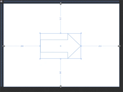
Note: By applying the above steps of the Layout Property you can manage the Arrow Shape.
Step 5: Select Arrow, select Fill -> Gradient Brush -> Grey Color -> Stroke -> Green Color and see the effect as shown below:
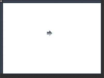
Here's the Next Button.
Step 6: Here's the final image, i.e. the Previous Button-Next Button.
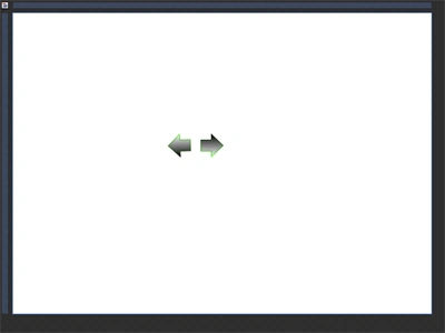
Note: The Previous and Next Buttons are also used as Left Side and Right Side Indicators The Previous and Next Buttons are used in Horizontal Scroll Bar to the Bottom everywhere ie; Websites, Expression Blend 4 etc as shown below:

Step 7: Select Assets -> Shapes -> Block Arrow Up Shape located to the left side of the Workspace as shown below:

Step 8: Draw an Arrow (Top Arrow) as shown below:
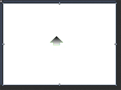
Note: By applying the above steps of the Layout Property you can manage the Arrow Shape as well as follow Step 5 to fill the Color and Stroke.
Step 9: Select Assets -> Shapes -> Block Arrow Down Shape Located to the Left Side of Workspace as shown below:
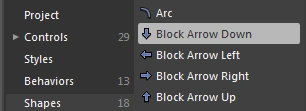
Step 10: Draw an Arrow (Bottom Arrow) as shown below:
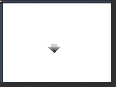
Note: By Applying the above Steps of Layout Property you can manage Arrow Shape as well as follow Step 5 to Fill Color and Stroke.
Step 11: Here's the final image; i.e. the Top Arrow-Bottom Arrow.
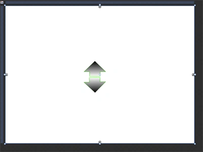
Note: The Top and Bottom Arrows are used in Vertical Scroll Bar to the Right everywhere ie; Websites, Expression Blend 4 etc as shown below:

Summary
The purpose of this article is to show the use of Block Arrow Shapes and the Layout Property.
Vishal ShirphulePosted Apr 7, 2016, 3:20 AM
How to draw clockwise and anticlockwise block arrow ???