

Journey with CSS3
Welcome to the CSS3 series where we'll discuss the many new things we can do to enhance the look and feel of a web page.
- CSS3 Series Part 1: Introduction, Features, and Usage of CSS3
- CSS3 Series Part 2: Playing with Background.
- CSS3 Series Part 3: Multi-column Layout.
- CSS3 Series Part 4: Playing with Border.
- CSS3 Series Part 5: Playing with Gradients.
- CSS3 Series Part 6: 2D Transformation with CSS3.
- CSS3 Series Part 7: 3D Transformation with CSS3.
- CSS3 Series Part 8: Animation with CSS3.
- CSS3 Series Part 9: Transitions with CSS3.
CSS3 Series Part 1: Introduction, Features, and Usage of CSS3
- Font Properties.
- Color of text, backgrounds, and other elements.
- Alignment of text, images, and other elements.
- Margin, border, padding and positioning of elements.
The second level (CSS2) was published in May 1998 by W3C. This level of CSS had new features like:
- Absolute positioning.
- Relative and fixed positioning.
- Z-index.
- Shadowing.
- Selectors
- Box Model
- Backgrounds and Borders
- Animation
- User Interface
- Border Image
- Border Radius
- Box Shadow
- Multiple Backgrounds
- Text Shadow
- Multi-column layouts
- CSS3 Transitions
- Word Wrap
- Box Resizing
- Transformation and so on.
Browser specific prefixes for CSS3
Let's see an example of using these prefixes that can work with various browsers.
| Prefix | Browsers |
| -webkit- | Google Chrome |
| -moz- | Firefox |
| -ms- | Internet Explorer |
| -o- | Opera |
| -webkit- | Safari |
- <style>
- #repeatedImageBorder {-webkit-border-image: url(banner2.jpg) 30 30 round; /* Google Chrome*/
- -ms-border-image: url(banner2.jpg) 30 30 round; /* IE */
- -moz-border-image: url(banner2.jpg) 30 30 round; /* Firefox */
- border-image: url(banner2.jpg) 30 30 round;
- }
- #stretchImageBorder {
- -webkit-border-image: url(banner2.jpg) 30 30 stretch; /* Google Chrome */
- -ms-border-image: url(banner2.jpg) 30 30 stretch; /* IE */
- -moz-border-image: url(banner2.jpg) 30 30 stretch; /* Firefox */
- border-image: url(banner2.jpg) 30 30 stretch;
- }
- </style>
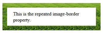
When we run the preceding code, we'll get the following output in all browsers.
Repeated
 Stretched
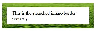 As you can see in the preceding output, the "round" value for the "border-image-repeat" property repeats the image to fill the area. Whereas the "stretch" value (the default) doesn't repeat the image, instead it uses the single image to fill the entire area.
In this introductory part, we've seen what CSS is, its various levels and versions with the features in each version. CSS3 is browser compatible. We'll take a closer look at other modules/features of CSS3 in the next series.
If there's any mistake in this article then please let me know. Please provide your valuable feedback and comments.
As you can see in the preceding output, the "round" value for the "border-image-repeat" property repeats the image to fill the area. Whereas the "stretch" value (the default) doesn't repeat the image, instead it uses the single image to fill the entire area.
In this introductory part, we've seen what CSS is, its various levels and versions with the features in each version. CSS3 is browser compatible. We'll take a closer look at other modules/features of CSS3 in the next series.
If there's any mistake in this article then please let me know. Please provide your valuable feedback and comments.
Abhishek YadavPosted Mar 22, 2015, 1:11 PM
Thanks Sanjay singh, if want to learn other advance concepts as well, you can also check other parts in this series.. :)
Sanjay SinghPosted Feb 15, 2015, 3:24 AM
good one sir !!!