

Introduction
The ListView element in XAML represents a WPF ListView control. This tutorial explains how to use a ListView control in WPF with code examples.
- <ListView></ListView>
The Width and Height properties represent the width and the height of a ListView. The Name property represents the name of the control, which is a unique identifier of a control. The Margin property tells the location of a ListView on the parent control. The HorizontalAlignment and VerticalAlignment properties are used to set horizontal and vertical alignments.
The following code snippet sets the name, height, and width of a ListView control. The code also sets horizontal alignment to left and vertical alignment to top.
- <ListView Margin="10,10,0,13" Name="ListView1" HorizontalAlignment="Left" VerticalAlignment="Top" Width="194" Height="200" />
Adding ListView Items
A ListView control hosts a collection of ListViewItem. The following code snippet adds items to a ListView control.
- <ListView Margin="10,10,0,13" Name="ListView1" HorizontalAlignment="Left" VerticalAlignment="Top" Width="194" Height="200">
- <ListViewItem Content="Coffie"></ListViewItem>
- <ListViewItem Content="Tea"></ListViewItem>
- <ListViewItem Content="Orange Juice"></ListViewItem>
- <ListViewItem Content="Milk"></ListViewItem>
- <ListViewItem Content="Iced Tea"></ListViewItem>
- <ListViewItem Content="Mango Shake"></ListViewItem>
- </ListView>
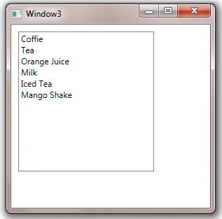
The above code generates Figure 1.
Adding ListView Items Dynamically
In the previous section, we saw how to add items to a ListView at design-time from XAML. We can add items to a ListView from the code.
Now we change our UI and add a TextBox and a button control to the page. The XAML code for the TextBox and Button controls look like following:
- <TextBox Height="23" HorizontalAlignment="Left" Margin="8,14,0,0" Name="textBox1" VerticalAlignment="Top" Width="127" />
- <Button Height="23" Margin="140,14,0,0" Name="button1" VerticalAlignment="Top" HorizontalAlignment="Left" Width="76" Click="button1_Click"> Add Item </Button>
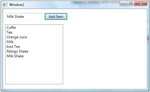
The final UI looks like Figure 2.

On button click event handler, we add the content of TextBox to the ListView by calling ListView.Items.Add method. The following code adds TextBox contents to the ListView items.
- privatevoid button1_Click(object sender, RoutedEventArgs e) {
- ListView1.Items.Add(textBox1.Text);
- }
On button click event handler, we add the contents of TextBox to the ListView by calling ListView.Items.Add method.
Now if you enter text in the TextBox and click Add Item button, it will add contents of the TextBox to the ListView.
Deleting ListView Items
We can use ListView.Items.Remove or ListView.Items.RemoveAt method to delete an item from the collection of items in the ListView. The RemoveAt method takes the index of the item in the collection.
Now, we modify our application and add a new button called Delete Item. The XAML code for this button looks like below.
- <Button Height="23" Margin="226,14,124,0" Name="DeleteButton" VerticalAlignment="Top" Click="DeleteButton_Click"> Delete Item</Button>
The button click event handler looks like following. On this button click, we find the index of the selected item and call ListView.Items.RemoveAt method as following.
- privatevoid DeleteButton_Click(object sender, RoutedEventArgs e) {
- ListView1.Items.RemoveAt(ListView1.Items.IndexOf(ListView1.SelectedItem));
- }
Formatting and Styling - Formatting ListView Items
The Foreground and Background attributes of ListViewItem represents the background and foreground colors of the item. The following code snippet sets background and foreground color of a ListViewItem.
- <ListViewItem Background="LightCoral" Foreground="Red" Content="Coffie"></ListViewItem>
The FontFamily, FontSize, and FontWeight are used to set a font of a ListViewItem. The following code snippet sets font verdana, size 12, and bold of a ListViewItem.
- <ListViewItem Background="LightCoral" Foreground="Red" Content="Coffie" FontFamily="Verdana" FontSize="12" FontWeight="Bold"></ListViewItem>
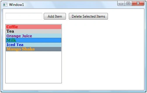
I set the following properties of ListViewItems.
- <ListViewItem Background="LightCoral" Foreground="Red" Content="Coffie" FontFamily="Verdana" FontSize="12" FontWeight="Bold"></ListViewItem>
- <ListViewItem Background="LightGray" Foreground="Black" Content="Tea" FontFamily="Georgia" FontSize="14" FontWeight="Bold"></ListViewItem>
- <ListViewItem Background="LightBlue" Foreground="Purple" Content="Orange Juice" FontFamily="Verdana" FontSize="12" FontWeight="Bold"></ListViewItem>
- <ListViewItem Background="LightGreen" Foreground="Green" Content="Milk" FontFamily="Georgia" FontSize="14" FontWeight="Bold"></ListViewItem>
- <ListViewItem Background="LightBlue" Foreground="Blue" Content="Iced Tea" FontFamily="Verdana" FontSize="12" FontWeight="Bold"></ListViewItem>
- <ListViewItem Background="LightSlateGray" Foreground="Orange" Content="Mango Shake" FontFamily="Georgia" FontSize="14" FontWeight="Bold"></ListViewItem>
The new ListView looks like Figure 4.
Displaying Images in a ListView
We can put any controls inside a ListViewItem such as an image and text. To display an image side by side some text, I simply put an Image and TextBlock control within a StackPanel. The Image.Source property takes the name of the image you would like to display in the Image control and TextBlock.Text property takes a string that you would like to display in the TextBlock.
The following code snippet adds an image and text to a ListViewItem.
- <ListViewItem Background="LightCoral" Foreground="Red" FontFamily="Verdana" FontSize="12" FontWeight="Bold">
- <StackPanel Orientation="Horizontal">
- <Image Source="coffie.jpg" Height="30"></Image>
- <TextBlock Text="Coffie"></TextBlock>
- </StackPanel>
- </ListViewItem>
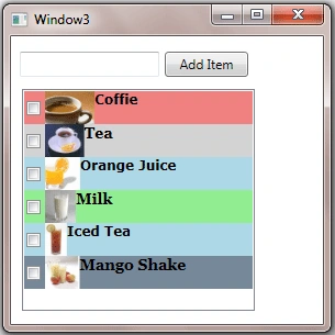
After changing my code for all 5 ListViewItems, the ListView looks like Figure 5.

ListView with CheckBoxes
If you put a CheckBox control inside ListViewItems, you generate a ListView control with checkboxes in it. The CheckBox can host controls within it as well. For instance, we can put an image and text block as content of a CheckBox.
The following code snippet adds a CheckBox with an image and text to a ListViewItem.
- <ListViewItem Background="LightCoral" Foreground="Red" FontFamily="Verdana" FontSize="12" FontWeight="Bold">
- <CheckBox Name="CoffieCheckBox">
- <StackPanel Orientation="Horizontal">
- <Image Source="coffie.jpg" Height="30"></Image>
- <TextBlock Text="Coffie"></TextBlock>
- </StackPanel>
- </CheckBox>
- </ListViewItem>
I change the code of ListViewItems and add following CheckBoxes to the items. As you may see, I have set the name of the CheckBoxes using Name property. If you need to access these CheckBoxes, you may access them in the code using their Name property.
- <ListViewItem Background="LightCoral" Foreground="Red" FontFamily="Verdana" FontSize="12" FontWeight="Bold">
- <CheckBox Name="CoffieCheckBox">
- <StackPanel Orientation="Horizontal">
- <Image Source="coffie.jpg" Height="30"></Image>
- <TextBlock Text="Coffie"></TextBlock>
- </StackPanel>
- </CheckBox>
- </ListViewItem>
- <ListViewItem Background="LightGray" Foreground="Black" FontFamily="Georgia" FontSize="14" FontWeight="Bold">
- <CheckBox Name="TeaCheckBox">
- <StackPanel Orientation="Horizontal">
- <Image Source="tea.jpg" Height="30"></Image>
- <TextBlock Text="Tea"></TextBlock>
- </StackPanel>
- </CheckBox>
- </ListViewItem>
- <ListViewItem Background="LightBlue" Foreground="Purple" FontFamily="Verdana" FontSize="12" FontWeight="Bold">
- <CheckBox Name="OrangeJuiceCheckBox">
- <StackPanel Orientation="Horizontal">
- <Image Source="OrangeJuice.jpg" Height="40"></Image>
- <TextBlock Text="OrangeJuice"></TextBlock>
- </StackPanel>
- </CheckBox>
- </ListViewItem>
- <ListViewItem Background="LightGreen" Foreground="Green" FontFamily="Georgia" FontSize="14" FontWeight="Bold">
- <CheckBox Name="MilkCheckBox">
- <StackPanel Orientation="Horizontal">
- <Image Source="Milk.jpg" Height="30"></Image>
- <TextBlock Text="Milk"></TextBlock>
- </StackPanel>
- </CheckBox>
- </ListViewItem>
- <ListViewItem Background="LightBlue" Foreground="Blue" FontFamily="Verdana" FontSize="12" FontWeight="Bold">
- <CheckBox Name="IcedTeaCheckBox">
- <StackPanel Orientation="Horizontal">
- <Image Source="IcedTea.jpg" Height="30"></Image>
- <TextBlock Text="Iced Tea"></TextBlock>
- </StackPanel>
- </CheckBox>
- </ListViewItem>
- <ListViewItem Background="LightSlateGray" Foreground="Orange" FontFamily="Georgia" FontSize="14" FontWeight="Bold">
- <CheckBox Name="MangoShakeCheckBox">
- <StackPanel Orientation="Horizontal">
- <Image Source="MangoShake.jpg" Height="30"></Image>
- <TextBlock Text="Mango Shake"></TextBlock>
- </StackPanel>
- </CheckBox>
- </ListViewItem>
Now, the new ListView looks like Figure 6.
Data Binding in ListView
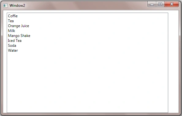
The ItemsSource property of ListView is used to bind a collection of IEnuemerable such as an ArrayList to the ListView control.
The following code snippet creates an ArrayList object.
- ///<summary>
- /// Generate data. This method can bring data from a database or XML file
- /// or from a Web service or generate data dynamically
- ///</summary>
- ///<returns></returns>
- privateArrayList LoadListViewData() {
- ArrayList itemsList = newArrayList();
- itemsList.Add("Coffie");
- itemsList.Add("Tea");
- itemsList.Add("Orange Juice");
- itemsList.Add("Milk");
- itemsList.Add("Mango Shake");
- itemsList.Add("Iced Tea");
- itemsList.Add("Soda");
- itemsList.Add("Water");
- return itemsList;
- }
On the Window loaded event, we create and load data items to the ListView by setting the ItemsSource property to an ArrayList.
- privatevoid Window_Loaded(object sender, RoutedEventArgs e) {
- // Get data from somewhere and fill in my local ArrayList
- myDataList = LoadListViewData();
- // Bind ArrayList with the ListView
- LeftListView.ItemsSource = myDataList;
- }
The collection items are being displayed in Figure 7.
Summary
In this article, I discussed how to create and use a ListView control available in WPF. We saw how we can add items to a ListView, change item properties, add images add check boxes. In the end of this article, we saw how data binding works in ListView.
Rushi MehtaPosted Nov 11, 2018, 10:37 PM
Nice One.. Thanks for sharing
Ammar ShaukatPosted Sep 14, 2017, 6:11 AM
This is a great contribution Sir. Can we have some content on Data Templates and Control Templates too ?
Kaleem Ullah KhanPosted Oct 23, 2015, 7:34 AM
2nd Question how to delete multiple items
Kaleem Ullah KhanPosted Oct 23, 2015, 7:18 AM
how to add multi selection ?
Kaleem Ullah KhanPosted Oct 23, 2015, 7:17 AM
Very Nice Article
Ruvaid AhmedPosted Oct 14, 2015, 4:54 AM
not bad
dk zclinPosted Feb 21, 2013, 4:36 AM
This article is very useful for me.Thanks very much
Mahesh AlleeditedPosted Jan 31, 2013, 12:35 AMEdited Mar 13, 2013, 6:41 AM
Thanks for posting this article
Ramasagar PulidindiPosted Jan 9, 2013, 11:10 AM
i had a xaml form which consists of text boxes check boxes list view and a button now when i click on a button i want to populate the list view from sql .. can u tell me how?
Avinash SinghPosted Oct 20, 2012, 2:48 AM
How to get a values of Checked rows in WPF ListView
ibrahim YILMAZPosted Jan 18, 2012, 3:27 PM
great deal
brahman programadorPosted Dec 6, 2011, 5:45 PM
amgios les escribo para que me ayuden con este problema que tengo estoy desarrollando una aplicaion wpf quiero llenar un listview con imagenes que estan en la base de datos en formato byte hasta el momento hize esto pero me asigna la primera imagen a todos los items del listview for (int i = 0; i < NumRegistros; i++) { LongImg = 500000; byte []Byte2Image = new byte[LongImg]; // aqui siempre tienes que crear una nueva variable listviewArticulos.DataContext= Reader.GetBytes(Reader.GetOrdinal("PathImagen"), 0, Byte2Image, 0, LongImg); listviewArticulos.Items.Add(Byte2Image); }
Anthony VPosted Jan 28, 2011, 8:17 AM
Thanks. Helpful article. I am new to this WPF stuff so wondering about how one would create these controls so that they exist in a different column than the first one? what i want to do is simulate the properties window in Visual Studio, the one that appears when you hit F4 on a control. in that you have two columns. the first column is a label, and the second column contains either text boxes, drop downs, or popups. and there's a faint gridline between the two columns. any help greatly appreciated. Thanks Anthony
Syed ShakeerPosted Dec 29, 2010, 3:01 AM
Hi, Can you tell me how to add a checkBox in LsitView dynamically
Raja SPosted Nov 30, 2010, 7:57 AM
very nice article........
Yudhi PandeyPosted Jun 11, 2010, 7:01 AM
Hi, I've a collection in a list view which is filled by a button click. As soon as it is filled , i have to enable/disable other buttons according to the selection. But the problem is as soon as it is filled, the buttons get enabled without the selection from the list. I have bound the listview IsSelected property to the buttons canExecute . But it doesn't seem to work??? <listviewItemStyle> <Setter Property="IsSelected" Value="{Binding Path=IsSelected, Mode=TwoWay}" /> </listviewItemStyle>
Dang Cong ThanhPosted Apr 9, 2010, 10:44 PM
thanks. If i want to handle click event on Checkbox, what should i do to it ?