

A menu control is a group of menu items. Each menu item can be used for a certain action. The code samples in this article show how to use a menu control and menu items in a WPF app at design time using XAML.
The complete tutorial is here: Working with WPF Menu Control using XAML and C# .
The following code snippet in XAML creates a menu control at design time.
- <Menu Height="22" Name="menu1" Width="200" Margin="10, 10, 5, 5" HorizontalAlignment="Left" VerticalAlignment="Top" Background="Chocolate">
- </Menu>
The following code snippet sets a menu property.
- <Menu Height="22" Name="menu1" Width="200" Margin="10, 10, 5, 5" HorizontalAlignment="Left" VerticalAlignment="Top" Background="Blue" BorderThickness="2">
- <Menu.BitmapEffect>
- <DropShadowBitmapEffect />
- </Menu.BitmapEffect>
- </Menu>
- <MenuItem Header="_File">
- <MenuItem Header="_Open" IsCheckable="true"/>
- <MenuItem Header="_Close" IsCheckable="true"/>
- <MenuItem Header="_Save" IsCheckable="true"/>
- </MenuItem>
The output looks following.
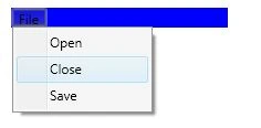
We can also add sub menus and sub menu items using the MenuItem tag within the parent, a MenuItem tag. The following code adds a separator and sub menus and sub menu items to the menu.
- <Separator/>
- <MenuItem Header="Sub Items">
- <MenuItem Header="Child1 SubItem" IsCheckable="true"/>
- <MenuItem Header="Child2 SubItem" IsCheckable="true">
- <MenuItem Header="GrandChild2 SubItem" IsCheckable="true"/>
- </MenuItem>
- </MenuItem>
Now, our new output looks like the following.
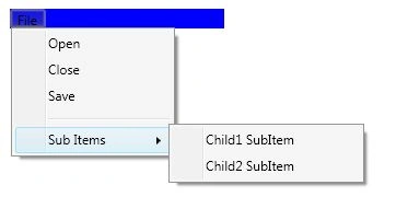
- <MenuItem Header="_Open" IsCheckable="true">
- <MenuItem.ToolTip>
- <ToolTip>
- Open a file.
- </ToolTip>
- </MenuItem.ToolTip>
- </MenuItem>
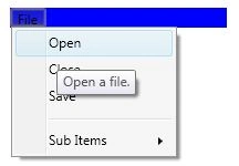
The InputGestureText property is used to add keyboard shortcuts to the menu item. The following code adds CTRL+O to a menu item.
- <MenuItem IsCheckable="true" Header="_Open" InputGestureText="Ctrl+O">
- <MenuItem IsCheckable="true" Header="_Open" Click="MenuItem_Click">
- private void MenuItem_Click(object sender, RoutedEventArgs e)
- {
- MessageBox.Show("Menu item clicked");
- }
The complete tutorial is here: Working with WPF Menu Control using XAML and C# .
Join the conversation! Your thoughts help the community grow.