

The WPF TextBlock control is a lightweight text editor control for displaying and formattting small amount of text flow content. The code examples in this tutorial demonstrates how to use a TextBlock control in WPF using XAML and C#.
Creating a TextBlock
The TextBlock element represents a WPF TextBlock control in XAML.
- <TextBlock/>
The Width and Height attributes of the TextBlock element represent the width and the height of a TextBlock. The Text property of the TextBlock element represents the content of a TextBlock. The Name attribute represents the name of the control, which is a unique identifier of a control. The Foreground property sets the foreground color of contents. This control does not have a Background property.
The code snippet in Listing 1 creates a TextBlock control and sets the name, height, width, foreground and content of a TextBlock control. Unlike a TextBox control, the TextBlock does not have a default border around it.
- <TextBlock Name="TextBlock1" Height="30" Width="200"
- Text="Hello! I am a TextBlock." Foreground="Red">
- </TextBlock>
Listing 1
The output looks like Figure 1.

As you can see from Figure 1, by default the TextBlock is place in the center of the page. We can place a TextBlock control where we want by using the Margin, VerticalAlignment and HorizontalAlignment attributes that sets the margin, vertical alignment, and horizontal alignment of a control.
The code snippet in Listing 2 sets the position of the TextBlock control in the left top corner of the page.
- <TextBlock Name="TextBlock1" Height="30" Width="200"
- Text="Hello! I am a TextBlock."
- Margin="10,10,0,0" VerticalAlignment="Top"
- HorizontalAlignment="Left">
- </TextBlock>
Listing 2
Creating a TextBlock Dynamically
The code listed in Listing 3 creates a TextBlock control programmatically. First, it creates a TextBlock object and sets its width, height, contents and foreground and later the TextBlock is added to the LayoutRoot.
- privatevoid CreateATextBlock()
- {
- TextBlock txtBlock = newTextBlock();
- txtBlock.Height = 50;
- txtBlock.Width = 200;
- txtBlock.Text = "Text Box content";
- txtBlock.Foreground = newSolidColorBrush(Colors.Red);
- LayoutRoot.Children.Add(txtBlock);
- }
Listing 3
Setting Fonts of TextBlock Contents
The FontSize, FontFamily, FontWeight, FontStyle, and FontStretch properties are used to set the font size, family, weight, style and stretch to the text of a TextBlock. The code snippet in Listing 4 sets the font properties of a TextBlock.
- FontSize="14" FontFamily="Verdana" FontWeight="Bold"
Listing 4
The new output looks like Figure 2.

The FontSource property allows loading custom fonts dynamically. The following code snippet sets the FontSource property.
- Uri fontUri = new Uri("SomeFont.ttf", UriKind.Relative);
- StreamResourceInfo MySRI = Application.GetResourceStream(fontUri);
- TextBlock1.FontSource = new FontSource(MySRI.Stream);
Wrapping, Alignment and Padding
The TextWrapping property sets the wrap of no wrap text. The following code snippet sets the wrapping text option.
- TextWrapping="Wrap"
The TextAlignment property sets the text alignment in a TextBlock, which is of type TextAlignment enumeration. A text can be aligned left, center, or right.
- TextAlignment="Right"
The Padding property sets the space between a boundary and the text that can be applied to all sides or a selected side of the boundary. The padding spacing is based on left, right, top, and bottom. If you specify only a single value, the padding will be applied to all four sides and if you specify two values, it will be applied to LeftTop and BottomRight sides.
Listing 5 shows all these properties in a complete sample.
- <TextBlock Name="TextBlock1" Height="30" Width="200"
- Text="Hello! I am a TextBlock." Foreground="Red"
- Margin="10,10,0,0" VerticalAlignment="Top"
- HorizontalAlignment="Left"
- FontSize="14" FontFamily="Verdana" FontWeight="Bold"
- TextWrapping="Wrap" TextAlignment="Center" Padding="2">
- </TextBlock>
Listing 5
Inlines
The Inlines property represents the collection of inline text within a TextBlock control. A Run object represents an inline text and can be treated as its own text control and have its foreground and font related properties.
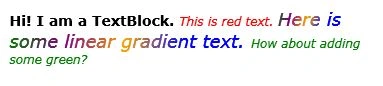
Listing 6 sets the Inlines property of the TextBlock and sets different fonts and foreground colors.
- <TextBlock.Inlines>
- <Run FontWeight="Bold" FontSize="14" Text="Hi! I am a TextBlock. " />
- <Run FontStyle="Italic" Foreground="Red" Text="This is red text. " />
- <Run FontStyle="Italic" FontSize="18" Text="Here is some linear gradient text. ">
- <Run.Foreground>
- <LinearGradientBrush>
- <GradientStop Color="Green" Offset="0.0" />
- <GradientStop Color="Purple" Offset="0.25" />
- <GradientStop Color="Orange" Offset="0.5" />
- <GradientStop Color="Blue" Offset="0.75" />
- </LinearGradientBrush>
- </Run.Foreground>
- </Run>
- <Run FontStyle="Italic" Foreground="Green" Text="How about adding some green? " />
- </TextBlock.Inlines>
Listing 6
The new output looks like Figure 3.
TextDecorations
The TextDecorations property represents the text decorations that are applied to the content of a TextBlock. WPF supports only underline text decoration.
Listing 7 sets the TextDecorations to underline.
- <TextBlock Name="TextBlock1"
- Margin="10,10,0,0" VerticalAlignment="Top"
- HorizontalAlignment="Left"
- FontSize="12" FontFamily="Verdana"
- TextWrapping="Wrap" TextAlignment="Left" Padding="2"
- TextDecorations="Underline">
Listing 7
The new output looks like Figure 4.
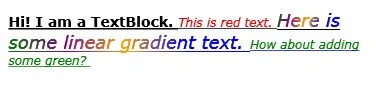
Figure 4
Background
The Background property represents the background color of a TextBlock. Listing 8 sets the Background property of a TextBlock to a LinearGradientBrush.
- <TextBlock.Background>
- <LinearGradientBrush StartPoint="0,0" EndPoint="1,1">
- <GradientStop Color="Blue" Offset="0.1" />
- <GradientStop Color="Orange" Offset="0.25" />
- <GradientStop Color="Green" Offset="0.75" />
- <GradientStop Color="Red" Offset="1.0" />
- </LinearGradientBrush>
- </TextBlock.Background>
Listing 7
The code snippet in Listing 8 sets an image as background of a TextBlock.
- <TextBlock.Background>
- <ImageBrush ImageSource="Garden.jpg" Opacity="0.6" />
- </TextBlock.Background>
Summary
In this article, I discussed how we can create and format a TextBlock control in WPF and C#. After that we saw how to create a TextBlock control dynamically. Then we saw how to set various properties of a TextBlock such as fonts, Inlines, and text decorations.
rahul kPosted Jun 28, 2019, 5:18 AM
Hi, how to set that text block should only display the maximum characters in a single line. if it exceeds 1st line it should show as "....". For showing as "..." we have TextTrimming="CharacterEllipsis" .
Abdul QureshiPosted Nov 15, 2018, 8:43 AM
Can we use TextBlock for editing or is it only for Display ?
Dim MaxPosted Jan 11, 2011, 3:13 AM
Hi, first of all, I want to thank all of you for your information. Also, I want to ask you (if you know of course) how to copy (with C#) the Text from a TextBlock to another TextBlock? Each TextBlock is found in different .xaml files. Thanks in advance!
harry thakraneditedPosted Jun 27, 2010, 1:46 PMEdited Jun 27, 2010, 1:46 PM
hi mahesh , i read ur artical on many site n u solve many problem in easiest way great sir, kp it up