

The Button control is one of the basic controls in WPF. A button is used to click and execute code on its click event handler. A button control can be represented at design-time using the XAML <Button> element. The Button class in C# represents the WPF button at run-time. This tutorial and code examples demonstrate how to create a button control, add a button control event handler, format a button control, and display an image in a button control using C# and XAML.
Creating a Button
The Button XAML element represents a WPF Button control.
- <Button/>
The code snippet in Listing 1 creates a Button control and sets the name, height, width and content of a Button control.
- <Button x:Name="DrawCircleButton" Height="40" Width="120"
- Content="Draw Circle" >
- </Button>
The default property of a button is Content. The following code snippet creates the same button as created by Listing 1.
- <Button x:Name="DrawCircleButton" Height="40" Width="120" >
- </Button>
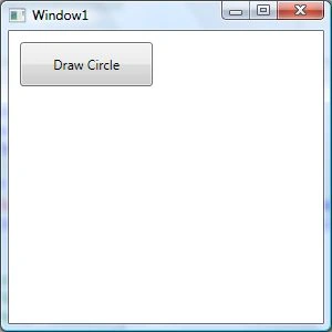
Figure 1
Positioning a Button
If you place a button on a Grid control, the button will be placed in the center of the Grid. If you are using a Canvas as your parent control of the Button, the Button will be placed in the left top corner of the Canvas.
You can use the Margin property to position a button control. If you are using a Canvas, you may also use Canvas.Left and Canvas.Top properties.
You may also use the VerticalAlignment and HorizontalAlignment attributes to set vertical alignment and horizontal alignment of a button.
The code snippet in Listing 2 sets the position of the Button control in the top-left corner of the page.
- <Button x:Name="DrawCircleButton" Height="40" Width="120"
- Canvas.Left="10" Canvas.Top="10"
- Content="Draw Circle"
- VerticalAlignment="Top"
- HorizontalAlignment="Left">
- </Button>
Adding a Button Click Event Handler
The Click attribute of the Button element adds the click event handler. The following code adds the click event handler for a Button.
- <Button x:Name="DrawCircleButton" Height="40" Width="120"
- Canvas.Left="10" Canvas.Top="10"
- Content="Draw Circle"
- VerticalAlignment="Top"
- HorizontalAlignment="Left">
- Click="DrawCircleButton_Click"
- </Button>
- private void DrawCircleButton_Click(object sender, RoutedEventArgs e)
- {
- }
- private void DrawCircleButton_Click(object sender, RoutedEventArgs e)
- {
- // creates a Circle
- Ellipse circle = new Ellipse();
- circle.Width = 200;
- circle.Height = 200;
- circle.Fill = new SolidColorBrush(Colors.Yellow);
- circle.Stroke = new SolidColorBrush(Colors.Black);
- circle.StrokeThickness = 4;
- LayoutRoot.Children.Add(circle);
- }
Formatting a Button
Not let's get a little creative. How about we create a Button control with a border formatting, background and foreground of the Button?
The BorderBrush property of the Button sets a brush to draw the border of a Button. You may use any brush to fill the border. The following code snippet uses a linear gradient brush to draw the border with a combination of red and blue color.
- <Button.BorderBrush>
- <LinearGradientBrush StartPoint="0,0" EndPoint="1,1" >
- <GradientStop Color="Blue" Offset="0" />
- <GradientStop Color="Red" Offset="1.0" />
- </LinearGradientBrush>
- </Button.BorderBrush>
- <Button.Background>
- <LinearGradientBrush StartPoint="0,0" EndPoint="1,1" >
- <GradientStop Color="Blue" Offset="0.1" />
- <GradientStop Color="Orange" Offset="0.25" />
- <GradientStop Color="Green" Offset="0.75" />
- <GradientStop Color="Red" Offset="1.0" />
- </LinearGradientBrush>
- </Button.Background>
- <Button.Foreground>
- <LinearGradientBrush StartPoint="0,0" EndPoint="1,1" >
- <GradientStop Color="Orange" Offset="0.25" />
- <GradientStop Color="Green" Offset="1.0" />
- </LinearGradientBrush>
- </Button.Foreground>
- <Window x:Class="ButtonSample.Window1"
- xmlns="http://schemas.microsoft.com/winfx/2006/xaml/presentation"
- xmlns:x="http://schemas.microsoft.com/winfx/2006/xaml"
- Title="Window1" Height="300" Width="300">
- <Canvas Name="LayoutRoot">
- <Button x:Name="DrawCircleButton" Height="40" Width="120"
- Canvas.Left="10" Canvas.Top="10" Click="DrawCircleButton_Click" >
- <Button.BorderBrush>
- <LinearGradientBrush StartPoint="0,0" EndPoint="1,1" >
- <GradientStop Color="Blue" Offset="0" />
- <GradientStop Color="Red" Offset="1.0" />
- </LinearGradientBrush>
- </Button.BorderBrush>
- <Button.Background>
- <LinearGradientBrush StartPoint="0,0" EndPoint="1,1" >
- <GradientStop Color="Blue" Offset="0.1" />
- <GradientStop Color="Orange" Offset="0.25" />
- <GradientStop Color="White" Offset="0.75" />
- <GradientStop Color="Red" Offset="1.0" />
- </LinearGradientBrush>
- </Button.Background>
- <Button.Foreground>
- <LinearGradientBrush StartPoint="0,0" EndPoint="1,1" >
- <GradientStop Color="Black" Offset="0.25" />
- <GradientStop Color="Green" Offset="1.0" />
- </LinearGradientBrush>
- </Button.Foreground>
- Draw Circle
- </Button>
- </Canvas>
- </Window>
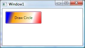
Figure 2
Mouse Rollover Formatting
How about giving some affects to your Button control when a mouse is over the Button and the mouse leaves the Button area? We can do this by adding MouseEnter and MouseLeave event handlers.
The following code snippet adds Mouse Enter and Mouse Leave event handlers.
- <Button x:Name="DrawCircleButton" Height="40" Width="120"
- Canvas.Left="10" Canvas.Top="10" Click="DrawCircleButton_Click"
- MouseEnter="DrawCircleButton_MouseEnter" MouseLeave="DrawCircleButton_MouseLeave">
- private void DrawCircleButton_MouseEnter(object sender, MouseEventArgs e)
- {
- DrawCircleButton.Background = new SolidColorBrush(Colors.Yellow );
- DrawCircleButton.Foreground = new SolidColorBrush(Colors.Green);
- }
- private void DrawCircleButton_MouseLeave(object sender, MouseEventArgs e)
- {
- DrawCircleButton.Background = new SolidColorBrush(Colors.Red);
- DrawCircleButton.Foreground = new SolidColorBrush(Colors.Purple);
- }
Setting Image as Background of a Button
To set an image as the background of a Button, we can set an image as the Background of the Button. The following code snippet sets the background of a Button to an image.
- <Button.Background>
- <ImageBrush ImageSource="dock.jpg" />
- </Button.Background>
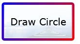
Figure 3
Creating a Button Dynamically
The code listed in Listing 5 creates a Button control programmatically. First, it creates a Button object and sets its width, height, contents, background and foreground and later the Button is added to the LayoutRoot.
- private void CreateAButton()
- {
- Button btn = new Button();
- btn.Height = 80;
- btn.Width = 150;
- btn.Content = "Click ME";
- btn.Background = new SolidColorBrush(Colors.Orange);
- btn.Foreground = new SolidColorBrush(Colors.Black);
- LayoutRoot.Children.Add(btn);
- }
Summary
In this article, I discussed how to create a Button control using XAML. We also saw how to format a Button by setting its border, background and foreground properties. Then, we showed how to set an image as the background of a Button. In the end of this article, we saw how to create a Button dynamically.
Join the conversation! Your thoughts help the community grow.