

This article will describe you how to set controls styles using triggers in WPF.
What is a trigger in WPF? WPF defines properties that correspond to end-user actions, such as the IsMouseOver property that is set to true when the user hovers the cursor over a UIElement or the corresponding IsMouseOver property of a ContentElement. Representing end-user actions in property values, along with the Trigger element, allows WPF styles to change property values based on those end-user actions, all from within markup.
First of all make a new WPF Project.
<Window x:Class="WpfTriggerExample.MainWindow"
xmlns="http://schemas.microsoft.com/winfx/2006/xaml/presentation"
xmlns:x="http://schemas.microsoft.com/winfx/2006/xaml"
Title="MainWindow" Height="350" Width="525">
<Window.Resources>
<Style x:Key="NormalStyle">
<Setter Property="Control.FontSize" Value="20"></Setter>
<Setter Property="Control.HorizontalAlignment" Value="Center"></Setter>
<Setter Property="Control.Margin" Value="10"></Setter>
<Setter Property="Control.Foreground" Value="Black"></Setter>
<Style.Triggers>
<Trigger Property="Control.IsMouseOver" Value="true">
<Setter Property="Control.FontStyle" Value="Italic"></Setter>
<Setter Property="Control.Foreground" Value="Red"></Setter>
<Setter Property="Control.Background" Value="Yellow"></Setter>
</Trigger>
<Trigger Property="Button.IsPressed" Value="true">
<Setter Property="Control.Foreground" Value="Green"></Setter>
<Setter Property="Control.Background" Value="Blue"></Setter>
</Trigger>
</Style.Triggers>
</Style>
</Window.Resources>
<Grid>
<Button Width="214" Style="{StaticResource
NormalStyle}" Margin="158,134,131,132" Content="WPF
Trigger Sample"></Button>
</Grid>
</Window>
Run the application:
When MouseOver button will look like this.
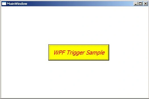
Image 1
When Button Pressed.
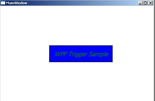
Image 2
Multi Trigger Example.
Represents a trigger that applies property values or performs actions when a set of conditions are satisfied.
<Window x:Class="WpfTriggerExample.MultiTriggerSample"
xmlns="http://schemas.microsoft.com/winfx/2006/xaml/presentation"
xmlns:x="http://schemas.microsoft.com/winfx/2006/xaml"
Title="MultiTriggerSample" Height="300" Width="300">
<Window.Resources>
<Style x:Key="NormalStyle">
<Setter Property="Control.FontSize" Value="20"></Setter>
<Setter Property="Control.HorizontalAlignment" Value="Center"></Setter>
<Setter Property="Control.Margin" Value="10"></Setter>
<Setter Property="Control.Foreground" Value="Black"></Setter>
<Style.Triggers>
<Trigger Property="Control.IsMouseOver" Value="true">
<Setter Property="Control.FontStyle" Value="Italic"></Setter>
<Setter Property="Control.Foreground" Value="Red"></Setter>
<Setter Property="Control.Background" Value="Yellow"></Setter>
</Trigger>
<MultiTrigger>
<MultiTrigger.Conditions>
<Condition Property="Control.IsMouseOver" Value="true"></Condition>
<Condition Property="Button.IsPressed" Value="false"></Condition>
</MultiTrigger.Conditions>
<Setter Property="Control.FontStyle" Value="Italic"></Setter>
<Setter Property="Control.Foreground" Value="Red"></Setter>
<Setter Property="Control.Background" Value="Yellow"></Setter>
</MultiTrigger>
</Style.Triggers>
</Style>
</Window.Resources>
<Grid>
<Button Style="{StaticResource
NormalStyle}" Content="WPF Multi Trigger Sample" Height="50" HorizontalAlignment="Left" Margin="12,84,0,0" Name="button1" VerticalAlignment="Top" Width="243"
/>
</Grid>
</Window>
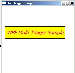
Image 3
Data Trigger Example:
Represents a trigger that applies property values or performs actions when the bound data meets a specified condition.
<Window x:Class="WpfTriggerExample.DataTriggerSample"
xmlns="http://schemas.microsoft.com/winfx/2006/xaml/presentation"
xmlns:x="http://schemas.microsoft.com/winfx/2006/xaml"
Title="DataTriggerSample" Height="300" Width="300">
<Window.Resources>
<Style TargetType="{x:Type Button}">
<Setter Property="Control.FontSize" Value="20"></Setter>
<Setter Property="Control.HorizontalAlignment" Value="Center"></Setter>
<Setter Property="Control.Margin" Value="10"></Setter>
<Setter Property="Control.Foreground" Value="Black"></Setter>
<Style.Triggers>
<DataTrigger Binding="{Binding ElementName=textBox1, Path=Text.Length}"
Value="0">
<Setter Property="IsEnabled" Value="False"></Setter>
</DataTrigger>
</Style.Triggers>
</Style>
</Window.Resources>
<Grid>
<Button Content="WPF
Data Trigger Style" Height="50"
HorizontalAlignment="Left" Margin="12,84,0,0" Name="button1" VerticalAlignment="Top" Width="243"
/>
<TextBox Height="23" HorizontalAlignment="Left" Margin="71,36,0,0" Name="textBox1" VerticalAlignment="Top" Width="120"
/>
</Grid>
</Window>
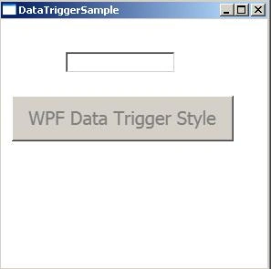
Image 4
Join the conversation! Your thoughts help the community grow.