

Introduction
In this article, we will learn about the CSS3 transform-origin property and will create a demo to understand how this property works. This property is a part of CSS3 and is not fully supported by all browsers so we need to use a browser-specific prefix with this property. This property comes in the following 3 variants:
- Transform origin with one value syntax\
- Transform origin with two value syntax\
- Transform origin with three value syntax
The value type of Transform Origin
This property accepts the following types of values:
- X-offset
It is an integer number given in pixels or in percentages, it describes the distance of the transformation origin from the left edge of the box. - offset-keyword
It is one of the keywords from the left, right, top, bottom or center describing the corresponding offset of the box. - Y-offset
It is an integer number given in pixels or in a percentage, it describes the distance of the transformation origin from the top edge of the box. - X-offset-keyword
It is chosen from one of the left, right or center keywords that describe the distance of the transform-origin from the chosen box edge. - Y-offset-keyword
It is chosen from one of the top, bottom or center keywords that describe the distance of the transform-origin from the chosen box edge. - Z- offset
It is a length given in pixels that describes how far from the user eye transformation origin is to be set. This value can't be set in a percentage as in X/Y offset.
In the preceding description the "left" keyword is equal to "0%", "center" is equal to "50%", "right" is equal to "100%" , "top" is equal to "0%" and "bottom" is the same as "100%".
Transform origin with one value syntax
In this variant, the origin is transformed in only one axis. This direction can be an X-axes or Y-axes but not both.
Syntax
transform-origin: x-offset
Ex. transform-origin: 100px;
transform-origin: offset-keyword
Ex. transform-origin: right;
Example 1
The HTML for this example is as follows:
- <div id="box">
- </div>
CSS
- #box{
- width:100px;
- height:100px;
- background-color:orange;
- margin:25%;
- border-top-left-radius:100px;
- -webkit-transition:all 0.5s;
- -webkit-transform-origin:top;
- }
- #box:hover{
- -webkit-transform:rotate(90deg);
- }
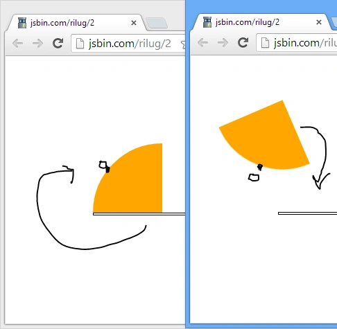
In this example the quarter circle rotates, keeping the origin at the top edge.
Output
Example 1.1
CSS
- #box{
- width:100px;
- height:100px;
- background-color:orange;
- margin:25%;
- border-top-left-radius:100px;
- -webkit-transition:all 2s;
- -webkit-transform-origin:200px;
- }
- #box:hover{
- -webkit-transform:rotate(720deg);
- }
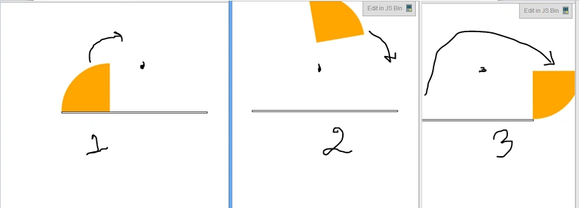
With the preceding CSS, the quarter circle will rotate by fixing the origin at a distance of 200px away from the left edge of the box.
Output
Transform origin with two value syntax
In this variant, the origin can be transferred to both axes with a different amount.
Syntax
- transform-origin: x-offset y-offset
- transform-origin: y-offset x-offset-keyword
- transform-origin: x-offset-keyword y-offset
- transform-origin: x-offset-keyword y-offset-keyword
- transform-origin: y-offset-keyword x-offset-keyword
Example 2
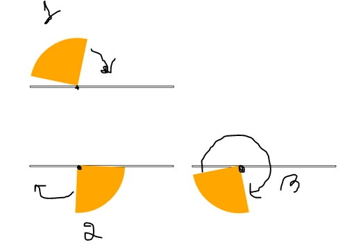
The HTML is the same as in Example 1, but the CSS has a few changes.
- #box{
- position:absolute;
- width:100px;
- height:100px;
- background-color:orange;
- margin:25%;
- border-top-left-radius:100px;
- -webkit-transition:all 2s;
- -webkit-transform-origin:100px 100px; <!-- X,Y -->
- }
- #box:hover{
- -webkit-transform:rotate(360deg);
- }
Output
Transform origin with three value syntax
With this syntax, we can translate the origin in all three axes with a different amount. It helps in making many 3D designs.
Syntax
- transform-origin: x-offset y-offset z-offset
- transform-origin: y-offset x-offset-keyword z-offset
- transform-origin: x-offset-keyword y-offset z-offset
- transform-origin: x-offset-keyword y-offset-keyword z-offset
- transform-origin: y-offset-keyword x-offset-keyword z-offset
Example 3
The HTML will remain the same as in Example 1 but the CSS has changed to accommodate a 3D view.
CSS
- body{
- -webkit-perspective:1000px;
- -webkit-perspective-origin:10px -400px;
- -webkit-transform:rotateY(45deg);
- }
- #box{
- position:absolute;
- width:100px;
- height:100px;
- background-color:orange;
- margin:25%;
- border-top-left-radius:100px;
- -webkit-transition:all 2s;
- -webkit-transform-origin:100px 100px 10px;
- -webkit-transform-style:preserve-3d;
- z-index:1;
- }
- #box:hover{
- -webkit-transform:rotateY(720deg);
- }
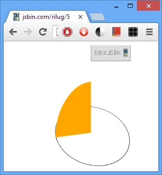
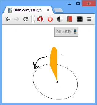
In the preceding example we have translated the origin at X=100px,Y=100px, Z=10px. To make the effect visible in 3D space we have added the perspective and "transform-style" property.
Output
Summary
That's all for this article. I hope you have enjoyed reading this article. This is one of the confusing properties of CSS3 but from now on you don't need to worry about it. In case of any doubts feel free to ask in the comments section.
Note: In case you are not running the Chrome browser you need to use your browser-specific prefix instead of -webkit-. Some of the prefixes are as follows:
- For mozilla use "-moz-"
- For IE use "-ms-"
- For Opera use "-o-"
Live Demo List
Join the conversation! Your thoughts help the community grow.