

Introduction
Google announced Material Design guidelines for Android apps last year and since then it has been adopted by many application developers. Google only issued guidelines to implement a Material theme. The material theme is available to Lollipop devices and no backward compatibility was provided, developers were dependent on libraries made by other developers. Last month Google released the Android Design Support Library that provides support for a large number of UI design components in a single library. I will be showing you how to use components in that library.
This article assumes that you have a basic understanding of Android and have done some development using Android Studio.
Let's start by creating a new Project with an Activity inside it. It will have an Activity with its respective layout, let's call it MainActivity.java and its layout file activity_main.xml.
My demo app has the target SDK version set to 22 and minimum SDK to 15.
Let's just add the design support library to our project first. The library already depends on support library v4 and v7, so you don't need to add them separately.
Add the following line to your dependencies in your app's build.gradle file.
- dependencies {
- ….
- compile 'com.android.support:design:22.2.0'
- …
- }
Then we will add a Drawer (Left Menu) to the main activity that is now a standard in a large number of applications.
Add the following lines of code to add a drawer to your app.
1. style.xml: Add these lines to your theme,
- <!-- your app branding color for the app bar -->
- <item name="colorPrimary">#512da8</item>
- <!-- darker variant for the status bar and contextual app bars -->
- <item name="colorPrimaryDark">#311b92</item>
- <!-- theme UI controls like checkboxes and text fields -->
- <item name="colorAccent">#7e57c2</item>
2. activity_main.xml: Add DrawerLayout as the base layout, then you can define 2 layouts inside it, one for the front layout and the other for the left menu layout.
- <android.support.v4.widget.DrawerLayout xmlns:android="http://schemas.android.com/apk/res/android"
- xmlns:app="http://schemas.android.com/apk/res-auto"
- android:id="@+id/drawer_layout"
- android:layout_height="match_parent"
- android:layout_width="match_parent">
- <FrameLayout
- android:id="@+id/content_frame"
- android:layout_width="match_parent"
- android:layout_height="match_parent" />
- <ListView android:id="@+id/left_drawer"
- android:layout_width="240dp"
- android:layout_height="match_parent"
- android:layout_gravity="start"
- android:choiceMode="singleChoice"
- android:divider="@android:color/transparent"
- android:dividerHeight="0dp"
- android:background="#ffffff"/>
- </android.support.v4.widget.DrawerLayout>
3. MainActivity.java: This is the basic code for getting the drawer layout and setting a ActionBarDrawerToggle button, this button opens and closes the drawer.
- public class MainActivity extends AppCompatActivity {
- private ActionBarDrawerToggle mDrawerToggle;
- private DrawerLayout mDrawerLayout;
- @Override
- protected void onCreate(Bundle savedInstanceState) {
- super.onCreate(savedInstanceState);
- setContentView(R.layout.activity_main);
- mDrawerLayout = (DrawerLayout)findViewById(R.id.drawer_layout);
- setTitle("Material Design Example");
- mDrawerToggle = new ActionBarDrawerToggle(this, mDrawerLayout, R.string.app_name, R.string.app_name);
- mDrawerLayout.setDrawerListener(mDrawerToggle);
- getSupportActionBar().setHomeButtonEnabled(true);
- getSupportActionBar().setDisplayHomeAsUpEnabled(true);
- }
- }
- @Override
- public boolean onCreateOptionsMenu(Menu menu) {
- // Inflate the menu; this adds items to the action bar if it is present.
- getMenuInflater().inflate(R.menu.menu_main, menu);
- return true;
- }
- @Override
- protected void onPostCreate(Bundle savedInstanceState) {
- super.onPostCreate(savedInstanceState);
- // Sync the toggle state after onRestoreInstanceState has occurred.
- mDrawerToggle.syncState();
- }
- @Override
- public void onConfigurationChanged(Configuration newConfig) {
- super.onConfigurationChanged(newConfig);
- mDrawerToggle.onConfigurationChanged(newConfig);
- }
- @Override
- public boolean onOptionsItemSelected(MenuItem item) {
- if (mDrawerToggle.onOptionsItemSelected(item)) {
- return true;
- }
- // Handle action bar item clicks here. The action bar will
- // automatically handle clicks on the Home/Up button, so long
- // as you specify a parent activity in AndroidManifest.xml.
- int id = item.getItemId();
- //noinspection SimplifiableIfStatement
- if (id == R.id.action_settings) {
- return true;
- }
- return super.onOptionsItemSelected(item);
- }
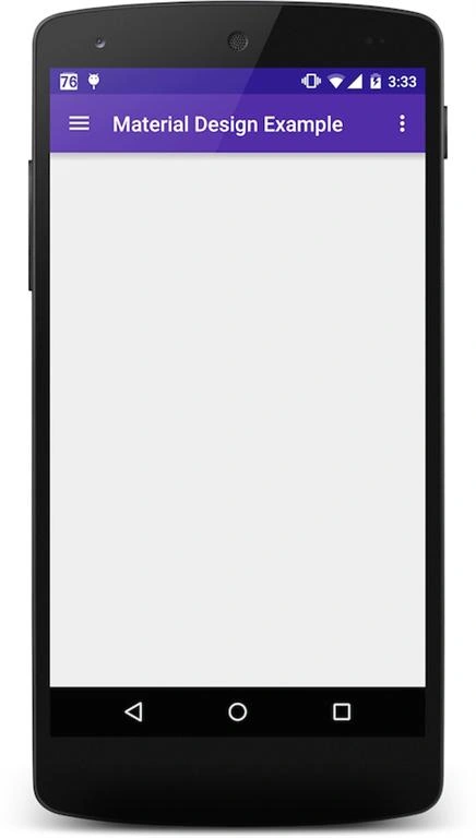
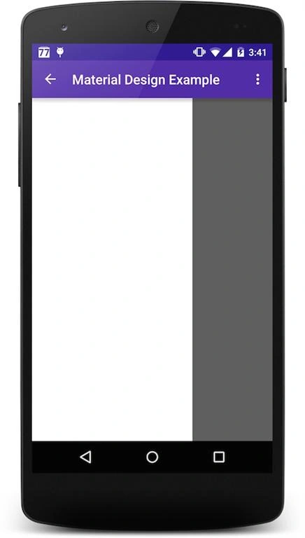
At this moment our app looks as in the following,
Now let's start with adding the new components.
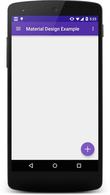
The first component we will add is the Floating Action Button (FAB). FAB is a small round button usually seen at the bottom-right corner of the screen, although they can be anywhere but need to be at the top of the screen all the time. FAB buttons should be used to promote an action like create, edit and so on. You don't need this button on every screen. For example, create a new mail button in the Gmail app.
There are the following two sizes for the FAB button:
-
Normal size (56dp): For most use cases.
-
Mini size (40dp): Only used if there are similarly sized buttons on the screen.
You can simply use the OnClickListener to get the click event of this button.
In the main.xml file, add the following code inside the frame to add a FAB button,
- <FrameLayout
- android:id="@+id/content_frame"
- android:layout_width="match_parent"
- android:layout_height="match_parent" >
- <android.support.design.widget.FloatingActionButton
- android:id="@+id/myFloatingActionButton"
- android:layout_width="wrap_content"
- android:layout_height="wrap_content"
- android:layout_gravity="bottom|right"
- android:src="@drawable/ic_plus"
- app:fabSize="normal" />
- </FrameLayout>
The ic_plus is a small image in the drawable folder.
This will add a FAB to the bottom-right of the screen. There is a bug in Android 5.0+ devices, the icon sticks to the bottom and Google developers already know this, so the fix is to add a margin of 16dp to API 21+ devices.
Add in values/dimens.xml
- <dimen name="fab_right_margin">0dp</dimen>
- <dimen name="fab_bottom_margin">0dp</dimen>
Values-v21/dimens.xml
- <dimen name="fab_right_margin">16dp</dimen>
- <dimen name="fab_bottom_margin">16dp</dimen>
In activity_main.xml add this,
- <android.support.design.widget.FloatingActionButton
- …
- android:layout_marginRight="@dimen/fab_right_margin"
- android:layout_marginBottom="@dimen/fab_bottom_margin"/>
This is fixed but there is another bug, the shadow doesn't appear so we will just add a workaround.
In activity_main.xml,
- <android.support.design.widget.FloatingActionButton
- …
- app:borderWidth="0dp"/>
This is how our app looks as of now.
Now let's add the second component SnackBar. Snackbar is a small view that shows a message and we can also add an action to it. The snack bar is like a toast that dismisses itself after some time, we can also add an action to it which shows on its right side. We can also swipe dismiss a Snackbar, unlike a toast. The syntax is also similar to a Toast.
Let's add it to the click event of FAB that we added earlier,
- private FloatingActionButton mFloatingActionButton;
- @Override
- protected void onCreate(Bundle savedInstanceState) {
- …
- mFloatingActionButton = (FloatingActionButton)findViewById(R.id.myFloatingActionButton);
- mFloatingActionButton.setOnClickListener(new View.OnClickListener() {
- @Override
- public void onClick(View v) {
- Snackbar.make(v, "This is a snackbar", Snackbar.LENGTH_SHORT)
- .setAction("Ok", new View.OnClickListener() {
- @Override
- public void onClick(View v) {
- }
- })
- .show();
- }
- });
- }
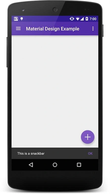
This is the result.
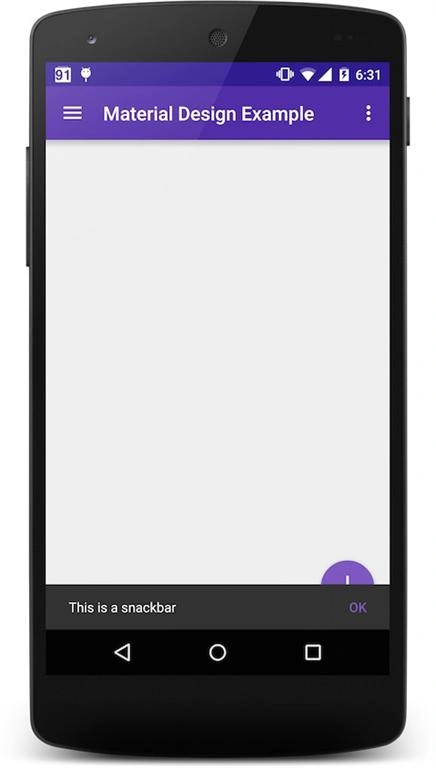
The snack bar here overlays the FAB. Although this is normal behavior, a FAB and SnackBar can work together. FAB can move up when the SnackBar shows. This can be done by our next component.
Coordinator Layout is a layout that provides an additional level of control over touch events between child views, something that many components in the Design library take advantage of. It will be of greater use later on when we add more components.
We will change the frame layout to CoordinatorLayout in the activity_main.xml file.
- <android.support.design.widget.CoordinatorLayout
- android:id="@+id/content_frame"
- android:layout_width="match_parent"
- android:layout_height="match_parent" >
- <android.support.design.widget.FloatingActionButton
- … />
- </android.support.design.widget.CoordinatorLayout>
This will make the FAB move up with SnackBar. But there is a new bug here, when I swiped the SnackBar, the FAB doesn't come down. We will find a fix for it later.
Here is the final result.
Summary
There are many other components that I will describe in later articles. So please wait until I add more components that are more visually appealing tha the ones we have discussed here.
Neeraj KumarPosted Jul 3, 2015, 2:55 PM
Gr8
Santhakumar MunuswamyPosted Jul 3, 2015, 2:29 PM
Thanks for nice article.:)