

Microsoft Power BI allows developers to use the declarative JSON syntax of the Vega or Vega-Lite languages to create highly customizable visuals. Vega and Vega-Lite are both languages for describing interactive data visualizations.
Here is a step-by-step guide for creating a custom visual in Power BI using the Deneb Vega-Lite custom visual.
- Install the Deneb custom visual directly from Power BI.
- Open Power BI and create a new report.
- Click on the "Visualizations" pane on the screen.
- Click on the "Get more visuals" button.
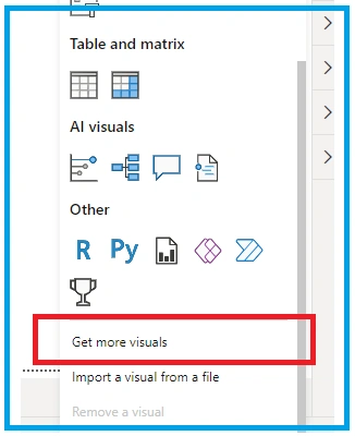
- Select "Deneb" from the list of custom visuals.
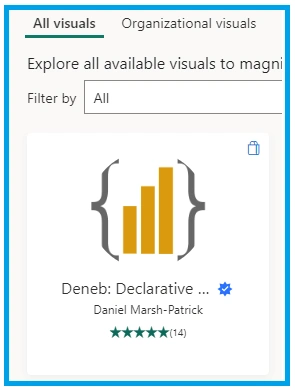
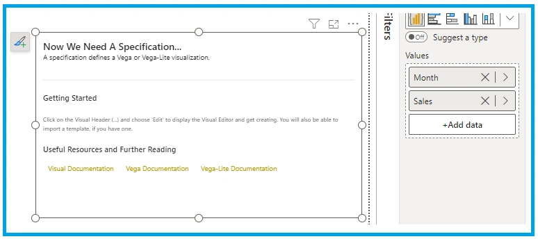
- Drag and drop the Deneb visual onto the report canvas.
- Click on the Deneb visual to select it.
- In the "Visualizations" pane, click on the "Fields" button to add data to the visual.
- Drag and drop the desired data fields onto the appropriate areas of the visual (e.g. "Values" for the y-axis, "Category" for the x-axis).
- Customize the visual using the Deneb interface. This can include changing the chart type, adding titles and labels, and adjusting the color scheme.
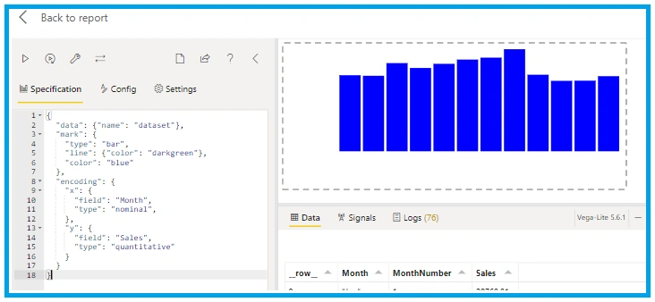
{
  "data": {
    "name": "dataset"
  },
  "mark": {
    "type": "bar",
    "line": {
      "color": "darkgreen"
    },
    "color": "blue"
  },
  "encoding": {
    "x": {
      "field": "Month",
      "type": "nominal"
    },
    "y": {
      "field": "Sales",
      "type": "quantitative"
    }
  }
}
Now we will start advanced configuration.
For the Sorting, we will use.
"sort": {"field": "MonthNumber", "order": "asc" }
For the tooltip
{
  "tooltip": [
    {
      "field": "Month",
      "type": "nominal"
    },
    {
      "field": "Sales",
      "type": "quantitative"
    }
  ],
  "color": {
    "x1": 1,
    "y1": 1,
    "x2": 1,
    "y2": 0,
    "gradient": "linear",
    "stops": [
      { "offset": 0, "color": "#000000" },
      { "offset": 1, "color": "Yellow" }
    ]
  }
}
Below are some images of the gradient bar chart.
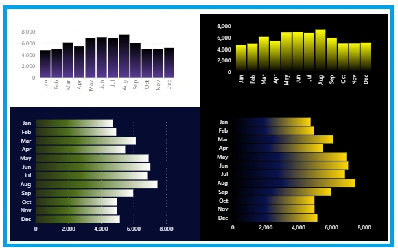
Please note that the exact steps and options may change based on Power BI updates and the specific version you are using. Always refer to the latest Power BI documentation or resources for the most up-to-date information on creating custom Vega-Lite visualizations in Power BI.
Join the conversation! Your thoughts help the community grow.