

A ColorPicker control is a new control in UWP programming. ColorPicker control allows the user to select the colors from the color spectrum or specify a color in RGB format.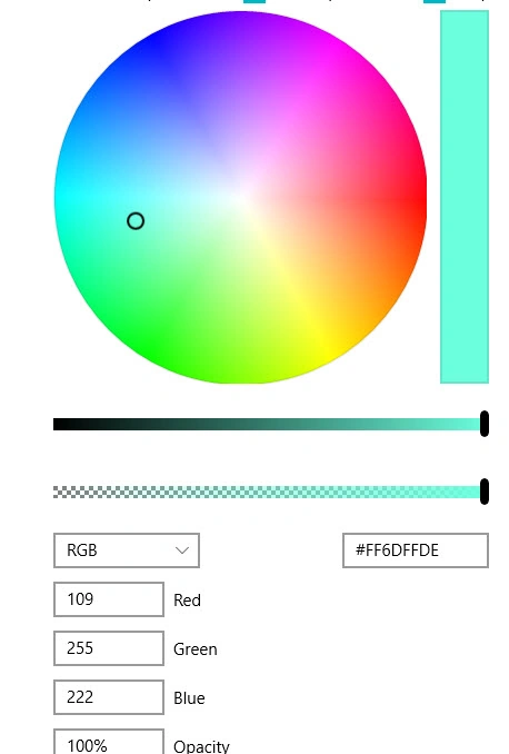
Note
This control will be supported on Windows Insider latest build version, public version will be available October 17 (Windows 10 fall creators update version) onwards.
Let’s see how to implement this control and some of the important properties and the events.
ColorSpectrumShape
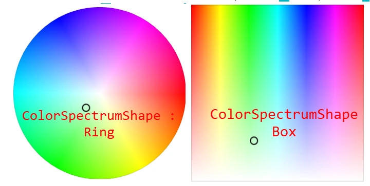
ColorSpectrumShape: This property is used to select the display(shape) style of the control, right now two styles are available: Box and Ring. Based on the style , the control will be display edto the GUI. The below images showRing and Box style format.
IsColorPreviewVisible
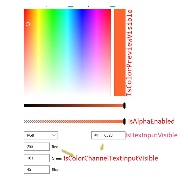
This property is used to show the preview of the color which user selects. If the mouse moves in the color spectrum control, the right side (Rectangle) box color will change.
IsColorChannelTextInputVisible
This property is used to show the RGB value to the user or get the input value from the user. Move the mouse on the color spectrum color value changes automatically to RGB value and displays in the RGB area. In other ways user can enter the RGB value, based on the RGB color value, it will display in the color spectrum area.( RGB area ref below image) .
IsHexInputVisible
This property is used to show the color value as a Hexadecimal (ref below image) value . This property depends on the IsColorChannelTextInputVisible ( set as false , IsHexInputVisiable also it won't display to the user).
ColorChanged Event
- private void CtrlPicker_OnColorChanged(ColorPicker sender, ColorChangedEventArgs args)
- {
- }
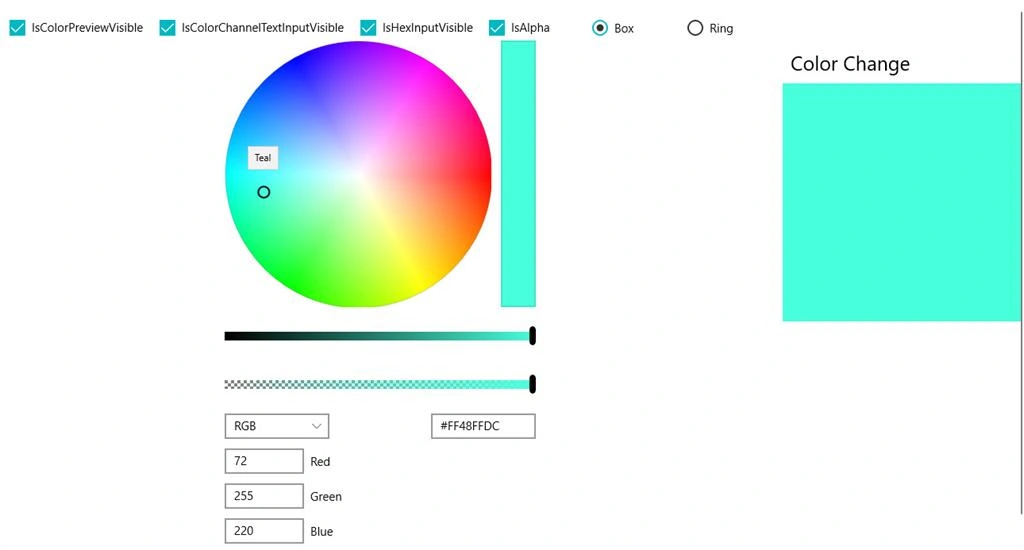
Let's see a simple example: When the color value is changing, it automatically changes the rectangle box color
System Requirements
- Windows 10 Insider Build latest
- Windows 10 Insider latest SDK
- Visual Studio 2017
XAML code changes
- <Page
- x:Class="FallCreatorUpdate.Views.ColorCtrl"
- xmlns="http://schemas.microsoft.com/winfx/2006/xaml/presentation"
- xmlns:x="http://schemas.microsoft.com/winfx/2006/xaml"
- xmlns:local="using:FallCreatorUpdate.Views"
- xmlns:d="http://schemas.microsoft.com/expression/blend/2008"
- xmlns:mc="http://schemas.openxmlformats.org/markup-compatibility/2006"
- mc:Ignorable="d">
- <ScrollViewer HorizontalScrollBarVisibility="Auto" VerticalScrollBarVisibility="Auto">
- <Grid Background="{ThemeResource ApplicationPageBackgroundThemeBrush}">
- <Grid.RowDefinitions>
- <RowDefinition Height="Auto"/>
- <RowDefinition Height="Auto"/>
- <RowDefinition Height="Auto"/>
- </Grid.RowDefinitions>
- <Grid.ColumnDefinitions>
- <ColumnDefinition Width="Auto"/>
- <ColumnDefinition Width="Auto"/>
- </Grid.ColumnDefinitions>
- <StackPanel Grid.Row="0" Margin="20,10,0,0" Orientation="Horizontal" Grid.Column="0">
- <CheckBox Name="ChkColorPreview" Content="IsColorPreviewVisible" Margin="20,10,0,0" IsChecked="True"/>
- <CheckBox Name="ChkColorTextInput" Content="IsColorChannelTextInputVisible"
- Margin="20,10,0,0" IsChecked="True"/>
- <CheckBox Name="ChkColorHexInput" Content="IsHexInputVisible" Margin="20,10,0,0" IsChecked="True"/>
- <CheckBox Name="ChkAlpha" Content="IsAlpha" Margin="20,10,0,0" IsChecked="True"/>
- <StackPanel Margin="10,10,0,0" Orientation="Horizontal">
- <RadioButton GroupName="CtlStyle" Content="Box" Tag="1" Click="ButtonBase_OnClick" IsChecked="True"/>
- <RadioButton GroupName="CtlStyle" Content="Ring" Tag="2" Click="ButtonBase_OnClick"/>
- </StackPanel>
- </StackPanel>
- <ColorPicker Name="CtrlPicker" Grid.Row="1" Grid.Column="0" ColorSpectrumShape="Ring"
- IsAlphaEnabled="{Binding ElementName=ChkAlpha,Path=IsChecked}"
- IsColorPreviewVisible="{Binding ElementName=ChkColorPreview,Path=IsChecked}"
- IsHexInputVisible="{Binding ElementName=ChkColorHexInput ,Path=IsChecked}"
- IsColorChannelTextInputVisible="{Binding ElementName=ChkColorTextInput,Path=IsChecked}"
- ColorChanged="CtrlPicker_OnColorChanged"/>
- <StackPanel Grid.Row="1" Grid.Column="1">
- <StackPanel Orientation="Vertical">
- <TextBlock Text="Color Change" FontSize="25" Margin="10,10,10,10"/>
- <Rectangle Name="NewRectColor" Width="300" Height="300" Fill="Brown"/>
- </StackPanel>
- </StackPanel>
- </Grid>
- </ScrollViewer>
- </Page>
- using System;
- using System.Collections.Generic;
- using System.IO;
- using System.Linq;
- using System.Runtime.InteropServices.WindowsRuntime;
- using Windows.Foundation;
- using Windows.Foundation.Collections;
- using Windows.UI.Xaml;
- using Windows.UI.Xaml.Controls;
- using Windows.UI.Xaml.Controls.Primitives;
- using Windows.UI.Xaml.Data;
- using Windows.UI.Xaml.Input;
- using Windows.UI.Xaml.Media;
- using Windows.UI.Xaml.Navigation;
- // The Blank Page item template is documented at https://go.microsoft.com/fwlink/?LinkId=234238
- namespace FallCreatorUpdate.Views
- {
- /// <summary>
- /// An empty page that can be used on its own or navigated to within a Frame.
- /// </summary>
- public sealed partial class ColorCtrl : Page
- {
- public ColorCtrl()
- {
- this.InitializeComponent();
- }
- private void ButtonBase_OnClick(object sender, RoutedEventArgs e)
- {
- if (sender is RadioButton)
- {
- var ctrInfo = (RadioButton) sender;
- int val = Convert.ToInt32(ctrInfo.Tag);
- if (val == 1)
- {
- CtrlPicker.ColorSpectrumShape = ColorSpectrumShape.Box;
- }
- if (val == 2)
- {
- CtrlPicker.ColorSpectrumShape = ColorSpectrumShape.Ring;
- }
- }
- }
- private void CtrlPicker_OnColorChanged(ColorPicker sender, ColorChangedEventArgs args)
- {
- NewRectColor.Fill = new SolidColorBrush(args.NewColor);
- }
- }
- }
- <ColorPicker Name="CtrlPicker" Grid.Row="1" Grid.Column="0" ColorSpectrumShape="Ring"
- IsAlphaEnabled="{Binding ElementName=ChkAlpha,Path=IsChecked}"
- IsColorPreviewVisible="{Binding ElementName=ChkColorPreview,Path=IsChecked}"
- IsHexInputVisible="{Binding ElementName=ChkColorHexInput ,Path=IsChecked}"
- IsColorChannelTextInputVisible="{Binding ElementName=ChkColorTextInput,Path=IsChecked}"/>
- Binding color into the Rectangle box
- <Rectangle Name="NewRectColor" Width="300" Height="300">
- <Rectangle.Fill>
- <SolidColorBrush Color="{x:Bind CtrlPicker.Color,Mode=OneWay}"/>
- </Rectangle.Fill>
- </Rectangle>
I hope you understood how to use Color picker control.
Join the conversation! Your thoughts help the community grow.