

Introduction
Portal is a concept in React where we can bind something outside of parent element. Usually reactdom works with everything within the root-element. Sometimes there is a use case where we have to bind something outside rootelement like modals or tooltip (because there is no need to render the whole component when the popup opens).
Basic syntax with example in index. html:
- <div id="app-root"></div>
- <div id="modal-root"></div>
In your tsx file:
- const appRoot = document.getElementById('app-root');
- const modalRoot = document.getElementById('modal-root');
- class Modal extends React.Component {
- constructor(props) {
- super(props);
- this.el = document.createElement('div');
- }
- componentDidMount() {
- modalRoot.appendChild(this.el);
- }
- componentWillUnmount() {
- modalRoot.removeChild(this.el);
- }
- render() {
- return ReactDOM.createPortal(
- this.props.children,
- this.el
- );
- }
- }
- class Parent extends React.Component {
- constructor(props) {
- super(props);
- this.state = {clicks: 0};
- this.handleClick = this.handleClick.bind(this);
- }
- handleClick() {
- this.setState(state => ({
- clicks: state.clicks + 1
- }));
- }
- render() {
- return (
- <div onClick={this.handleClick}>
- <Modal>
- <Child />
- </Modal>
- </div>
- );
- }
- }
- function Child() {
- return (
- <div className="modal">
- <button>Click</button>
- </div>
- );
- }
- ReactDOM.render(<Parent />, appRoot);
Usually the child element is boundd inside the parent element, but in the above example although the child component model and child are present inside parent component it will bind in the element id model-root, rather than app-root.
Now we are going to look at the the third party plugin present in npm repository to create an efficient portal concept in React component. Since this plugin is written in React hooks, it will support a higher version that the 16.8 React version.
React Cool Portal is the name of the plugin:
- npm i react-cool-portal
- const { Portal } = usePortal({ containerId: "my-portal-root" });
- <Portal>
- <p>Now I am rendered into the specify element (id="my-portal-root").</p>
- </Portal>
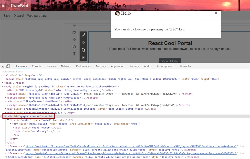
The above code will not bind on the root element of the component. Instead it will create a new id at the end of root component and bind there. If we fail to mention containerid, it will generate default containerid with the name react-cool-portal.
Let's see in our spfx example
Steps
Open a command prompt and create a directory for the SPFx solution.
md spfx-ReactPortal
Navigate to the above created directory.
cd spfx-ReactPortal
Run the Yeoman SharePoint Generator to create the solution.
yo @microsoft/sharepoint
Solution Name
Hit Enter for the default name (spfx-ReactPortal in this case) or type in any other name for your solution.
Selected choice - Hit Enter
Target for the component
Here, we can select the target environment where we are planning to deploy the client web part; i.e., SharePoint Online or SharePoint OnPremise (SharePoint 2016 onwards).
Selected choice - SharePoint Online only (latest).
Place of files
We may choose to use the same folder or create a subfolder for our solution.
Selected choice - same folder.
Deployment option
Selecting Y will allow the app to be deployed instantly to all sites and be accessible everywhere.
Selected choice - N (install on each site explicitly).
Permissions to access web APIs
Choose if the components in the solution require permission to access web APIs that are unique and not shared with other components in the tenant.
Selected choice - N (solution contains unique permissions)
Type of client-side component to create
We can choose to create a client-side web part or an extension. Choose the web part option.
Selected choice - WebPart
Web part name
Hit Enter to select the default name or type in any other name.
Selected choice - ReactPortal
Web part description
Hit Enter to select the default description or type in any other value.
Framework to use
Select any JavaScript framework to develop the component. Available choices are - No JavaScript Framework, React, and Knockout.
Selected choice - React
The Yeoman generator will perform a scaffolding process to generate the solution. The scaffolding process will take a significant amount of time.
Once the scaffolding process is completed, lock down the version of project dependencies by running the below command:
npm shrinkwrap
In the command prompt, type the below command to open the solution in the code editor of your choice.
NPM Packages used,
- npm i react-cool-portal
- import * as React from 'react';
- import { IReactPortalProps } from './IReactPortalProps';
- import Myportal from "./Myportal";
- export default class ReactPortal extends React.Component<IReactPortalProps, {}> {
- public render(): React.ReactElement<IReactPortalProps> {
- return (
- <div >
- <Myportal/>
- </div>
- );
- }
- }
- import* as React from "react";
- import usePortal from "react-cool-portal";
- import "./mystyle.scss";
- const Myportal = () => {
- // const { Portal } = usePortal({ containerId: "my-portal-root" });
- const { Portal, show, hide } = usePortal({ defaultShow: false,containerId:"my-portal-root" });
- const handleClickBackdrop = (e: React.MouseEvent) => {
- const { id } = e.target as HTMLDivElement;
- if (id === "modal") hide();
- };
- return (
- <div className="App">
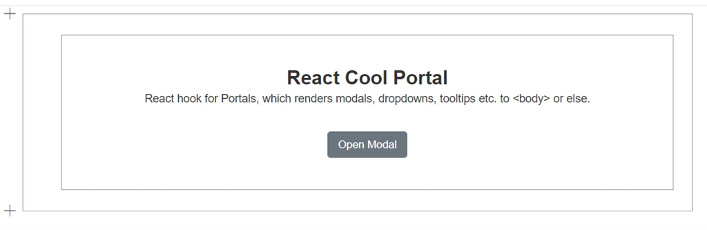
- <h1 className="title">React Cool Portal</h1>
- <p className="subtitle">
- {
- "React hook for Portals, which renders modals, dropdowns, tooltips etc. to <body> or else."
- }
- </p>
- <button className="btn" onClick={show} type="button">
- Open Modal
- </button>
- <Portal>
- <div
- id="modal"
- className="modal"
- onClick={handleClickBackdrop}
- tabIndex={-1}
- >
- <div
- className="modal-dialog"
- role="dialog"
- aria-labelledby="modal-label"
- aria-modal="true"
- >
- <div className="modal-header">
- <h5 id="modal-label" className="modal-title">
- <span role="img" aria-label="Hello">
- 👋🏻
- </span>{" "}
- Hola
- </h5>
- <button
- className="modal-close"
- onClick={hide}
- type="button"
- aria-label="Close"
- >
- <span aria-hidden="true">×</span>
- </button>
- </div>
- <div className="modal-body">
- <p>You can also close me by pressing the "ESC" key.</p>
- </div>
- </div>
- </div>
- </Portal>
- </div>
- );
- };
- export default Myportal;
- .App {
- font-family: sans-serif;
- padding: 2rem 1rem;
- text-align: center;
- }
- .title {
- margin: 0 0 0.25rem;
- font-size: 1.5rem;
- }
- .subtitle {
- margin: 0 0 2rem;
- }
- .btn {
- padding: 0.375rem 0.75rem;
- border: 1px solid transparent;
- border-color: #6c757d;
- border-radius: 0.25rem;
- line-height: 1.5;
- color: #fff;
- background: #6c757d;
- cursor: pointer;
- user-select: none;
- transition: color 0.15s ease-in-out, background-color 0.15s ease-in-out,
- border-color 0.15s ease-in-out, box-shadow 0.15s ease-in-out;
- &:hover {
- border-color: #545b62;
- background: #5a6268;
- }
- &:focus {
- outline: none;
- box-shadow: 0 0 0 0.2rem rgba(130, 138, 145, 0.5);
- }
- }
- .modal {
- position: fixed;
- top: 0;
- width: 100%;
- height: 100%;
- background: rgba(0, 0, 0, 0.5);
- .modal-dialog {
- margin: 1.75rem auto;
- width: 90%;
- max-width: 500px;
- background: #fff;
- background-clip: padding-box;
- border: 1px solid rgba(0, 0, 0, 0.2);
- border-radius: 0.3rem;
- }
- .modal-header {
- display: flex;
- justify-content: space-between;
- align-items: center;
- padding: 1rem;
- border-bottom: 1px solid #dee2e6;
- .modal-title {
- margin: 0;
- font-size: 1.25rem;
- font-weight: 500;
- line-height: 1.5;
- }
- .modal-close {
- margin: -1rem -1rem -1rem;
- padding: 1rem;
- border: none;
- font-size: 1.5rem;
- font-weight: 700;
- line-height: 1;
- color: #000;
- background: inherit;
- text-shadow: 0 1px 0 #fff;
- opacity: 0.5;
- cursor: pointer;
- &:hover {
- opacity: 0.75;
- }
- }
- }
- .modal-body {
- padding: 1rem;
- }
- }
We can also handle events like close and open with the following code snippet:
- const { Portal, isShow, show, hide, toggle } = usePortal({
- defaultShow: false, // The default visibility of portal, default is true
- onShow: (e) => {
- // Triggered when portal is shown
- // The event object will be the parameter of "show(e?)"
- },
- onHide: (e) => {
- // Triggered when portal is hidden
- // The event object will be the parameter of "hide(e?)", it maybe MouseEvent (on clicks outside) or KeyboardEvent (press ESC key)
- }, });
Properties
| Key | Type | Default | Description |
| containerId | string | react-cool-portal | You can specify the container of portal you want by setting it as the id of the DOM element. |
| defaultShow | boolean | TRUE | The initial show/hide state of the portal. |
| clickOutsideToHide | boolean | TRUE | Hide the portal by clicking outside of it. |
| escToHide | boolean | TRUE | Hide the portal by pressing ESC key. |
| internalShowHide | boolean | TRUE | Enable/disable the built-in show/hide portal functions, which gives you a flexible way to handle your portal. |
| onShow | function | Triggered when portal is shown or the isShow set to true. | |
| onHide | function | Triggered when portal is hidden or the isShow set to false. |
Return objects
| Key | Type | Default | Description |
| Portal | component | FALSE | Renders children into a DOM node that exists outside the DOM hierarchy of the parent component. |
| isShow | boolean | The show/hide state of portal. | |
| show | function | To show the portal or set the isShow as true. | |
| hide | function | To hide the portal or set the isShow as false. | |
| toggle | function | To toggle (show/hide) the portal or set the isShow as true/false. |
Conclusion
In this article, we learned how to implement Portal concept of React in SPFX webpart. I hope this helps someone. Happy coding :)
Join the conversation! Your thoughts help the community grow.