

In this article, I'll cover How to create a custom date picker in material-ui
I have already explained How to Integrate the Material-UI with the React JS link here.
- How to Integrate the Material-UI with React JS
- Create a Material-UI Custom Select Component with React js.
- How to Integrate the Material-UI with React JS
If you're a beginner, I highly recommend referring to the How to Integrate Material-UI with React.js article. It provides a step-by-step guide to setting up a React.js application with Material-UI. The article covers everything from configuring the Node.js environment and creating a new React app using create-react-app to installing Material-UI, Google Web Fonts, and Font Icons. Each step is explained in detail with clear instructions and illustrations.
Create a custom date picker
Now, I will explain how to create a custom date picker in material-ui.
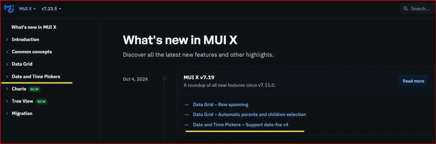
Material-UI X V7.22.5
Click on the Date and Time Pickers.
Click on the Date Component
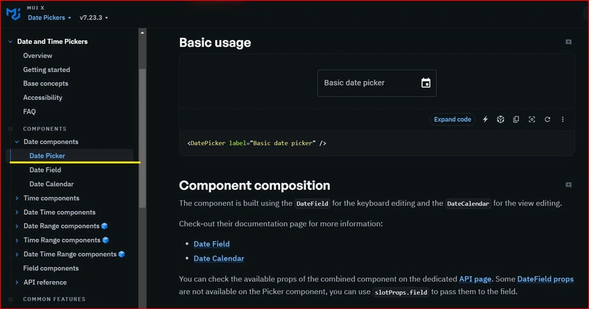
Material-UI X -DatePicker
Material-UI (MUI) DatePicker
If you're using Material-UI, its DatePicker component is a common choice.
The @mui/x-date-pickers library requires a specific version of date-fns. Ensure you install it as a dependency.
npm install @mui/x-date-pickers
npm install date-fns

npm install date-fns@latest
In your project directory, navigate to the src folder and create a new folder named Mui_Component.
Inside the Mui_Component folder, create the CustomDatePicker.jsx, and define your component using either function.
import * as React from 'react';
import { LocalizationProvider } from '@mui/x-date-pickers/LocalizationProvider';
import { AdapterDateFns } from '@mui/x-date-pickers/AdapterDateFns';
import { DatePicker } from '@mui/x-date-pickers/DatePicker';
import TextField from '@mui/material/TextField';


export default function BasicDatePicker({ selectedDate, setSelectedDate, Picker_name }) {
  return (
    <LocalizationProvider dateAdapter={AdapterDateFns}>
      <DatePicker
        label={Picker_name}
        value={selectedDate}
        onChange={(newValue) => setSelectedDate(newValue)}
        renderInput={(params) => <TextField {...params} />}
      />
    </LocalizationProvider>
  );
}
Mui_Component folder, and the CustomBasicDatePicker.jsx page created
App. js page
import { useState } from 'react';
import './App.css';
import BasicDatePicker from './Mui_Component/CustomBasicDatePicker';
import { format } from 'date-fns';

function App() {

  const [selectedDate, setSelectedDate] = useState(null);

  return (
    <div className="App">
      <div className="App-header">
        <div><h5>{"MUI- Basic Date Picker"}</h5></div>
      <BasicDatePicker
          selectedDate={selectedDate}
          setSelectedDate={setSelectedDate}
          Picker_name="Select a date"
        />
         <h6>{selectedDate ? format(new Date(selectedDate), 'dd-MM-yyyy') : 'No date selected'}</h6>
      </div>

    </div>
  );
}

export default App;
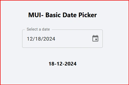
Mui BasicDatePicker
Now I'm going to customize this DatePicker.
Customise MUI DatePicker with AdapterDayjs
Material-UI (MUI) provides powerful components, including a DatePicker, to enhance React applications. This guide covers how to install and use MUI's DatePicker with AdapterDayjs, along with customisation options for a better user experience.
1. Installing Dependencies
To use MUI DatePicker, you need to install the required dependencies. Run the following command in your React project:
npm install @mui/x-date-pickers dayjs
2. Importing Required Components
Before using the DatePicker, import the necessary components in your React file:
import React from "react";
import { IconButton, Stack } from "@mui/material";
import { DatePicker } from "@mui/x-date-pickers/DatePicker";
import { LocalizationProvider } from "@mui/x-date-pickers/LocalizationProvider";
import { AdapterDayjs } from "@mui/x-date-pickers/AdapterDayjs";
import ClearIcon from "@mui/icons-material/Clear";
3. Modify my previous Basic DatePicker Component
Below is a simple modified DatePicker implementation with props, along with the updated App.js page.
import React from "react";
import { IconButton, Stack } from "@mui/material";
import { DatePicker } from "@mui/x-date-pickers/DatePicker";
import { LocalizationProvider } from "@mui/x-date-pickers/LocalizationProvider";
import { AdapterDayjs } from "@mui/x-date-pickers/AdapterDayjs";
import ClearIcon from "@mui/icons-material/Clear";

const CustomDatePicker = ({
    selectedDate,
    onChange,
    label,
    onClick
}) => {

  return (
    <LocalizationProvider dateAdapter={AdapterDayjs}>
      <Stack direction="row" spacing={1} alignItems="center">
        <DatePicker
          label={label}
          value={selectedDate}
          onChange={(newValue) => onChange(newValue)}
          slotProps={{
            textField: { fullWidth: true },
          }}
        />
        {selectedDate && (
          <IconButton onClick={onClick}>
            <ClearIcon />
          </IconButton>
        )}
      </Stack>
    </LocalizationProvider>
  );
};

export default CustomDatePicker;
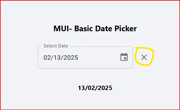
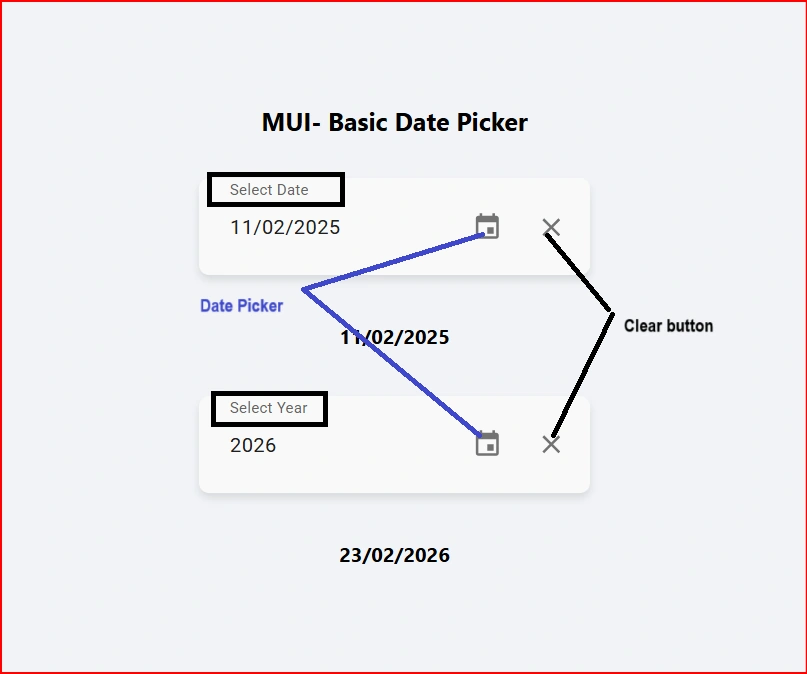
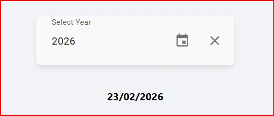
Now we added a Clear Icon and clear state
{selectedDate && (
          <IconButton onClick={onClick}>
            <ClearIcon />
          </IconButton>
        )}
update APP.js also.
import { useState } from "react";
import "./App.css";
import CustomDatePicker from "./Mui_Component/BasicDatePicker";
import { format } from "date-fns";

function App() {
  const [selectedDate, setSelectedDate] = useState(null);

  const handleValueChange = (newDate) => {
      setSelectedDate(newDate);
  };

  const handleClear = () => {
    setSelectedDate(null);
  };

  return (
    <div className="App">
      <div className="App-header">
        <div>
          <h5>{"MUI- Basic Date Picker"}</h5>
        </div>
        <div>
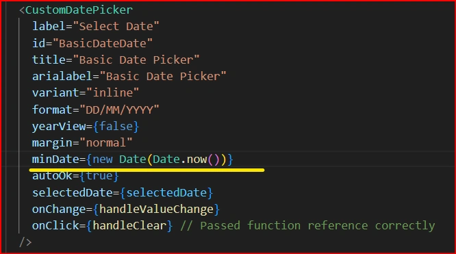
          <CustomDatePicker
            label="Select Date"
            selectedDate={selectedDate}
            onChange={handleValueChange}
            onClick={handleClear}
          />
          <h6>
            {selectedDate
              ? format(new Date(selectedDate), "dd/MM/yyyy")
              : "No date selected"}
          </h6>
        </div>
      </div>
    </div>
  );
}

export default App;
Shashank SoodPosted May 16, 2025, 7:42 AM
Its important to mention that -date-pickers can be used if you have license key for it as it is not for free