

Introduction
In this article we are going to learn how to create a progress bar using ngx-bootstrap in Angular 8.
Ngx-Bootstrap has released a package of open-source tools which is native Angular directives for Bootstrap 3 and 4. It contains all core components powered by Angular. In this article we will learn about Typehead component which is a cool feature of Ngx-bootstrap.
What is Progress Bar?
A Progress bar is a component in GUI which is used to visualize the progression of a task which is completed, such as the percentage of amount that is completed during downloading.
In Ngx-bootstrap progressbar there are normal, striped and striped with animated striped progress bar.
Prerequisites
- Basic knowledge of Angular
- Visual Studio Code must be installed
- Angular CLI must be installed
- Node JS must be installed
Step 1
- ng new progressBar
Step 2
Now, let's create a new component by using the following command,
ng g c ngx-bootstrap-progressbar
Step 3
Install ngx-bootstrap from npm by using the folowing command.
- npm install ngx-bootstrap --save
Or,
- ng add ngx-bootstrap --component progressbar
Step 4
Now let's add bootstrap styles in our index.html file .
For Bootstrap 3,
- <link href="https://maxcdn.bootstrapcdn.com/bootstrap/3.3.7/css/bootstrap.min.css" rel="stylesheet">
For Bootstrap 4,
- <link href="https://maxcdn.bootstrapcdn.com/bootstrap/4.0.0/css/bootstrap.min.css" rel="stylesheet">
Step 5
Let add the template in our ngx-bootstrap-progressbar.component.html.
- <div class="row">
- <h2 style="margin: auto;">Example of Ngx-Bootstrap Progress Bar</h2>
- <div class="col-sm-8" style="margin: 10px;">
- <div style="margin: 10px;">
- <button (click)="showProgressBar(1)" class="btn btn-primary">Show Normal Progress Bar</button>
- </div>
- <div *ngIf="normalPB" class="mb-2">
- <progressbar [value]="55"></progressbar>
- </div>
- </div>
- <div class="col-sm-8" style="margin: 10px;">
- <div style="margin: 10px;">
- <button (click)="showProgressBar(2)" class="btn btn-primary">Show Striped Progress Bar</button>
- </div>
- <div *ngIf="stripedPB" class="mb-2">
- <progressbar [value]="35" type="danger" [striped]="true">35%</progressbar>
- </div>
- </div>
- <div class="col-sm-8" style="margin: 10px;">
- <div style="margin: 10px;">
- <button (click)="showProgressBar(3)" class="btn btn-primary">Show Animated Progress Bar</button>
- </div>
- <div *ngIf="animatedPB" class="mb-2">
- <progressbar max="200" [value]="180" type="success" [striped]="true" [animate]="true"><i>180 / 200</i></progressbar>
- </div>
- </div>
- </div>
Step 6
Now, open the ngx-bootstrap-progressbar.component.ts file and add the following code in this file.
- import { Component } from '@angular/core';
- @Component({
- selector: 'app-progress-bar',
- templateUrl: './progress-bar.component.html'
- })
- export class AngularProgressBarComponent {
- normalPB: boolean;
- stripedPB: boolean;
- animatedPB: boolean;
- showProgressBar(value){
- // Value =1 Normal Progress bar
- // Value =2 Striped Progress bar
- // Value =3 Animated Progress bar
- this.normalPB=false;
- this.stripedPB=false;
- this.animatedPB=false;
- value ==1 ? this.normalPB=true : value ==2 ? this.stripedPB=true : this.animatedPB=true;
- }
- }
Step 7
Now, open the app.component.html file and add the following code in the file,
- <app-ngx-bootstrap-progressbar></app-ngx-bootstrap-progressbar>
Step 8
Let's open app.module.ts file and add the following code in the file,
- import { BrowserModule } from '@angular/platform-browser';
- import { NgModule } from '@angular/core';
- import { FormsModule} from '@angular/forms';
- import { AppComponent } from './app.component';
- import {ProgressbarModule} from 'ngx-bootstrap/progressbar';
- import {ProgressBarComponent } from './progress-bar/progress-bar.component';
- @NgModule({
- declarations: [
- AppComponent,
- ProgressBarComponent
- ],
- imports: [
- BrowserModule,
- FormsModule,
- ProgressbarModule
- ],
- bootstrap: [AppComponent]
- })
- export class AppModule { }
Now it's time for the output,
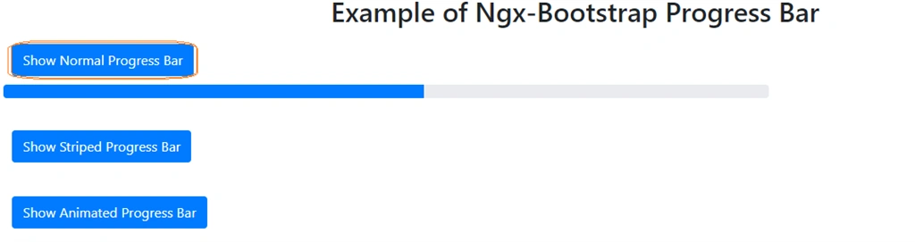
This is the normal progress bar which we can use with different bootstrap supported contextual classes : success, info, warning, danger
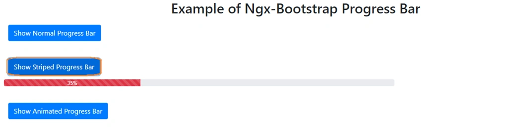
This is the striped progress bar which has striped lines to show the amount of tasks done.
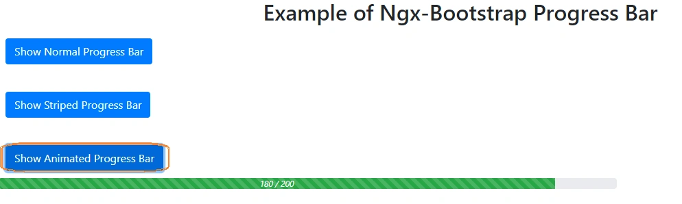
This is the animated progress which looks like it is in progress .
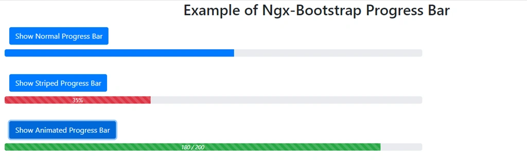
Though we can use these progress bars dynamically we just want to replace the value field with our dynamic variable.
Conclusion
In this article, we have seen the Ngx-Bootstrap progressbar Component in an Angular 8 application.
I hope you have enjoyed this article, as I have enjoyed writing and coding the examples.
Please let me know how to improve it.
Join the conversation! Your thoughts help the community grow.