

One of the things I enjoy most about Power BI is the ability to move beyond the standard visuals and create custom indicators that make reports more engaging. While Power BI provides built-in conditional formatting and icon sets, there are situations where I want complete control over the appearance of my KPIs. One technique I frequently use is generating SVG (Scalable Vector Graphics) directly from DAX measures.
In this article, I will demonstrate how I created a dynamic star-shaped KPI that changes colour based on business performance. Instead of displaying a simple circle, I use a star to highlight whether a key performance indicator has met its target.
Why Use SVG Images?
SVG stands for Scalable Vector Graphics, an XML-based image format that maintains perfect quality regardless of size. Since SVG is simply text, I can generate it dynamically using DAX.
This means every row in a Power BI table or matrix can display its own custom graphic based entirely on the underlying data. There is no need to import image files or install custom visuals.
Using SVG also gives me complete creative freedom. I can generate circles, stars, arrows, progress bars, gauges, badges, and virtually any vector graphic that can be described using SVG markup.
The Business Scenario
Suppose I have a report containing the following information:
Year
Total Cost
Total Sales
Total Revenue
Percentage of Revenue
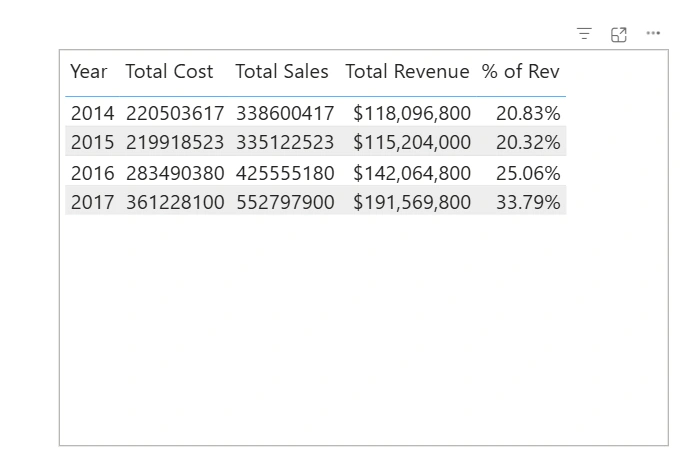
My objective is to make it immediately obvious whether each year's revenue percentage has achieved the business target.
The business rule is simple:
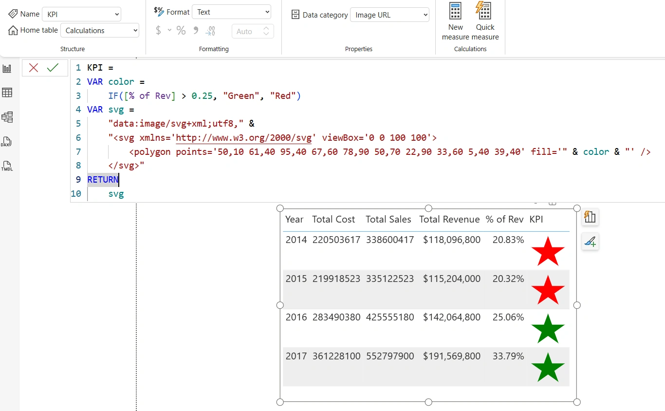
Display a green star when % of Revenue is greater than 25%.
Display a red star when the target has not been achieved.
Rather than expecting report consumers to interpret percentages manually, the coloured stars provide an instant visual summary of performance.
Writing the DAX Measure
The entire solution is implemented using a single DAX measure.
KPI =
VAR color =
    IF([% of Rev] > 0.25, "Green", "Red")

VAR svg =
    "data:image/svg+xml;utf8," &
    "<svg xmlns='http://www.w3.org/2000/svg' viewBox='0 0 100 100'>
        <polygon points='50,10 61,40 95,40 67,60 78,90 50,70 22,90 33,60 5,40 39,40'
                 fill='" & color & "' />
    </svg>"

RETURN
    svg
Let's examine how this measure works.
Step 1: Determine the Star Colour
The first variable determines whether the star should be green or red.
VAR color =
    IF([% of Rev] > 0.25, "Green", "Red")
The measure evaluates the % of Revenue value for the current row.
If the percentage exceeds 25%, the variable returns Green; otherwise, it returns Red.
Keeping the colour in its own variable makes the measure easier to read and maintain. If the business target changes in the future—for example, from 25% to 30%—I only need to modify this single line of code.
Step 2: Generate the SVG Image
The next step is constructing the SVG image.
VAR svg =
    "data:image/svg+xml;utf8," &
    "<svg xmlns='http://www.w3.org/2000/svg' viewBox='0 0 100 100'>
        <polygon points='50,10 61,40 95,40 67,60 78,90 50,70 22,90 33,60 5,40 39,40'
                 fill='" & color & "' />
    </svg>"
The measure begins with
data:image/svg+xml;utf8,
which tells Power BI that the returned text should be interpreted as an SVG image.
The points attribute defines the coordinates that make up the five-pointed star. Each pair of numbers represents an X and Y coordinate, and together they create the familiar star shape.
The fill attribute determines the colour of the star. Instead of assigning a fixed colour, I concatenate the color variable into the SVG so that each row can display a different colour based on its KPI value.
This demonstrates one of the biggest strengths of SVG in Power BI: the image itself becomes data-driven.
Step 3: Return the SVG
Finally, I return the completed SVG string.
RETURN
    svg
Power BI renders the text as an image instead of displaying the SVG markup.
Displaying the SVG in Power BI
After creating the measure, I perform one additional configuration step.
I select the measure, navigate to Column Tools, and set its Data Category to Image URL.
Once this is done, I add the measure to a Table or Matrix visual.
Power BI automatically converts the SVG into a rendered image, displaying a coloured star for every row.
The Result
The finished report provides a much richer visual experience.
Rows where the Percentage of Revenue exceeds 25% display a green star, immediately indicating success.
Rows below the target display a red star, signalling that attention may be required.
Users no longer need to scan percentages and mentally compare them against the target. The visual indicator communicates the result instantly.
Advantages of Using SVG KPIs
I regularly use SVG images because they offer several advantages:
They are completely dynamic and generated using DAX.
They require no external image files.
They remain perfectly sharp regardless of size.
They integrate seamlessly into table and matrix visuals.
They provide unlimited opportunities for customization.
They make reports more engaging and easier to interpret.
Taking It Further
Although this example uses a simple star, the same technique can be used to create a wide variety of custom indicators. For example, I can generate:
Traffic light indicators
Star ratings
Directional arrows
Progress bars
Battery indicators
Check marks and warning symbols
KPI badges
Speedometers
Data bars
Company-branded icons
Since SVG is based on XML, almost any vector graphic can be generated dynamically with DAX.
Conclusion
SVG images are one of the most powerful yet underutilized features in Power BI. By combining SVG markup with DAX, I can transform ordinary tables into visually compelling reports without relying on custom visuals or imported images.
This star-shaped KPI demonstrates how a simple DAX measure can deliver immediate visual feedback while remaining lightweight, flexible, and easy to maintain. Once I started using SVGs in my Power BI projects, I discovered that they significantly improved both the appearance and usability of my dashboards, allowing report consumers to understand business performance at a glance.
Join the conversation! Your thoughts help the community grow.