

Introduction
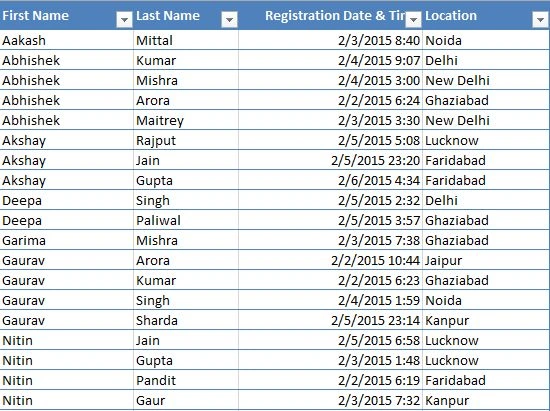
In this article, we will use an Excel worksheet as a data source and will create a report using the Power BI Designer. I have created an Excel sheet containing four columns named First Name, Last Name, Registration Date and Time and Location. We will first simplify the data and then we will create a report.
The following is the sample of the Excel table we will be using.
Step 1. Get Started
- Open Microsoft Power BI Designer select Excel as a data source from the Get Data dialog box click on Connect and select the Registered Data Excel file from the Open File dialog box.
- From the navigator pane select the Registered table and click on Edit Query.
Step 2. Splitting the Registered Date & Time column
- Select the header of the Registered Date & Time column and click on the Split Column option under the Transform ribbon tab.
- Select Split Column -> By Delimiter, a new window will appear. Select Space from the Select or enter delimiter option and select At the left-most delimiter option from the Split list and click on OK that will now split the column into two, one having date and the other having time.
- Rename the columns Date and Time respectively.

Step 3. Shaping the Data
- Make sure the Data Type for the Date column is Date and for the Time column is Time.
- Select the Date Column and select Date -> Date Only under the Date & Time Column group from the Transform ribbon tab.

- Select the Time column and select the Time -> Hour option under the Date & Time Column group from the Transform ribbon tab.

- Now our data is ready to be transformed into a visualization.

Step 4. Creating Visualizations
- Drag and drop the First Name column from the Registered table available under the Fields list to the report canvas.
- A Clustered column chart will be created. Drag and drop the First Name column into the Axis section, the Date column into the Legend section, and the Time column into the Value section on the right-hand side.


This chart shows which user was registered on what date and at what time.
When we click on any of the dates, it will show the number of users registered on that day along with their registration time.
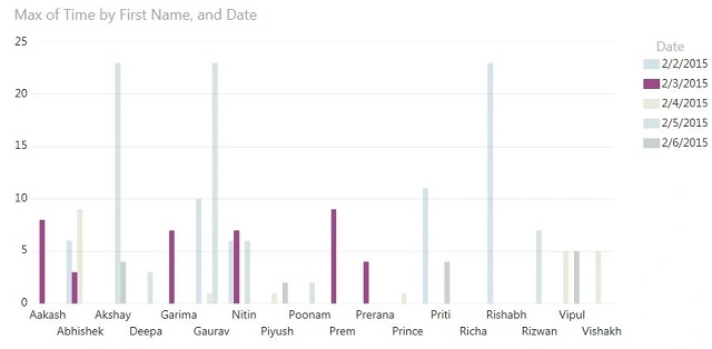
The preceding visualization shows the registered number of users for the date 2/3/2015.
Now again drag and drop a Date column and Location column and ensure the Location column is under the Axis section and the Date column is under the Value section and be sure the type of visualization selected is Clustered Column Chart. Now the visualization will show the number of registered users by location.
Now select the Noida location from the visualization and we will now be able to see the changes in the other visualization that will now show the users registered from the Noida location.

Summary
In this article, we learned how to use an Excel sheet as a data source for creating rich and interactive visualization reports using Power BI Designer.
Join the conversation! Your thoughts help the community grow.