

This chapter is taken from book "Programming Windows Phone 7" by Charles Petzold published by Microsoft press. http://www.charlespetzold.com/phone/index.html
you're creating a custom control class, and that class defines new properties, and if you want those properties to be set through styles, or you want those properties to be set through data bindings, or you want those properties to be the target of animations, then you need to do something very special with those properties, You need to make them dependency properties.
To illustrate the difference that dependency properties make, let's first look at a custom control class perhaps coded by a naive programmer
Suppose you want to use a bunch of buttons whose foregrounds are colored with various linear gradient brushes, and you figure it would be convenient for you to specify the two colors as properties of the buttons, perhaps properties named Color1 and Color2. So you open a project named NaiveGradientButtonDemo and add a new class named NaiveGradientButton. Here's that class:
public classNaiveGradientButton : Button
{
GradientStop gradientStop1, gradientStop2;
public NaiveGradientButton()
{
LinearGradientBrush brush = newLinearGradientBrush();
brush.StartPoint =newPoint(0, 0);
brush.EndPoint = newPoint(1, 0);
gradientStop1 = newGradientStop();
gradientStop1.Offset = 0;
brush.GradientStops.Add(gradientStop1);
gradientStop2 = newGradientStop();
gradientStop2.Offset = 1;
brush.GradientStops.Add(gradientStop2);
Foreground = brush;
}
publicColor Color1
{
set { gradientStop1.Color = value; }
get { return (Color)gradientStop1.Color; }
}
publicColor Color2
{
set { gradientStop2.Color = value; }
get { return (Color)gradientStop2.Color; }
}
}
Where did these two methods SetValue and GetValue come from? SetValue and
GetValue are two public methods defined by DependencyObject and inherited by all
derived classes. Notice that the second argument to SetValue is the value to
which the property is being set. The return value of GetValue is of type object
so it must be explicitly cast to a Color.
The MainPage.xaml file in the NaiveGradientButtonDemo project references this
class. The root element includes an XML namespace declaration that associates
the namespace prefix "local" with the CLR namespace of NaiveGradientButton:
xmlns:local="clr-namespace:NaiveGradientButtonDemo"
The Resources collection in MainPage.xaml defines a Style for NaiveGradientButton:
<phone:PhoneApplicationPage.Resources>
<Style x:Key="gradientButtonStyle"
TargetType="local:NaiveGradientButton">
<Setter Property="HorizontalAlignment" Value="Center" />
<!--
<Setter Property="Color1" Value="Cyan" />
<Setter Property="Color2" Value="Pink" />
-->
</Style>
</phone:PhoneApplicationPage.Resources>
The content area of the XAML file has four instances of NaiveGradientButton with their Color1 and Color2 properties set in a variety of different ways:
<Grid x:Name="ContentPanel" Grid.Row="1" Margin="12,0,12,0">
<StackPanel>
<local:NaiveGradientButton Content="Naive Gradient Button #1"
HorizontalAlignment="Center" />
<local:NaiveGradientButton Content="Naive Gradient Button #2"
Color1="Blue" Color2="Red"
HorizontalAlignment="Center" />
<local:NaiveGradientButton Content="Naive Gradient Button #3"
Color1="{StaticResource PhoneForegroundColor}"
Color2="{StaticResource PhoneBackgroundColor}"
HorizontalAlignment="Center" />
<local:NaiveGradientButton Content="Naive Gradient Button #4"
Style="{StaticResource gradientButtonStyle}" />
</StackPanel>
</Grid>
When you run the program, you'll discover that the second and third buttons are fine, but the first and fourth seem to have no content:
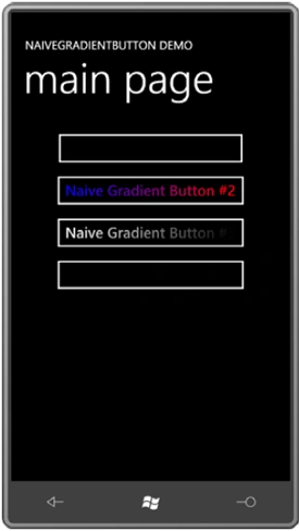
In Silverlight, properties can be set in several ways. We have empirically discovered that a strict precedence is established when the same property is set from property inheritance, or from a theme, or a style, or a local setting.
Deriving from UserControl
As you've seen, it's possible to derive from a class that derives from Control to add some additional properties. It's also possible to derive directly from Control to create entirely new controls (or to derive from ContentControl if the control needs to have a Content property). However, deriving from Control or ContentControl in a proper and cordial manner involves creating a default template in XAML that describes the control's visual appearance, and allowing that template to be replaced to redefine the visuals of the control.
Within the Petzold.Phone.Silverlight project given below (or any other library project), you can add a new item by right-clicking the project name in the Solution Explorer and selecting Add and New Item.
To make a new UserControl in either an application project or a library project. From the Add New Item dialog box, select Windows Phone User Control and give it a name.You'll get two files: a XAML file and a code-behind file.
The XAML file is rather simpler than the one created for a PhoneApplicationPage class. The root element is UserControl. It contains an x:Class attribute indicating the derived class, and the only nested element is a Grid named LayoutRoot. You don't need to retain that Grid but it's usually convenient.
I also deleted the designer-related attributes, so here's the complete ColorColumn.xaml file. Notice I've also changed the Background property on the Grid from a StaticResource referencing PhoneChromeBrush to Transparent:
<UserControl
x:Class="Petzold.Phone.Silverlight.ColorColumn"
xmlns="http://schemas.microsoft.com/winfx/2006/xaml/presentation"
xmlns:x="http://schemas.microsoft.com/winfx/2006/xaml" mc:Ignorable="d"
xmlns:d="http://schemas.microsoft.com/expression/blend/2008"
xmlns:mc="http://schemas.openxmlformats.org/markup
compatibility/2006" d:DesignHeight="800" d:DesignWidth="480">
<Grid x:Name="LayoutRoot" Background="Transparent">
<Grid.RowDefinitions>
<RowDefinition Height="Auto" />
<RowDefinition Height="*" />
<RowDefinition Height="Auto" />
</Grid.RowDefinitions>
<TextBlock Name="colorLabel"
Grid.Row="0"
TextAlignment="Center" />
<Slider Name="slider"
Grid.Row="1"
Orientation="Vertical"
Minimum="0"
Maximum="255"
ValueChanged="OnSliderValueChanged" />
<TextBlock Name="colorValue"
Grid.Row="2"
Text="00"
TextAlignment="Center" />
</Grid>
</UserControl>
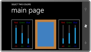
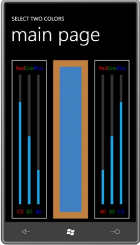
Generally a UserControl derivative will define its own properties and events, and very often these properties and events will parallel properties and events of elements in its visual tree. It's typical for a class like ColorColumn to have a Label property corresponding to the Text property of a TextBlock, and a Value property corresponding to the Value property of the Slider, and a ValueChanged event corresponding to the ValueChanged event of the Slider.
Here's the portion of the ColorColumn code-behind file devoted to the Label property for the text above the Slider:
public partialclassColorColumn : UserControl
{
...
public staticreadonlyDependencyProperty LabelProperty =
DependencyProperty.Register("Label",
typeof(string),
typeof(ColorColumn),
new PropertyMetadata(OnLabelChanged));
...
public string Label
{
set { SetValue(LabelProperty, value); }
get { return (string)GetValue(LabelProperty); }
}
...
static void OnLabelChanged(DependencyObject obj,
DependencyPropertyChangedEventArgs args)
{
(objasColorColumn).colorLabel.Text = args.NewValue asstring;
}
}
Join the conversation! Your thoughts help the community grow.