

Introduction
I wrote an earlier post about Creating Custom Html Helpers in ASP.NET MVC which emphasized on how we can write custom html helper extensions in ASP.NET MVC according to our need, so that we can reuse them in our complete application, instead of writing plain html in View.
The example in that article was using ActionLink, today I am going to tell how we can implement custom Validation Message helper. I wanted to modify the validation message displaying in my application so that it displays * in front of required fields and the error message in tooltip of it like,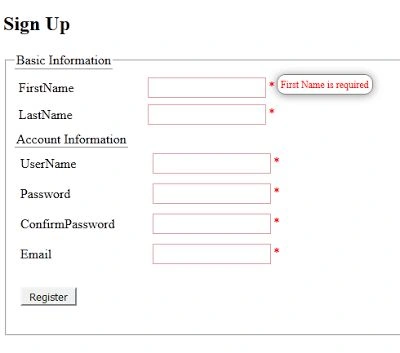
For that, add a class in the project and add an extension method which will render our custom html that will be displayed for error message,
- namespace CustomValidationMessageHelper.Helpers
- {
- public static class Validator
- {
- public static MvcHtmlString MyValidationMessageFor < TModel,
- TProperty > (this HtmlHelper < TModel > helper,
- Expression < Func < TModel, TProperty >> expression)
- {
- TagBuilder containerDivBuilder = new TagBuilder("div");
- containerDivBuilder.AddCssClass("tip_trigger");
- containerDivBuilder.InnerHtml = "*";
- TagBuilder midDivBuilder = new TagBuilder("div");
- midDivBuilder.AddCssClass("classic");
- midDivBuilder.AddCssClass("tip");
- midDivBuilder.InnerHtml = helper.ValidationMessageFor(expression).ToString();
- containerDivBuilder.InnerHtml += midDivBuilder.ToString(TagRenderMode.Normal);
- return MvcHtmlString.Create(containerDivBuilder.ToString(TagRenderMode.Normal));
- }
- }
- }
and then define the following CSS in a CSS file, in my case it is site.css or you can add it in the view,
- .validated
- {
- border - color: #DCE4EC!important;
- }
- textarea, input[type = "text"], input[type = "password"],
- input[type = "datetime"],
- input[type = "datetime-local"], input[type = "date"],
- input[type = "month"],
- input[type = "time"], input[type = "week"],
- input[type = "number"], input[type = "email"],
- input[type = "url"], input[type = "search"],
- input[type = "tel"], input[type = "color"],
- .uneditable - input {
- padding: 3 px 3 px;
- border: 1 px solid# DCE4EC;
- }
- .tip
- {
- background: none repeat scroll 0 0# FFFFFF;
- border: 1 px solid #808080;
- border-radius: 10px;
- box-shadow: 0 1px 10px rgba(32, 32, 32, 0.5);
- color: red;
- display: none;
- font-size: 12px;
- font-style: normal;
- margin-left: 10px;
- margin-top: -24px;
- padding: 4px;
- position: absolute;
- z-index: 999999;
- }
- .tip_trigger
- {
- width: 10px;
- float: right;
- color: red;
- margin-left: 3px;
- }
Ehsan SajjadPosted Dec 11, 2015, 8:51 AM
thanks Harshad Pansuriya
Harshad PansuriyaPosted Dec 11, 2015, 7:10 AM
Nice one
Muhammad Aqib ShehzadPosted Dec 11, 2015, 5:18 AM
nice one
Maruthi PalllamalliPosted Dec 10, 2015, 8:46 AM
I found, You given validations to only text boxes, Is it work for all other controls like dropdown, radio, check boxes.
Humayun Kabir MamunPosted Dec 10, 2015, 2:46 AM
Nice...
Sibeesh VenuPosted Dec 10, 2015, 12:30 AM
Nice Share
Raja TPosted Dec 9, 2015, 11:32 PM
Nice, Thanks for sharing