

Introduction
Ah, theming is one of the most loved and debated aspects of UI design. Should your app be dark and enchanting like Spirited Away or bright and uplifting like My Neighbor Totoro?
Theming gives users control over their preferences.
In this article, let’s take a journey through theming in a Blazor Web App. I plan to cover:
- Creating our own theme.css
- The overall architecture of our app, including the roles of MainLayout.razor, App.razor, and theming components
- How to override global styles from a component level (spoiler: we'll customize a button!
- Isolating Styles to a Specific Component
And yes, we’re following a Studio Ghibli-inspired theme for this tutorial! So, let's hop onto the Catbus and start building!
Sneak Peek
Before we dive in, check out the demo below. You can also download the full application as a ZIP file from this article. This will help you follow along and experiment with the code.

This is What We’re Building in This Article
1. Why Are We Using theme.css for Theming?
Let's first understand why we need to add styles in the wwwroot folder.
Styles defined here can be accessed and applied to the entire application without needing to include them in every component. Plus, since files in wwwroot are static assets, browsers can cache them for improved performance.
Now, let's go back to our original question: Why theme.css?
- To define a universal style guide
- To ensure theme consistency across all components
- To toggle theme mode
Structure of theme.css
1. First, let's define reusable CSS variables for light and dark themes.
:root {
    --background-color: white;
    --text-color: black;
    --form-bg-color: #f9f9f9;
    --shadow-color: rgba(0, 0, 0, 0.2);
}

.dark-mode {
    --background-color: #121212;
    --text-color: #ffffff;
    --form-bg-color: #1e1e1e;
    --shadow-color: rgba(255, 255, 255, 0.2);
}
Listing 1. css variables: theme.css
- :root defines default (light mode) variables.
- .dark-mode overrides these variables when dark mode is active.
- When .dark-mode is applied, background and text colors switch instantly.
2. Body styling
body {
    background-color: var(--background-color);
    color: var(--text-color);
    transition: background-color 0.3s ease, color 0.3s ease;
}
Listing 2. body tag: theme.css
- body tag uses var(--background-color) and var(--text-color), to ensure theme consistency. This will help us to transition smoothly when switching themes.
3. Toggle button: Position and style of the toggle button.
.theme-toggle {
    position: fixed;
    top: 10px;
    right: 10px;
    padding: 10px 15px;
    background-color: var(--text-color);
    color: var(--background-color);
    border: none;
    cursor: pointer;
    border-radius: 5px;
}
Listing 3. toggle button: theme.css
- Fixed Positioning: Stays in the top-right corner.
- Background & Text Color: Inverted dynamically based on theme.
- No Border: Keeps the button minimalistic.
4. Form and container Styles: This is the style of the registration form.
.container {
    max-width: 800px;
    margin: 20px auto;
    padding: 20px;
    background: var(--form-bg-color);
    box-shadow: 0 4px 8px var(--shadow-color);
    border-radius: 8px;
}
Listing 4. container styles: theme.css
- Background Color: Matches theme (var(--form-bg-color)).
- Box Shadow: Adds a depth effect (var(--shadow-color)).
- Border Radius: Soft rounded corners.
5. Input Fields (input, textarea, button): input fields match the selected theme.
input, textarea {
    width: 100%;
    padding: 10px;
    margin: 10px 0;
    border-radius: 5px;
    border: 1px solid var(--text-color);
    background: var(--background-color);
    color: var(--text-color);
}

button {
    background-color: var(--button-bg);
    color: var(--button-text);
    border: 2px solid var(--button-border);
    padding: 10px 20px;
    border-radius: 5px;
    font-size: 16px;
    cursor: pointer;
    transition: background-color 0.3s ease, border-color 0.3s ease;
}

    button:hover {
        background-color: var(--button-hover-bg);
    }
Listing 5. input fields: theme.css
- Text, Border & Background: Inputs follow the theme color scheme.
- For the buttons, we have customized the button's appearance for the hover effect.
This structured approach ensures all components inherit a consistent design.
2. Application Architecture
- theme.css: we just saw what theme.css looks like, and it is located in the wwwroot/css folder.
- theme.js: The theme.js file is responsible for managing the dark mode toggle and saving user preferences. Same as stylesheet this file is also located in the wwwroot/js folder.
- App.razor: This is the entry point of our application, responsible for rendering the router.
- Header.razor & footer.razor: Self-explanatory, but they help in maintaining a structured UI.
- RegisterCharacter.razor: This goes inside our container, and it showcases a component where users can register their favorite Ghibli characters
- ThemeToggle.razor: Handles switching between light and dark modes.
- MainLayout.razor: Defines the page structure, including the header, footer, and container.
Since we have already covered theme.css, we can now move on to theme.js.
theme.js
function toggleDarkMode() {
    document.body.classList.toggle('dark-mode');
    localStorage.setItem('theme', document.body.classList.contains('dark-mode') ? 'dark' : 'light');
}

window.applySavedTheme = function () {
    if (localStorage.getItem('theme') === 'dark') {
        document.body.classList.add('dark-mode');
    }
}
Listing 6. theme.js
1. toggleDarkMode():
- This function toggles the dark-mode class on the <body> element.
- If dark-mode is present, the theme is set to dark, otherwise, it's set to light.
- The theme preference is stored in localStorage so that the user's choice persists across page reloads.
2. applySavedTheme():
- This function checks localStorage for the saved theme preference.
- If the stored theme is "dark", it applies the dark-mode class to <body>, this ensures the app loads with the user's preferred theme.
App.razor
<!DOCTYPE html>
<html lang="en">

<head>
    ....
    <link rel="stylesheet" href="css/theme.css" />
    <HeadOutlet />
</head>

<body>
    <Routes />
    <script src="js/theme.js"></script>
    <script>
        window.applySavedTheme();
    </script>
    <script src="_framework/blazor.web.js"></script>
</body>

</html>
Listing 7. App.razor
- Loads theme.css and imports theme.js.
- It is also responsible to run applySavedTheme() function immediately when the app starts, this ensure that the user’s preferred theme (stored in localStorage) is applied before anything renders.
Header & Footer
The Header.razor component serves as the top section of the app.
<header>
    <h1>Register Your Ghibli Character</h1>
</header>
Listing 8. Header.razor
The Footer.razor component provides a consistent footer across the application. If you notice below, we are using the class attribute on the <footer> element, this styling is coming from Footer.razor.css.
<footer class="footer-centered">
    <p>© 2025 Ghibli Fan Club - Rikam Palkar</p>
</footer>
Listing 9. Footer.razor
Footer.razor.css
.footer-centered {
    text-align: center;
    padding: 10px 0;
    width: 100%;
}
Listing 10. Footer.razor.css
Component-specific styles like Footer.razor.css are scoped to that particular component. This approach has its own advantages, we will explore this in detail later in the article.
The container: RegisterCharacter.razor
@rendermode InteractiveServer

<div class="container">
    <h2>Character Registration</h2>
    <form>
        <label for="name">Character Name:</label>
        <input id="name" type="text" />

        <label for="movie">Movie:</label>
        <input id="movie" type="text" />

        <label for="description">Description:</label>
        <textarea id="description"></textarea>

        <button type="submit">Register</button>
    </form>
</div>
Listing 11. RegisterCharacter.razor
- This component provides a character registration form.
- Server-side interactivity: Notice how i have added interactive, server-side rendering (@rendermode InteractiveServer): Without it, no user interaction (such as form submission, theme toggling, or live updates) would trigger events in the backend.
- The form includes fields for a character's name, movie, and description, along with a submit button.
- The container class ensures a consistent layout and theme, it is ofcourse inherited global style.
ThemeToggle.razor
@rendermode InteractiveServer
@inject IJSRuntime JS

<button class="theme-toggle" @onclick="ToggleTheme">Toggle Dark Mode</button>

@code {
    protected override async Task OnAfterRenderAsync(bool firstRender)
    {
        if (firstRender)
        {
            await JS.InvokeVoidAsync("applySavedTheme");
        }
    }

    private async Task ToggleTheme()
    {
        await JS.InvokeVoidAsync("toggleDarkMode");
    }
}
Listing 12. ThemeToggle.razor
- The purpose of this component is to enable users to switch between light and dark modes dynamically.
- It integrates with JavaScript using IJSRuntime to toggle the theme and store the user's preference in localStorage.
- Button Click Handler: When clicked, it calls toggleDarkMode() from theme.js, switching between light and dark modes.
- Applying Saved Theme (OnAfterRenderAsync)
- Runs once after the component renders (firstRender check).
- Calls applySavedTheme() from theme.js, restoring the user’s previously selected theme from localStorage.
MainLayout.razor
@using ThemeSwitch.Components.Pages
@inherits LayoutComponentBase

<Header />

<div class="container">
    @Body
</div>

<Footer />

<ThemeToggle />
Listing 13. MainLayout.razor
- The MainLayout.razor file acts as the primary structure for all pages in the Blazor app. It defines the global layout, which ensures that all pages share common elements like the header, footer, and theme toggle etc.
- @inherits LayoutComponentBase: Inherits Blazor's layout functionality.
- <Header /> and <Footer />: These components appear on every page.
- @Body: This placeholder dynamically loads the active page.
- <ThemeToggle />: Provides a global dark/light mode switch.
How @Body Works?
- The @Body directive is a placeholder that Blazor replaces with the content of the active page.
- When a user navigates, the content inside @Body updates, while the rest of the layout (header, footer, and theme toggle) remains the same.
@page "/"
<RegisterCharacter />
Listing 14. Home.razor
- When the user visits " / ", the RegisterCharacter component gets rendered inside @Body.
Now it's time for the action!
If you have followed the steps as mentioned, you should be able to see the theming in action:
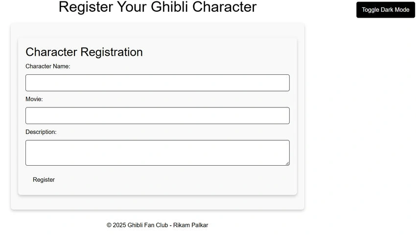
Image 1. Light theme
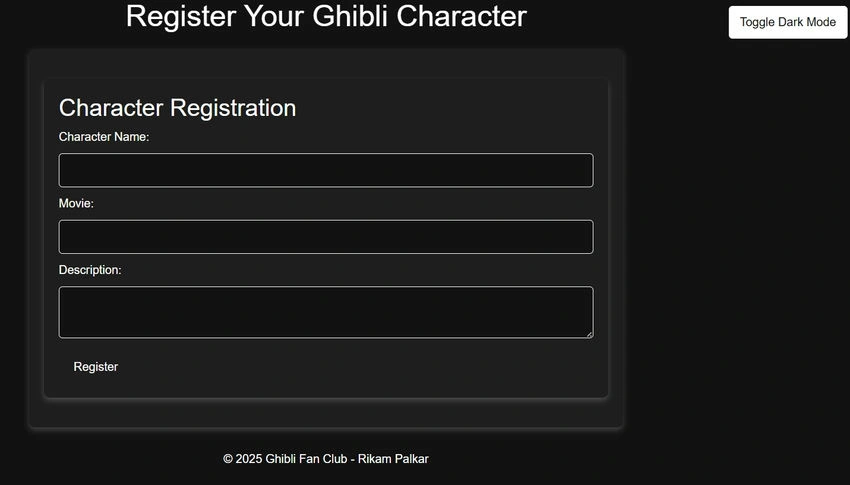
Image 2. Dark theme
What We've Achieved So Far
At this point, we've successfully set up global theming for our Blazor app! The dark and light modes are applied across all components.
But what if we want to tweak styles for specific components? Let's explore how we can override styles at the component level while still maintaining theme adaptability.
3. Overriding Styles Globally for all components
1. Using theme.css
Sometimes, we want to change the styling of elements everywhere in our app. The easiest way to achieve this is by using global CSS rules inside theme.css or even injecting styles directly inside a component.
For example, if we wanted all buttons across the app to have a red border, we could simply add the following to theme.css:
button {
    border: 2px solid red !important;
}
Listing 15. Overriding Styles in theme.css
- Since we are using the button selector without any class or ID, this rule applies to every button in our app. The ! important ensures that it overrides any previous styles applied to buttons, whether they are from theme.css or component-specific stylesheets.
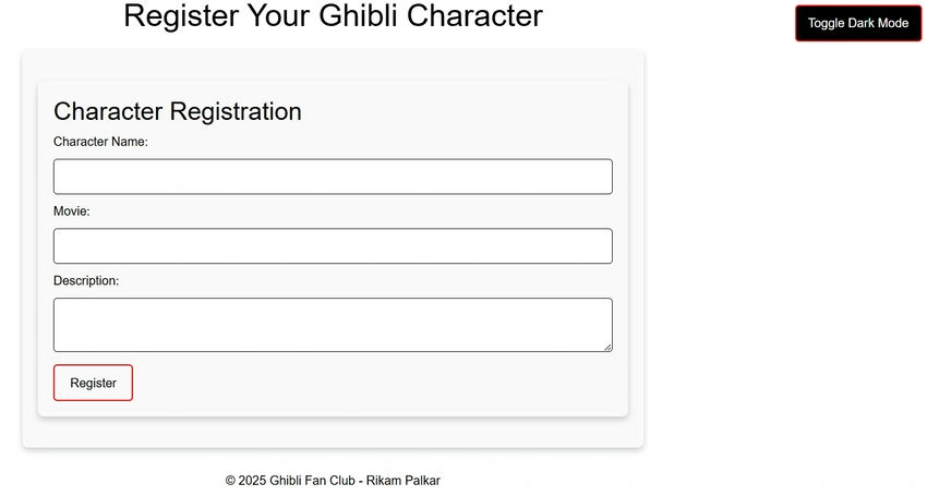
Image 3. Overriding button styles across application
2. Using <style> tag in RegisterCharacter.razor
Now, instead of modifying theme.css, let’s add the same rule directly inside our RegisterCharacter.razor component:
<div class="container">
    <h2>Character Registration</h2>
    <form>
        ....
        <button type="submit">Register</button>
    </form>
</div>

<style>
     button {
        border: 2px solid red !important;
    }
</style>
Listing 16. Overriding Styles in RegisterCharacter.razor
This will give you the same output as Image 3.
- What happens here?
- Even though this <style> block is inside RegisterCharacter.razor, the style isn't scoped, so every button in the app will now have a red border!
- This is another way to override styles globally from within a component, but be careful it might impact elements you didn’t intend to change!
Let Me Show You How the Browser Processes Styles Using the Inspect Element.
Let's inspect the element
1. Register button
Here, you can see that the original styles for the button (such as padding, border radius, and font size) are coming from theme.css. However, the border color is being overridden by the styles inside RegisterCharacter.razor.
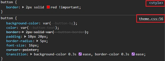
Image 4. Inspecting the Register Button
2. Toggle button
The same behavior applies to the theme toggle button. Most of its styles are inherited from theme.css, but the border color is being overridden by the styles in RegisterCharacter.razor.
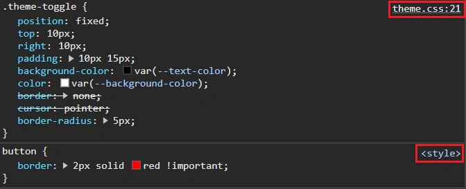
Image 5. Inspecting the Toggle Button
4. Overriding Styles only for specified components: Isolated Styles
One of the fantastic features of Blazor is the ability to isolate styles into specific components. This means that we can write styles for a particular component without affecting the rest of the application. By doing this, we can keep our styles modular and conflict-free.
Add Isolated Styles to the RegisterCharacter Component
The key here is to create a .razor.css file with the same name as the component to apply styles specifically to that component.
- Create the CSS File: In the same folder as RegisterCharacter.razor, create a new file called RegisterCharacter.razor.css.
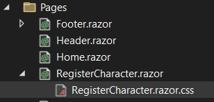
- Add Your Styles: Now, add the styles you want to isolate to the RegisterCharacter component.
button {
    border: 2px solid red !important;
}
Listing 17. Isolating Styles for RegisterCharacter.razor
Now Blazor will automatically scope these styles to the RegisterCharacter component. This means only the button within the RegisterCharacter component will have the red border, and the rest of the application will remain unaffected.
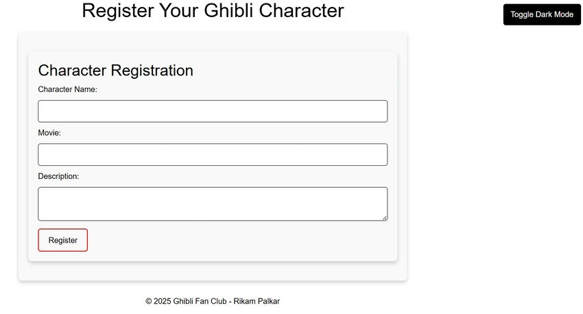
Image 6. Isolating Styles for Register button
Conclusion
Whoa, that was a long article. I know, I know! But let’s take a moment to recap what we’ve learned. We explored how to implement theming in Blazor, from defining global styles in theme.css to overriding them at the component level with RegisterCharacter.razor.css.
We started by understanding why Blazor handles styling differently, with styles being globally managed in wwwroot/css, ensuring consistency across the application. Then, we covered overriding styles and isolating component styles. We also leveraged theme switching via JavaScript (theme.js).
Final Thoughts
It’s more than just aesthetics; it’s about creating a user experience that adapts to user preferences while maintaining structure. Now, go ahead and make your Blazor app as stunning as a Studio Ghibli masterpiece!
Join the conversation! Your thoughts help the community grow.