

Introduction
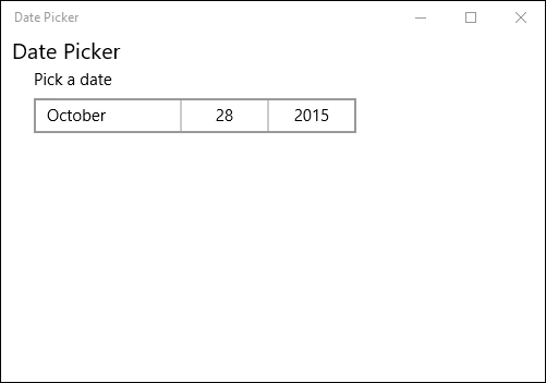
DatePicker represents a control that allows a user to pick a date value.
Step 1
Open a blank app and add DatePicker and Textblock control either from the toolbox or by copying the following XAML code into your grid.
- <TextBlock Text=" Time Picker " FontSize="20">
- </TextBlock>
- <StackPanel Margin="20,30,0,0">
- <TimePicker Name="myTime" Header="Select a time" ClockIdentifier="12HourClock" TimeChanged="myTime_TimeChanged" Margin="15,0,0,0">
- </TimePicker>
- <TextBlock x:Name="selectedTime" Margin="15,15,0,0" Foreground="Green" />
- </StackPanel>
The Header defines a small text above the DatePicker control.
Step 2
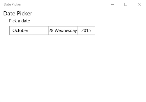
If you want to show the day of the week along with the date you can add the following code to the DatePicker XAML code.
- DayFormat="{}{day.integer} {dayofweek.full}"
Step 3
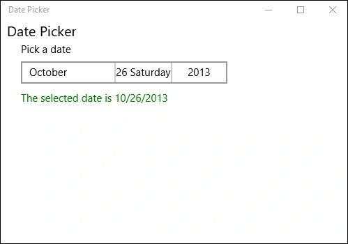
Copy and paste the following code to the myDate_DateChanged event on the cs page.
- DateTimeFormatter dtf = new DateTimeFormatter("shortdate");
- selectedDate.Text = "The selected date is " + dtf.Format(e.NewDate).ToString();
Step 4
Run your application and select a date. It will be shown in our TextBlock assigned.
Step 5
If you want to assign a Minimum and a Maximum
year for the calendar you can also add the following code to the class.
- this.myDate.MinYear = new DateTimeOffset(new DateTime(1990, 1, 1));
- this.myDate.MaxYear = new DateTimeOffset(new DateTime(2016, 12, 1));
Summary
In this article, we learned about DatePicker Control For Windows 10.
Kuppurasu NagarajPosted Feb 11, 2016, 12:39 PM
Nice Ramees..
Nilesh JadavPosted Oct 30, 2015, 11:55 AM
Nice pace on win 10 ! Good one !
RameesPosted Oct 30, 2015, 9:35 AM
Thanks :)
Mukesh KumarPosted Oct 30, 2015, 2:13 AM
Good One
Harshad PansuriyaPosted Oct 30, 2015, 1:37 AM
Nice one
Sibeesh VenuPosted Oct 30, 2015, 12:41 AM
Nice Share