

Step 1: Open Expression Blend 4 -> select Silverlight Application + Web -> change Name and Location accordingly -> hit OK; a Blank Window appears on the Artboard, Fill Background with Gradient Brush.
Step 2: Controls : The controls consist of 29 controls. We are going to discuss the Border Control, Frame Control and Button Control.
Step 3: Select Controls -> Border Control and draw a border as shown below:
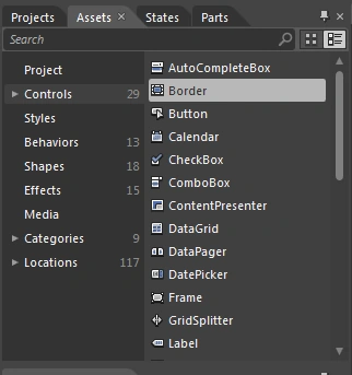
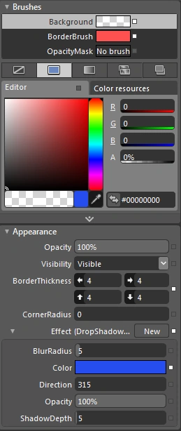
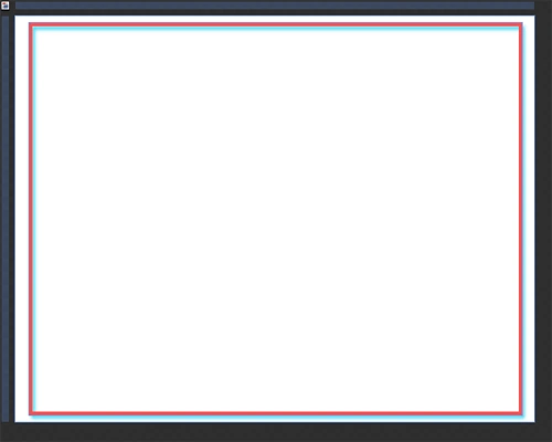
Note: Manage the Color, Width, Height, Margin, Padding, DropShadowEffect, BorderThickness, ShadowDepth, BorderBrushColor, Background Color and BlurRadius using the Brushes Property and Appearance Property of the Property Panel as shown above.
Step 4: Select the Frame Control and draw a frame as shown below:
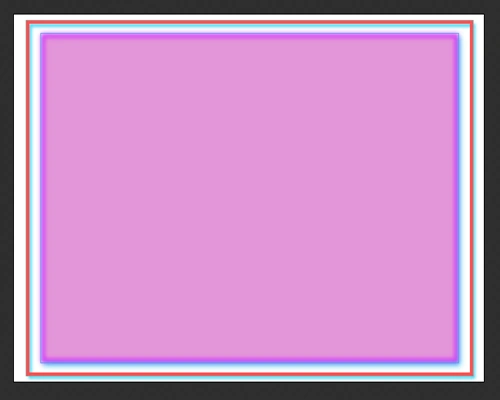
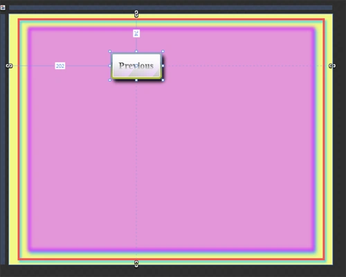
Step 5: Select Button Control and draw a button as shown below:
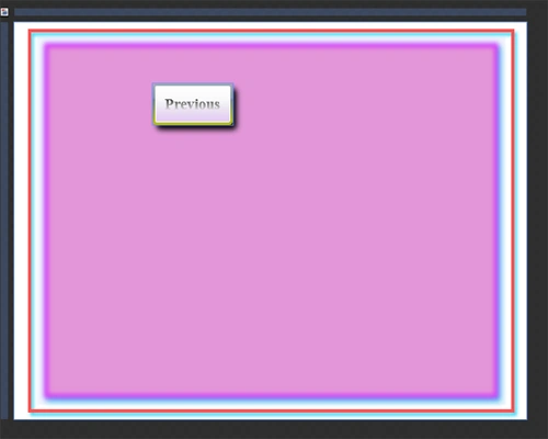
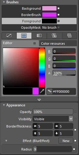
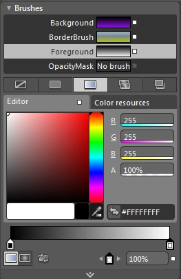
- Brushes Property: Mange Background Color, Border Brush, Foreground Color and OpacityMask as shown below:
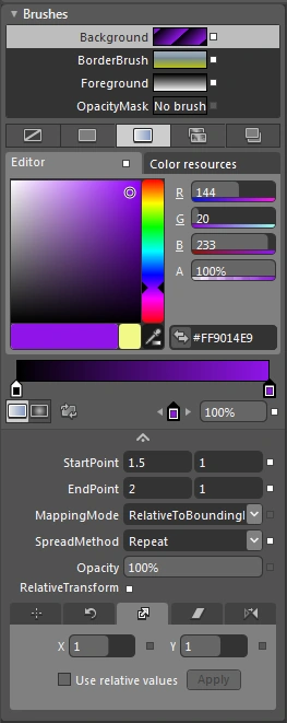
Note: Manage StartPoint, EndPoint, MappingMode, SpreadMethod, Opacity and RelativeTransform as shown below:
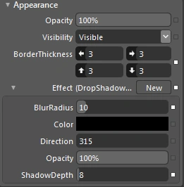
- Appearance Property: Manage Opacity, BorderThickness, Effect, BlurRadius, Color, Direction, Opacity of BlurEffect and ShadowDepth as shown below:
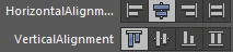
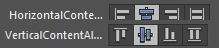
- Layout Property: Manage Width, Height, HorizontalAlignment of Button, VerticalAlignment of Button, Margin, HorizontalAlignment of Text and VerticalAlignment of Text and Padding as shown below:
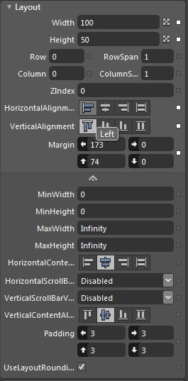
- This image displays the Horizontal Alignment of the button to the left.

- This image displays the Horizontal Alignment of the button to right.

- This image displays the Horizontal Alignment of the button to the center.
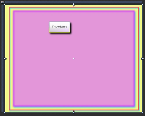
- This image displays the Horizontal Alignment of the text to the left.

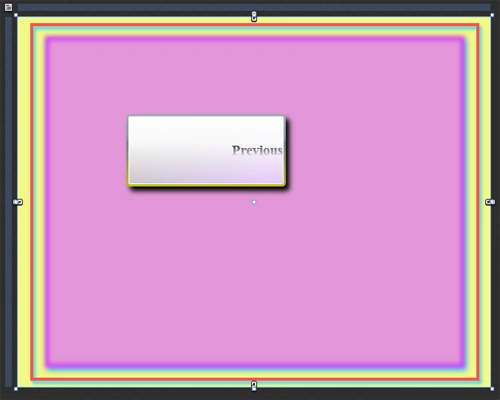
- This image displays the Horizontal Alignment of the text to the right.
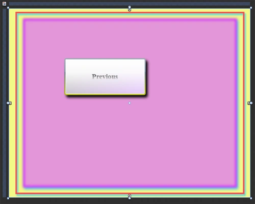
- This image displays the Horizontal Alignment of the text to the center.
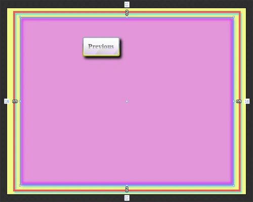
- This image displays the Vertical Alignment of the button on top.
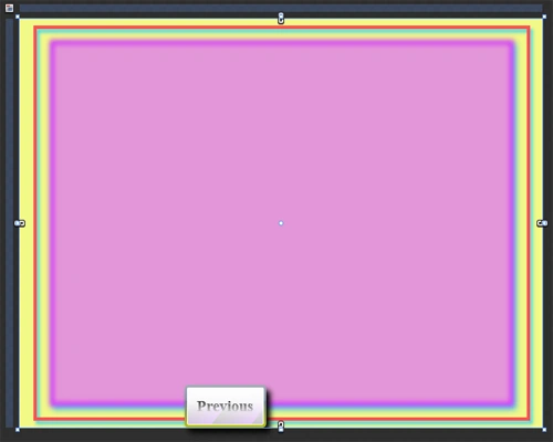
- This image displays the Vertical Alignment of the button at the bottom.
- This image displays the Vertical Alignment of the button to the center.

- This image displays the Vertical Alignment of the text to the top.

- This image displays the Vertical Alignment of the text to the center.
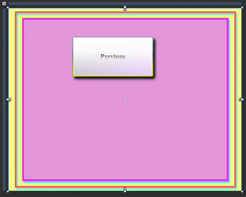
- This image displays the Vertical Alignment of the text to the bottom.
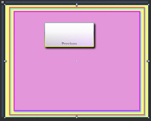
Note: Here, by using the HorizontalAlignment and VerticalAlignment proeprties of the Property Panel we can manage the Text as well as the buttons according to our choice as shown below:
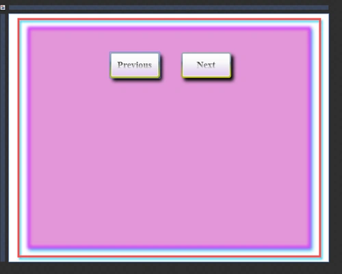
Step 6: Follow the Step 5 and draw another button and give it the name Next as shown below:
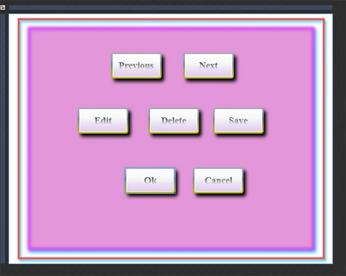
Step 7: By following Step 6 we can draw more buttons and give them the name Edit, Delete, save, Ok and Cancel as shown below:
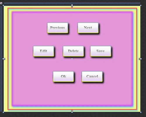
Step 8: We can also Fill Color in Layout Background as shown below:
Summary
The objective of this article is to convey knowledge of the use of Button Controls and Properties of the Property Panel.
Join the conversation! Your thoughts help the community grow.