

When building interactive reports in Microsoft Power BI, one of the most powerful features available to report developers is the Slicer. Slicers allow users to filter report data quickly and intuitively without writing queries or modifying the underlying dataset.
Instead of navigating complex filter panes, business users can simply click a value in a slicer to instantly adjust all visuals on a report page. This makes slicers an essential component for creating dynamic, user-friendly dashboards.
In this article, we will explore the different types of slicers in Power BI, how they work, and when to use them in real-world reporting scenarios.
Understanding Slicers in Power BI
A Slicer is a visual filtering component that enables users to filter report visuals by selecting values from a list, dropdown, or range.
For example, a sales dashboard might include slicers for:
Year
Region
Product Category
Salesperson
Selecting a value in a slicer dynamically updates all connected visuals such as charts, tables, and KPIs.
Key benefits include:
Easy filtering for report consumers
Interactive dashboards
Improved data exploration
Reduced reliance on technical users
Power BI offers multiple types of slicers, each designed for different data types and user interaction styles.
1. List Slicer
The List Slicer is the default slicer type in Power BI. It displays available values in a vertical list that users can select.
Example
A slicer showing payment type:
Apply
Bank Transfer
Cash
Cheque etc
Users can select:
Single value
Multiple values
Features
Checkbox selection
Multi-select capability
Scrollable list
Search functionality
When to Use
List slicers work best when:
The number of values is relatively small
Users need to select multiple values
Visibility of all options is important
Example scenarios:
Filtering by Product Category
Filtering by Region
Filtering by Department
2. Dropdown Slicer
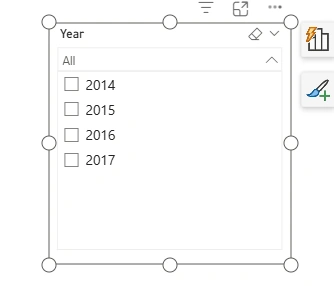
The Dropdown Slicer provides the same functionality as a list slicer but saves space on the report canvas.
Instead of showing all values, it collapses them into a dropdown menu.
Example
A dropdown slicer for Year might show:
Advantages
Saves dashboard space
Keeps reports visually clean
Ideal for fields with many values
When to Use
Dropdown slicers are useful when:
Dashboard space is limited
The field contains many options
A cleaner layout is required
3. Between Slicer (Range Slicer)
The Between Slicer allows users to filter numeric or date values within a range.
It uses sliders or input boxes to define the start and end values.
Example
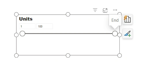
A sales report might include a range slicer for Units:
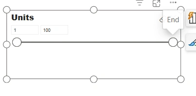
Users can drag the handles to select a specific range.
Supported Data Types
Numbers
Dates
DateTime values
Use Cases
Range slicers are commonly used for:
Filtering sales amount ranges
Selecting date periods
Analyzing price ranges
Example:
Sales between £10,000 and £50,000
Orders between January and June
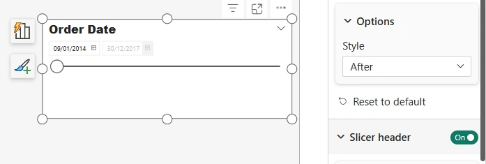
4. Before and After Slicers
For date and numeric fields, Power BI allows additional range filtering options.
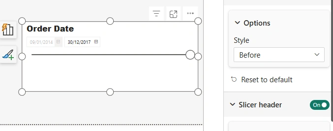
Before
Shows values before a specified date or number.
Example:
Orders before 1 Jan 2023
After
Shows values after a specified value.
Example:
Orders after 1 Jan 2023
Use Cases
These slicers are particularly useful for:
Historical trend analysis
Future projections
Time-based comparisons
5. Relative Date Slicer
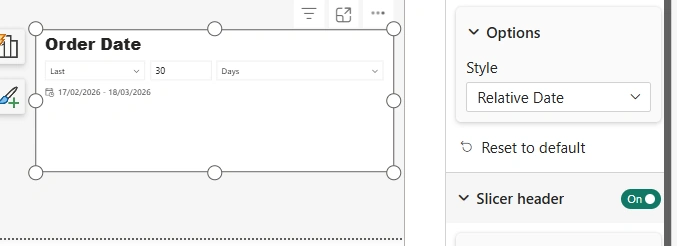
The Relative Date Slicer is one of the most powerful slicers available for time-based analysis.
It dynamically filters data relative to today's date.
Example selections include:
Last 7 days
Last 30 days
Last 3 months
Last 1 year
Example
A sales manager might select:
Conclusion
Slicers play a crucial role in making Power BI dashboards interactive, intuitive, and user-friendly. By choosing the right slicer type for the data being analyzed, report developers can significantly enhance the user experience and make insights easier to discover.
Whether you are building a simple sales report or an enterprise analytics dashboard in Microsoft Power BI, understanding the different types of slicers will help you create more dynamic and effective reports.
In modern data-driven organizations, interactive filtering is no longer a luxury—it is an expectation. Slicers make that interaction seamless and powerful.
Join the conversation! Your thoughts help the community grow.