

Introduction
In this article I will explain how to make an ASP.Net web application a responsive UI. That means the website will fit into any device apart from a desktop.
Content
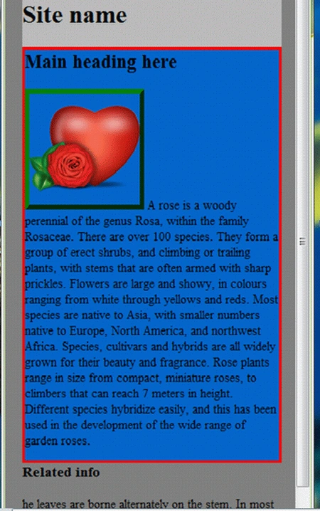
Normally in a mobile device when we run website pages, most often the pages do not fit in the screen, which means it's not properly aligned; we have to scroll horizontally very often. It is the same as when we resize a browser and squeeze it small; the webpage can become cut off like in the following picture.
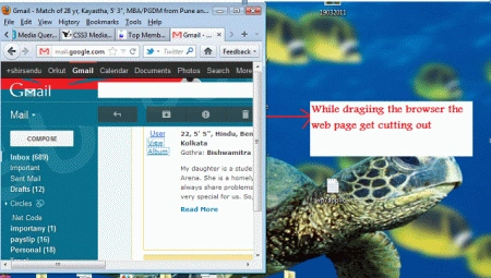
Now I will share a smart trick with you.
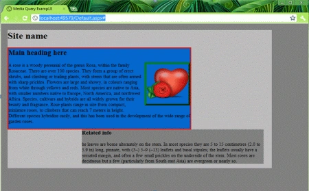
If you don't have a mobile simulator (Windows, Apple, Android) to test your web application, then don't worry; just drag your browser and squeeze it just like a mobile phone with a width size of say 320px. Then if your web page fits then that means all your page content will not be cut off; you win the jackpot.
So for achieving this we have to design our web page's controls in such a manner that they fit in the width and alignment for any media screen size.
Now here is where the power of CSS3 comes (normally we know CSS2). In CSS3 we have a property name "MEDIA QUERY".
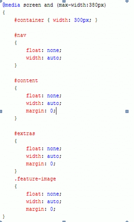
"By using Media Queries, presentations can be tailored to a specific range of output devices without changing the content itself"; that means we will apply this CSS into our web controls. So the control will adjust its width according to the device.
Note: The CSS3 is supported only by Chrome, Mozilla 4+, Safari and I.E 9.
The media query syntax will be the following:
t@media screen and (max-width:999px)
{
}
Now I will create a small web application where we will implement this css3media screen property.
Step 1: Create an ASP.Net web application.
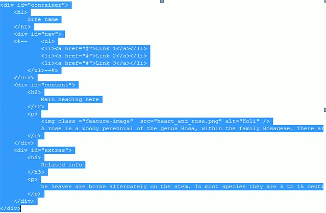
Step 2: Now in our application we have a Parent DIV say <div id="container">
Inside this div we have the following 3 child div:
<div id="nav">
<div id="content">
<div id="extras">

Amit MaheshwariPosted Jan 21, 2012, 11:31 PM
It's a great effort to do such task so keep it up and thanks for sharing.....
Arjun PanwarPosted Jan 21, 2012, 11:18 PM
Really nice work