

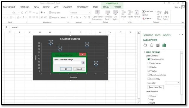
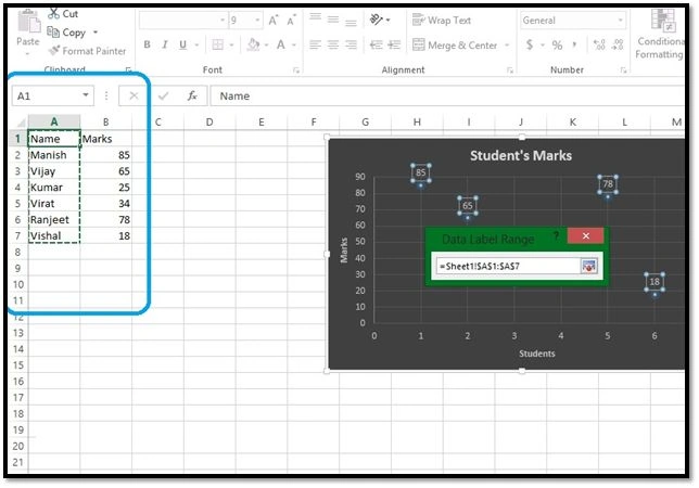
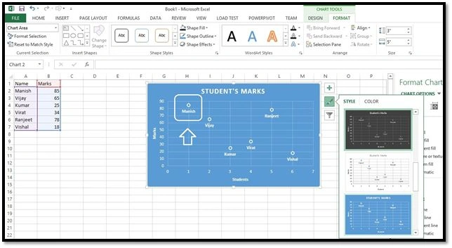
Hey there, what's up? Another trick is on the way that you will love to learn and share. We all know how to add a chart and show chart data in data labels, but have you ever wanted to set the Data Label from a given Range in Excel? I mean set the Text as data labels instead of Numbers. I'm sure you would like to, since this feature has been in the wishlist for 15 years to be added to the Microsoft Office Package. Use the following procedure for that.
Procedure
1. Prepare some data
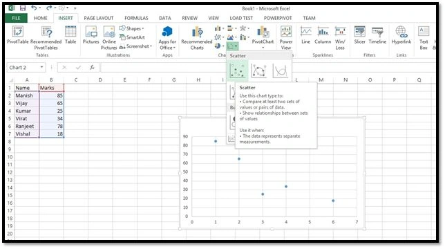
2. Select the data and go to "Insert" > "In Charts" section, select a chart type (I'd prefer scatter chart for the sake of brevity)
Picture 1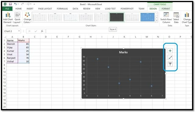
Picture 2
As you see, I've a nice chart plotted with a nice dark theme and it's cool. I must say I really love the formatting enhancements done by Microsoft in Microsoft Office 2013. Choose another one if you want to. Anyway, the chart is bare without any label showing over there with data points. You can see it shows three buttons with the chart when you click on the chart. They're formatting menus. The first one, the plus symbol, lets you play with various options like show/hide Axis Title, Data Labels, Error Bars, Legend, Trendline and so on. The second one is for styling your chart with some predefined format by Microsoft that are awesome. The last one is a filter that will let you filter the data for the chart. So, now we need to show up the data Labels. 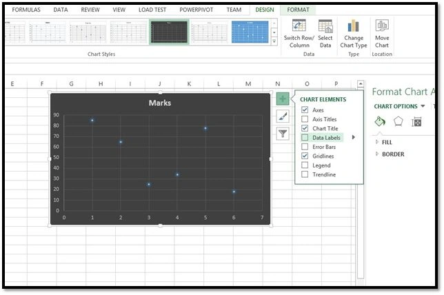
Picture 3
3. Click on the plus symbol, the first icon, and check "Data Labels". Now you will see them added to your chart. You can also click on the right arrow on "Data Labels" and select where you want the data labels to be aligned, in other words center, right, top, bottom and so on.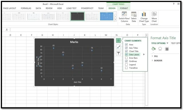
Picture 4
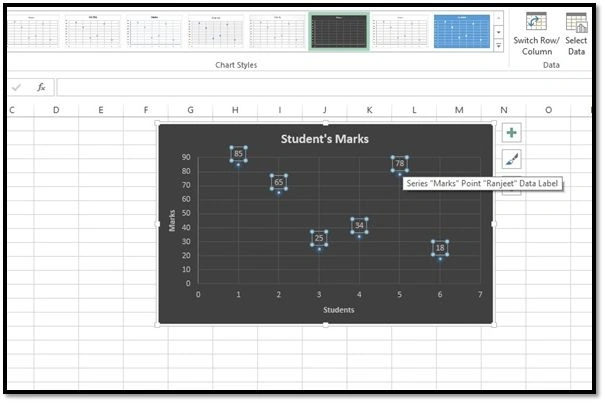
4. I modified the chart and axis titles to look good. Now we have data labels on the data points but still they're numbers. Click on any of the data labels, all of them will be selected automatically.
Join the conversation! Your thoughts help the community grow.