

Introduction
If you are a web developer/designer then you might ask how to center a div vertically/horizontally. Yes, centering a div element probably was a tricky job before HTML5.
Searching the internet for “center a div” might give you many links. The possible ways are to apply "margin: 0 auto" and setting the "top:50%" and "left:50%", but these are not the ultimate solutions. We need to do some more tricky things with them.
But the Flexible Box aka flexbox module in HTML5 provides us flexible ways to arrange/align the elements. It provides efficient ways to layout and distributes the space among elements in a container, even when the size of the items is unknown.
Flexible Box
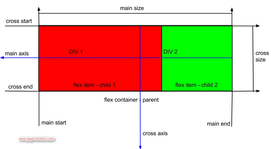
The preceding picture shows the Flexible Box Module. Let us discuss the attributes of the flexible box.
Main axis: The main axis is the default flow direction for the flex items.
Cross axis: The cross axis is perpendicular to the main axis.
Cross-start and Cross-end: The flex items are placed from the start at the cross-start point and end at a cross-end point.
Main size: The flex items width or height in the main dimension is the main size of the flexbox.
Cross size: The flex items width or height in the cross dimension is the cross size of the flexbox.
Properties of Flexible Box
There are many properties available in the Flexible Box module. Let us explain each of them. First, we shall explain the properties that are available in the parent element, in other words, the flex container.
Parent Element Properties
Display: flex | inline-flex
Setting the flex value to display a CSS rule makes an element a block-level Flex Container. And the inline-flex makes the element an inline-level
Flex Container.
The properties applied to a Block Layout, clear, float and vertical-align, are not valid on a flex container.
Flex-direction: row | row-reverse | column | column-reverse
This property assures the direction of the flex item in the flex container.
The row value is the default one that makes the flex items to flow from left to right based on direction property. The row-reverse value makes the flex items to flow right to left.
The flex items flow top to bottom if the value is set to the column. And the column-reverse sets the direction of the flex item to bottom to top.
Flex-wrap: nowrap | wrap | wrap-reverse
Flex-wrap property sets the flex container to be a single-lined or multi-lined container. Here the cross-axis property sets the orientation of the single/multi-lined flexbox.
Comments
Join the conversation! Your thoughts help the community grow.