

Introduction
In this article, we will discuss React Material UI Stepper and Tabs. Stepper is a component that is used to create a wizard-like workflow by separating content into different steps.
You can check my previous article in which we discussed ReactJS and its basic components from the below-mentioned links.
- Add Material UI In React Application
- Add Material-UI Table In ReactJS Application
- How To Create PDF In ReactJS
Prerequisites
- Basic Knowledge of React
- Visual Studio Code
- Node and NPM installed
- Material UI Installed
Create ReactJS project
- npx create-react-app platform
Install Material-UI
Now Install Material-UI by using the following command.
- npm install @material-ui/core --save
Now, right-click on the "src" folder and add a new component named 'Stepper.js'
First let’s add the following reference in this component.
- import Stepper from '@material-ui/core/Stepper';
- import Step from '@material-ui/core/Step';
- import StepLabel from '@material-ui/core/StepLabel';
- import Button from '@material-ui/core/Button';
- import Typography from '@material-ui/core/Typography';
- import AppBar from '@material-ui/core/AppBar';
- import Toolbar from '@material-ui/core/Toolbar';
Add the following code in Stepper component.
- import React from 'react';
- import { makeStyles } from '@material-ui/core/styles';
- import Stepper from '@material-ui/core/Stepper';
- import Step from '@material-ui/core/Step';
- import StepLabel from '@material-ui/core/StepLabel';
- import Button from '@material-ui/core/Button';
- import Typography from '@material-ui/core/Typography';
- import AppBar from '@material-ui/core/AppBar';
- import Toolbar from '@material-ui/core/Toolbar';
- function getSteps() {
- return ['Personal Details', 'Address', 'Review Details'];
- }
- function getStepContent(step) {
- switch (step) {
- case 0:
- return 'Personal Details';
- case 1:
- return 'Address';
- case 2:
- return 'Review Details';
- default:
- return 'Unknown step';
- }
- }
- export default function StepperDemo() {
- const [activeStep, setActiveStep] = React.useState(0);
- const [skipped, setSkipped] = React.useState(new Set());
- const steps = getSteps();
- const isStepOptional = step => {
- return step === 1;
- };
- const isStepSkipped = step => {
- return skipped.has(step);
- };
- const handleNext = () => {
- let newSkipped = skipped;
- if (isStepSkipped(activeStep)) {
- newSkipped = new Set(newSkipped.values());
- newSkipped.delete(activeStep);
- }
- setActiveStep(prevActiveStep => prevActiveStep + 1);
- setSkipped(newSkipped);
- };
- const handleBack = () => {
- setActiveStep(prevActiveStep => prevActiveStep - 1);
- };
- const handleSkip = () => {
- if (!isStepOptional(activeStep)) {
- throw new Error("You can't skip a step that isn't optional.");
- }
- setActiveStep(prevActiveStep => prevActiveStep + 1);
- setSkipped(prevSkipped => {
- const newSkipped = new Set(prevSkipped.values());
- newSkipped.add(activeStep);
- return newSkipped;
- });
- };
- const handleReset = () => {
- setActiveStep(0);
- };
- return (
- <>
- <AppBar position="static">
- <Toolbar style={{ 'paddingLeft': "600px" }}>
- Stepper in React Application
- </Toolbar>
- </AppBar>
- <div>
- <Stepper activeStep={activeStep}>
- {steps.map((label, index) => {
- const stepProps = {};
- const labelProps = {};
- if (isStepOptional(index)) {
- labelProps.optional = <Typography variant="caption">Optional</Typography>;
- }
- if (isStepSkipped(index)) {
- stepProps.completed = false;
- }
- return (
- <Step key={label} {...stepProps}>
- <StepLabel {...labelProps}>{label}</StepLabel>
- </Step>
- );
- })}
- </Stepper>
- <div>
- {activeStep === steps.length ? (
- <div>
- <Typography >
- All steps completed - you're finished
- </Typography>
- <Button onClick={handleReset} >
- Reset
- </Button>
- </div>
- ) : (
- <div>
- <Typography >{getStepContent(activeStep)}</Typography>
- <div>
- <Button disabled={activeStep === 0} onClick={handleBack} >
- Back
- </Button>
- {isStepOptional(activeStep) && (
- <Button
- variant="contained"
- color="primary"
- onClick={handleSkip}
- >
- Skip
- </Button>
- )}
- <Button
- variant="contained"
- color="primary"
- onClick={handleNext}
- >
- {activeStep === steps.length - 1 ? 'Finish' : 'Next'}
- </Button>
- </div>
- </div>
- )}
- </div>
- </div>
- </>
- );
- }
- import React from 'react';
- import logo from './logo.svg';
- import './App.css';
- import StepperDemo from './Stepper';
- import TabsDemo from './Tabs';
- function App() {
- return (
- <div className="App">
- <StepperDemo/>
- </div>
- );
- }
- export default App;
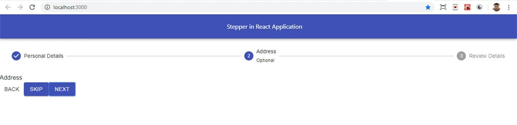
Now let's add another component 'Tabs.js' file,in this component we add Tabs. Tabs is used to switch between different pages. Open Tabs.js and add the following code.
- import React from 'react';
- import PropTypes from 'prop-types';
- import AppBar from '@material-ui/core/AppBar';
- import Tabs from '@material-ui/core/Tabs';
- import Tab from '@material-ui/core/Tab';
- import Typography from '@material-ui/core/Typography';
- import Box from '@material-ui/core/Box';
- function TabPanel(props) {
- const { children, value, index, ...other } = props;
- return (
- <Typography
- component="div"
- role="tabpanel"
- hidden={value !== index}
- id={`simple-tabpanel-${index}`}
- aria-labelledby={`simple-tab-${index}`}
- {...other}
- >
- {value === index && <Box p={3}>{children}</Box>}
- </Typography>
- );
- }
- TabPanel.propTypes = {
- children: PropTypes.node,
- index: PropTypes.any.isRequired,
- value: PropTypes.any.isRequired,
- };
- function testProps(index) {
- return {
- id: `simple-tab-${index}`,
- 'aria-controls': `simple-tabpanel-${index}`,
- };
- }
- export default function TabsDemo() {
- const [value, setValue] = React.useState(0);
- const handleChange = (event, newValue) => {
- setValue(newValue);
- };
- return (
- <div>
- <AppBar position="static">
- <Tabs value={value} onChange={handleChange}>
- <Tab label="Home" {...testProps(0)} />
- <Tab label="About" {...testProps(1)} />
- <Tab label="Contact" {...testProps(2)} />
- </Tabs>
- </AppBar>
- <TabPanel value={value} index={0}>
- Home
- </TabPanel>
- <TabPanel value={value} index={1}>
- About
- </TabPanel>
- <TabPanel value={value} index={2}>
- Contact
- </TabPanel>
- </div>
- );
- }
Now open app.js file and add the following code.
- import React from 'react';
- import logo from './logo.svg';
- import './App.css';
- import StepperDemo from './Stepper';
- import TabsDemo from './Tabs';
- function App() {
- return (
- <div className="App">
- {/* <StepperDemo/> */}
- <TabsDemo/>
- </div>
- );
- }
- export default App;
Run the project by using 'npm start' and check the result.

Summary
In this article, we learned how we add Stepper and Tabs in React applications using React material UI.
Join the conversation! Your thoughts help the community grow.