

Introduction
In this article, we will learn how to add Syncfusion dropdowns in the Angular 10 application.
Prerequisites
- Basic Knowledge of Angular 2 or higher
- Visual Studio Code
- Node and NPM installed
- Bootstrap
Create an Angular Project
Create an Angular project by using the following command,
- ng new Kanbandata
Open this project in Visual Studio Code and install Bootstrap by using the following command,
- npm install bootstrap --save
Now open the styles.css file and add Bootstrap file reference. To add a reference in the styles.css file add this line.
- @import '~bootstrap/dist/css/bootstrap.min.css';
Now install the Syncfusion dropdown library, To install, use the following command,
- npm install @syncfusion/ej2-angular-dropdowns
Now import dropdown module in app.module.ts file, add the following code in this file.
- import { NgModule } from '@angular/core';
- import { BrowserModule } from '@angular/platform-browser';
- import { HttpClientModule } from "@angular/common/http";
- import { AppComponent } from './app.component';
- import { DropDownListAllModule } from '@syncfusion/ej2-angular-dropdowns';
- import { CheckBoxAllModule } from '@syncfusion/ej2-angular-buttons';
- import { DropdownDemoComponent } from './dropdown-demo/dropdown-demo.component';
- @NgModule({
- declarations: [
- AppComponent,
- DropdownDemoComponent
- ],
- imports: [
- BrowserModule,HttpClientModule,DropDownListAllModule,CheckBoxAllModule
- ],
- providers: [],
- bootstrap: [AppComponent]
- })
- export class AppModule { }
Now create a new component by using the following command,
- ng g c dropdowndemo
Now open dropdown-demo.component.html file and add the following code,
- <div class="container" style="margin-top:10px;margin-bottom: 24px;">
- <div class="col-sm-12 btn btn-success">
- How To Use Syncfusion Dropdown in Angular Application
- </div>
- </div>
- <div class="col-lg-9 content-wrapper" style="height: 350px">
- <div style="margin: 0px auto; width:250px; padding-top: 40px;">
- <ejs-dropdownlist id='Cities' #sample [dataSource]='CityData' [value]='value' [fields]='fields' [placeholder]='waterMark' [popupHeight]='height'></ejs-dropdownlist>
- </div>
- </div>
Now open dropdown-demo.component.ts file and add the following lines,
- import { Component,ViewChild, OnInit } from '@angular/core';
- import { DropDownListComponent } from '@syncfusion/ej2-angular-dropdowns';
- @Component({
- selector: 'app-dropdown-demo',
- templateUrl: './dropdown-demo.component.html',
- styleUrls: ['./dropdown-demo.component.css']
- })
- export class DropdownDemoComponent implements OnInit {
- constructor() { }
- public listObj: DropDownListComponent;
- public CityData: Object[] = [
- { Id: '1', City: 'Jaipur' },
- { Id: '2', City: 'Delhi' },
- { Id: '3', City: 'Noida' },
- { Id: '4', City: 'Gurgoan' },
- { Id: '5', City: 'Pune' },
- { Id: '6', City: 'Mumbai' },
- { Id: '7', City: 'Ajmer' },
- { Id: '8', City: 'Bangalore' },
- { Id: '9', City: 'Hyderabad' },
- { Id: '10', City: 'Vizag' }
- ];
- ngOnInit(): void {
- }
- public fields: Object = { text: 'City', value: 'Id' };
- public height: string = '220px';
- public waterMark: string = 'Select a City';
- public value: string = '3';
- }
Now open app.component.html file and add the following code,
- <app-dropdown-demo></app-dropdown-demo>
Now run the application using npm start and check the result.
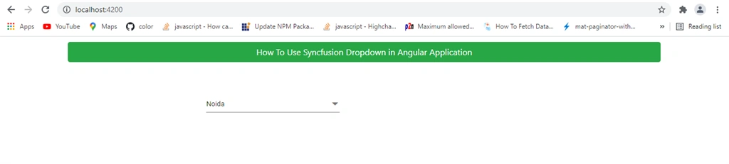
Now we add a Multiselect dropdown. Let's create a new component by using the following command,
- ng g c multi-select dropdowns
Now open multiselectdropdowns.component.html file and add the following code,
- <div class="container" style="margin-top:10px;margin-bottom: 24px;">
- <div class="col-sm-12 btn btn-success">
- How To Use Syncfusion MultiSelect Dropdown in Angular Application
- </div>
- </div>
- <div class="container" style="height: 150px">
- <div id="multiselect-sample" class="control-section" style="height: 500px">
- <div id='content'>
- <div class="control-styles">
- <h6>Select City</h6>
- <ejs-multiselect id='sample-list1' [dataSource]='CityData' [mode]='default' [fields]='fields' [placeholder]='waterMark'></ejs-multiselect>
- </div>
- </div>
- </div>
- </div>
- <div class="container" style="height: 350px">
- <ejs-multiselect id='multiselect-checkbox' #checkbox [dataSource]='CityData' [placeholder]='checkWaterMark' [fields]='checkFields'
- [mode]='mode' [popupHeight]='popHeight' [showDropDownIcon]='true' showSelectAll='true' [filterBarPlaceholder]='filterPlaceholder'></ejs-multiselect>
- </div>
Now open multiselectdropdowns.component.tsfile and add the following code,
- import { Component,ViewChild, OnInit } from '@angular/core';
- import { CheckBoxComponent } from '@syncfusion/ej2-angular-buttons';
- import { MultiSelectComponent } from '@syncfusion/ej2-angular-dropdowns';
- @Component({
- selector: 'app-multiselectdropdowns',
- templateUrl: './multiselectdropdowns.component.html',
- styleUrls: ['./multiselectdropdowns.component.css']
- })
- export class MultiselectdropdownsComponent implements OnInit {
- mode: string;
- filterPlaceholder: string;
- constructor() { }
- @ViewChild('sample')
- public listObj: MultiSelectComponent;
- public CityData: Object[] = [
- { Id: '1', City: 'Jaipur' },
- { Id: '2', City: 'Delhi' },
- { Id: '3', City: 'Noida' },
- { Id: '4', City: 'Gurgoan' },
- { Id: '5', City: 'Pune' },
- { Id: '6', City: 'Mumbai' },
- { Id: '7', City: 'Ajmer' },
- { Id: '8', City: 'Bangalore' },
- { Id: '9', City: 'Hyderabad' },
- { Id: '10', City: 'Vizag' }
- ];
- public fields: Object = { text: 'City', value: 'Id' };
- public waterMark: string = 'Choose Cities';
- public default : string = 'Default';
- public box : string = 'Box';
- public delimiter : string = 'Delimiter';
- public checkWaterMark: string = 'Select City';
- public checkFields: Object = { text: 'City', value: 'Id' };
- public popHeight: string = '350px';
- ngOnInit(): void {
- this.mode = 'CheckBox';
- this.filterPlaceholder = 'Search city';
- }
- }
Now open app.module.ts file ,add the following code in this file.
- import { NgModule } from '@angular/core';
- import { BrowserModule } from '@angular/platform-browser';
- import { HttpClientModule } from "@angular/common/http";
- import { AppComponent } from './app.component';
- import { DropDownListAllModule } from '@syncfusion/ej2-angular-dropdowns';
- import { CheckBoxAllModule } from '@syncfusion/ej2-angular-buttons';
- import { DropdownDemoComponent } from './dropdown-demo/dropdown-demo.component';
- import { AutoCompleteModule } from '@syncfusion/ej2-angular-dropdowns';
- import { MultiSelectAllModule } from '@syncfusion/ej2-angular-dropdowns';
- import { MultiselectdropdownsComponent } from './multiselectdropdowns/multiselectdropdowns.component';
- @NgModule({
- declarations: [
- AppComponent,
- DropdownDemoComponent,
- MultiselectdropdownsComponent
- ],
- imports: [
- BrowserModule,HttpClientModule,DropDownListAllModule,CheckBoxAllModule,AutoCompleteModule,MultiSelectAllModule
- ],
- providers: [],
- bootstrap: [AppComponent]
- })
- export class AppModule { }
Now run the application using npm start and check the result.
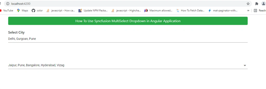
Summary
In this article, we learned how to add Syncfusion dropdowns in an Angular 10 Application.
Pranam BhatPosted May 31, 2021, 4:58 AM
Great article ..