

Introduction
In this article, we will discuss React Material UI Progress bar and Snackbar. Progress bar is used to inform the user that data loading is in progress. Basically it is used to show the loading state of data in an application.
You can check my previous articles in which we discussed ReactJS and its basic components from the below-mentioned links.
- Add Material UI In React Application
- How To Add Stepper And Tabs in React Applications
- How To Add TreeView Component In React Application
Prerequisites
- Basic Knowledge of React
- Visual Studio Code
- Node and NPM installed
- Material UI Installed
Create ReactJS project
- npx create-react-app platform
Install Material-UI
Now Install Material-UI by using the following command.
- npm install @material-ui/core --save
Now, right-click on the "src" folder and add a new component named 'Progressdemo.js'
Add the following code in Progressdemo component.
- import React from 'react';
- import clsx from 'clsx';
- import { makeStyles } from '@material-ui/core/styles';
- import CircularProgress from '@material-ui/core/CircularProgress';
- import { green } from '@material-ui/core/colors';
- import Button from '@material-ui/core/Button';
- import AppBar from '@material-ui/core/AppBar';
- import Toolbar from '@material-ui/core/Toolbar';
- const useStyles = makeStyles(theme => ({
- buttonSuccess: {
- backgroundColor: green[500],
- '&:hover': {
- backgroundColor: green[700],
- },
- },
- buttonProgress: {
- color: green[500],
- position: 'absolute',
- top: '50%',
- left: '50%',
- marginTop: -12,
- marginLeft: -12,
- },
- }));
- export default function Progessdemo() {
- const classes = useStyles();
- const [loading, setLoading] = React.useState(false);
- const [success, setSuccess] = React.useState(false);
- const timer = React.useRef();
- const buttonClassname = clsx({
- [classes.buttonSuccess]: success,
- });
- const handleButtonClick = () => {
- if (!loading) {
- setSuccess(false);
- setLoading(true);
- timer.current = setTimeout(() => {
- setSuccess(true);
- setLoading(false);
- }, 2000);
- }
- };
- return (
- <>
- <AppBar position="static">
- <Toolbar style={{ 'paddingLeft': "600px" }}>
- Material UI Progres Bar
- </Toolbar>
- </AppBar>
- <div>
- <div style={{ 'paddingLeft': "600px" }}>
- {loading && <CircularProgress size={80} className={classes.buttonProgress} />}
- </div>
- <div style={{ 'paddingLeft': "600px" }}>
- <Button
- variant="contained"
- color="primary"
- className={buttonClassname}
- disabled={loading}
- onClick={handleButtonClick}
- >
- Click
- </Button>
- </div>
- </div>
- </>
- );
- }
Run the project by using 'npm start' and check the result:
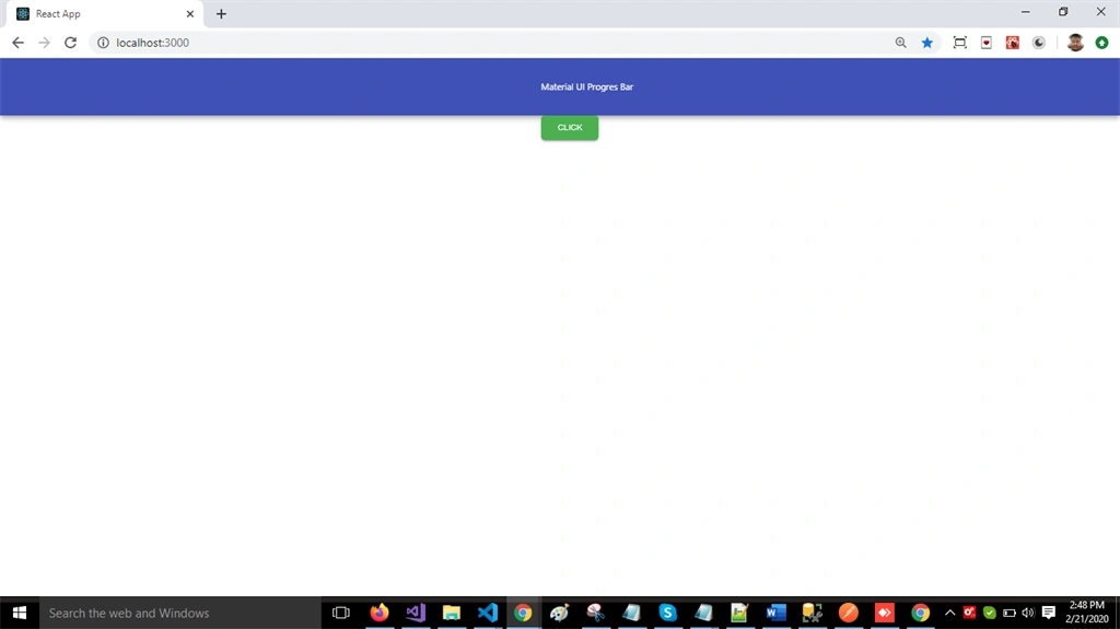
Now, right-click on the "src" folder and add a new component named 'Progressdemo1.js' and add the following code int this component
- import React from 'react';
- import { makeStyles } from '@material-ui/core/styles';
- import LinearProgress from '@material-ui/core/LinearProgress';
- import AppBar from '@material-ui/core/AppBar';
- import Toolbar from '@material-ui/core/Toolbar';
- export default function Progessdemo1() {
- return (
- <>
- <div style={{"marginBottom":"20px"}}>
- <AppBar position="static">
- <Toolbar style={{ 'paddingLeft': "600px" }}>
- Material UI Progres Bar
- </Toolbar>
- </AppBar>
- </div>
- <div>
- <LinearProgress />
- <LinearProgress color="secondary" />
- </div>
- </>
- );
- }
Run the project by using 'npm start' and check the result.
Now, right-click on the "src" folder and add a new component named 'Snackbar.js' and add the following code int this component
- import React from 'react';
- import Button from '@material-ui/core/Button';
- import Snackbar from '@material-ui/core/Snackbar';
- import AppBar from '@material-ui/core/AppBar';
- import Toolbar from '@material-ui/core/Toolbar';
- export default function SnackbarDemo() {
- const [state, setState] = React.useState({
- open: false,
- vertical: 'top',
- horizontal: 'center',
- });
- const { vertical, horizontal, open } = state;
- const handleClick = newState => () => {
- setState({ open: true, ...newState });
- };
- const handleClose = () => {
- setState({ ...state, open: false });
- };
- return (
- <div>
- <AppBar position="static">
- <Toolbar style={{ 'paddingLeft': "600px" }}>
- Material UI Snack Bar
- </Toolbar>
- </AppBar>
- <Button onClick={handleClick({ vertical: 'bottom', horizontal: 'center' })}>
- Bottom-Center
- </Button>
- <Button onClick={handleClick({ vertical: 'bottom', horizontal: 'left' })}>Bottom-Left</Button>
- <Button onClick={handleClick({ vertical: 'top', horizontal: 'left' })}>Top-Left</Button>
- <Snackbar
- anchorOrigin={{ vertical, horizontal }}
- key={`${vertical},${horizontal}`}
- open={open}
- onClose={handleClose}
- message="Snack Bar Demo"
- />
- </div>
- );
- }
Open app.js file and add the following code:
- import React from 'react';
- import logo from './logo.svg';
- import './App.css';
- import SnackbarDemo from './Snackbar';
- function App() {
- return (
- <div className="App">
- <SnackbarDemo/>
- </div>
- );
- }
- export default App;
Run the project by using 'npm start' and check the result:
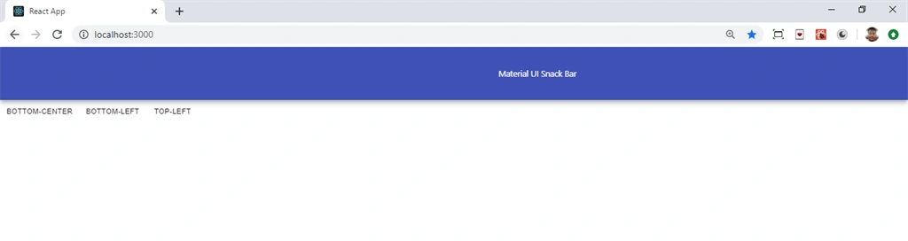
Summary
In this article, we learned how we add Progressbar and Snackbar in React applications using React material UI.
Join the conversation! Your thoughts help the community grow.