

Introduction
This article demonstrates how to create and use a custom switch control in Xamarin.Forms using XAML and C#. This article starts with the introduction of the CustomSwitch tag in XAML. After that, it demonstrates how to set BorderColor, ThumbColor, and ThumbImage of a Custom Switch.

Implementation
Open Visual Studio and create a "New Project".
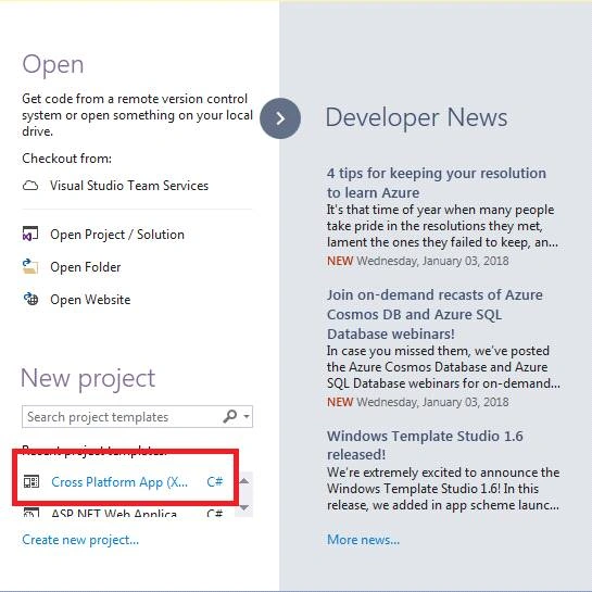
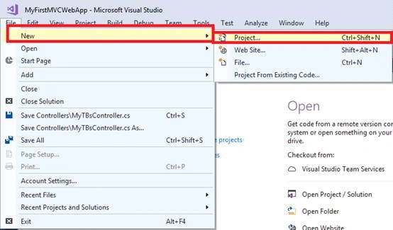
Another way to create a project is to go to File >> New>>Project or press ctrl+Shft+N.
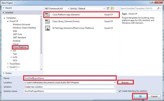
Now, select Cross-Platform App, give the project a name, and set the project path. Then, click OK.
Select the template as "Blank App" and code sharing as "PCL".

Right-click on PCL Project and select Add >> New Item or Add >> Class.
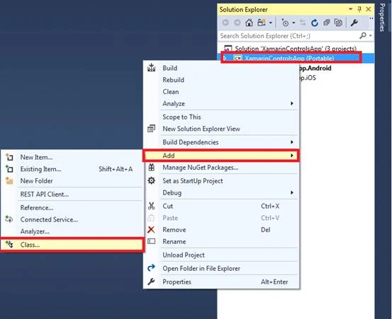
Now, we give the class a name as "CustomSwich.cs".
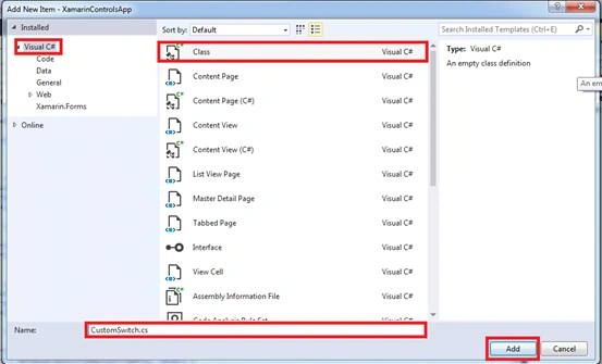
Now, generate the custom properties...
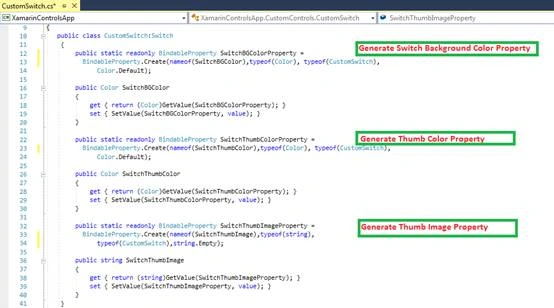
CustomSwitch.cs
- public class CustomSwitch : Switch
- {
- public static readonly BindableProperty SwitchOffColorProperty =
- BindableProperty.Create(nameof(SwitchOffColor),
- typeof(Color), typeof(CustomSwitch),
- Color.Default);
- public Color SwitchOffColor
- {
- get { return (Color)GetValue(SwitchOffColorProperty); }
- set { SetValue(SwitchOffColorProperty, value); }
- }
- public static readonly BindableProperty SwitchOnColorProperty =
- BindableProperty.Create(nameof(SwitchOnColor),
- typeof(Color), typeof(CustomSwitch),
- Color.Default);
- public Color SwitchOnColor
- {
- get { return (Color)GetValue(SwitchOnColorProperty); }
- set { SetValue(SwitchOnColorProperty, value); }
- }
- public static readonly BindableProperty SwitchThumbColorProperty =
- BindableProperty.Create(nameof(SwitchThumbColor),
- typeof(Color), typeof(CustomSwitch),
- Color.Default);
- public Color SwitchThumbColor
- {
- get { return (Color)GetValue(SwitchThumbColorProperty); }
- set { SetValue(SwitchThumbColorProperty, value); }
- }
- public static readonly BindableProperty SwitchThumbImageProperty =
- BindableProperty.Create(nameof(SwitchThumbImage),
- typeof(string),
- typeof(CustomSwitch),
- string.Empty);
- public string SwitchThumbImage
- {
- get { return (string)GetValue(SwitchThumbImageProperty); }
- set { SetValue(SwitchThumbImageProperty, value); }
- }
- }
Let us start with Android. We are creating a Class in Android Project and rendering the Switch. Then, we set all the properties when we generate it in PCL Project.
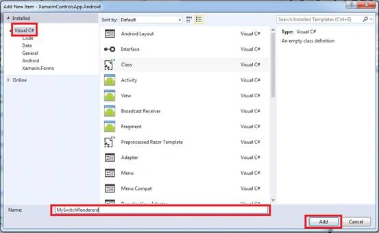
Please make sure of the dependency [assembly: ExportRenderer(typeof(CustomSwitch), typeof(MySwitchRenderer))] of Android (MySwitchRndered) and PCL (CustomSwitch).
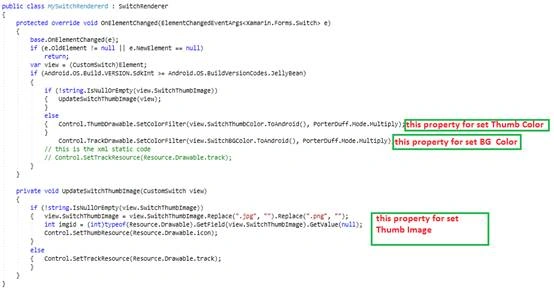
MySwitchRenderer.cs
- public class MySwitchRendererd : SwitchRenderer
- {
- private CustomSwitch view;
- protected override void OnElementChanged(ElementChangedEventArgs<Xamarin.Forms.Switch> e)
- {
- base.OnElementChanged(e);
- if (e.OldElement != null || e.NewElement == null)
- return;
- view = (CustomSwitch)Element;
- if (Android.OS.Build.VERSION.SdkInt >= Android.OS.BuildVersionCodes.JellyBean)
- {
- if (this.Control != null)
- {
- if (this.Control.Checked)
- {
- this.Control.TrackDrawable.SetColorFilter(view.SwitchOnColor.ToAndroid(), PorterDuff.Mode.SrcAtop);
- }
- else
- {
- this.Control.TrackDrawable.SetColorFilter(view.SwitchOffColor.ToAndroid(), PorterDuff.Mode.SrcAtop);
- }
- this.Control.CheckedChange += this.OnCheckedChange;
- UpdateSwitchThumbImage(view);
- }
- //Control.TrackDrawable.SetColorFilter(view.SwitchBGColor.ToAndroid(), PorterDuff.Mode.Multiply);
- }
- }
- private void UpdateSwitchThumbImage(CustomSwitch view)
- {
- if (!string.IsNullOrEmpty(view.SwitchThumbImage))
- {
- view.SwitchThumbImage = view.SwitchThumbImage.Replace(".jpg", "").Replace(".png", "");
- int imgid = (int)typeof(Resource.Drawable).GetField(view.SwitchThumbImage).GetValue(null);
- Control.SetThumbResource(Resource.Drawable.icon);
- }
- else
- {
- Control.ThumbDrawable.SetColorFilter(view.SwitchThumbColor.ToAndroid(), PorterDuff.Mode.Multiply);
- // Control.SetTrackResource(Resource.Drawable.track);
- }
- }
- private void OnCheckedChange(object sender, CompoundButton.CheckedChangeEventArgs e)
- {
- if (this.Control.Checked)
- {
- this.Control.TrackDrawable.SetColorFilter(view.SwitchOnColor.ToAndroid(), PorterDuff.Mode.SrcAtop);
- }
- else
- {
- this.Control.TrackDrawable.SetColorFilter(view.SwitchOffColor.ToAndroid(), PorterDuff.Mode.SrcAtop);
- }
- }
- protected override void Dispose(bool disposing)
- {
- this.Control.CheckedChange -= this.OnCheckedChange;
- base.Dispose(disposing);
- }
- }
We are creating a Class, so right click on iOS project and select Apple. Then, select "Class" and give this class a name as MySliderRendered.cs.
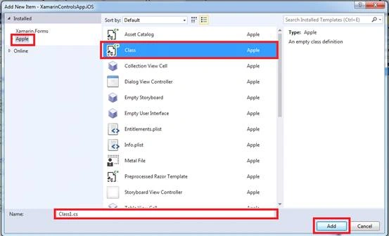
Now, let us write some code for Switch and Set Properties.
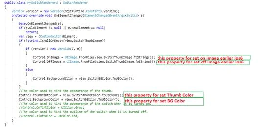
MySwitchRenderer.cs
- public class MySwitchRendererd : SwitchRenderer
- {
- Version version = new Version(ObjCRuntime.Constants.Version);
- protected override void OnElementChanged(ElementChangedEventArgs<Switch> e)
- {
- base.OnElementChanged(e);
- if (e.OldElement != null || e.NewElement == null)
- return;
- var view = (CustomSwitch)Element;
- if (!string.IsNullOrEmpty(view.SwitchThumbImage))
- {
- if (version > new Version(6, 0))
- { //n iOS 6 and earlier, the image displayed when the switch is in the on position.
- Control.OnImage = UIImage.FromFile(view.SwitchThumbImage.ToString());
- //n iOS 6 and earlier, the image displayed when the switch is in the off position.
- Control.OffImage = UIImage.FromFile(view.SwitchThumbImage.ToString());
- }
- else
- {
- Control.ThumbTintColor = view.SwitchThumbColor.ToUIColor();
- }
- }
- //The color used to tint the appearance of the thumb.
- Control.ThumbTintColor = view.SwitchThumbColor.ToUIColor();
- //Control.BackgroundColor = view.SwitchBGColor.ToUIColor();
- //The color used to tint the appearance of the switch when it is turned on.
- Control.OnTintColor = view.SwitchOnColor.ToUIColor();
- //The color used to tint the outline of the switch when it is turned off.
- Control.TintColor = view.SwitchOffColor.ToUIColor();
- }
- }
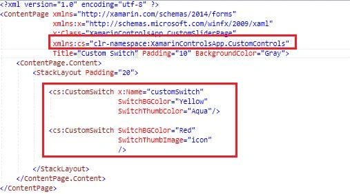
As you can see in the above code, we have to set the view reference in xmlns:custom="clr-namespace:XamarinControlApp.CustomControls" MainPage.xaml.
Write the following code for CustomSwitch.
MainPage.xaml
- <ContentPage.Content>
- <StackLayout Padding="20" BackgroundColor="Gray" >
- <Label Text="Custom Switch" FontSize="Large"/>
- <cs:CustomSwitch x:Name="customSwitch"
- SwitchOffColor="Yellow"
- SwitchOnColor="Black"
- SwitchThumbImage="icon"
- HorizontalOptions="CenterAndExpand"
- VerticalOptions="CenterAndExpand"/>
- <cs:CustomSwitch SwitchOffColor="Navy"
- SwitchOnColor="Green"
- SwitchThumbColor="Violet"
- HorizontalOptions="CenterAndExpand"
- VerticalOptions="CenterAndExpand"/>
- </StackLayout>
- </ContentPage.Content>
Now, you will have your CustomSwitch working!!
NOTE
Not tested on iOS.
Features of CustomSwitch Controls
- Custom Switch On Color Property=(SwitchOnColor="Red")
- Custom Switch Off Color Property=(SwitchOffColor="Yellow")
- Custom Switch Thumb Color Property=(SwitchThumbColor="Yellow")
- Custom Thumb Image Property=(SwitchThumbImage="Black")
Geral TorresPosted Oct 28, 2018, 5:30 PM
Add this line Element.IsToggled = Control.Checked;in OnCheckedChange function
David KleinPosted Sep 2, 2018, 8:22 AM
I used your renderer on Android, everything works just fine except the "Toggled" event doesn't trigger on click. Did you get that problem too? Please tell me if you have a solution.